The green corner
Elegant and sophisticated
The white room
All the pictures from Daily Apple Photography.
We are super excited to share the news, We have a new showroom! and we are almost ready for you to see it. This coming 12 - 14 October we will be hosting the official opening for our brand new showroom in Paradijslaan 157, Eindhoven.

Discover the new space and meet our autumn / winter collection, our new brands and the newest products you will love in a beautiful new location.

GARDEN BRUNCH
Loving our new Norm Dinnerware
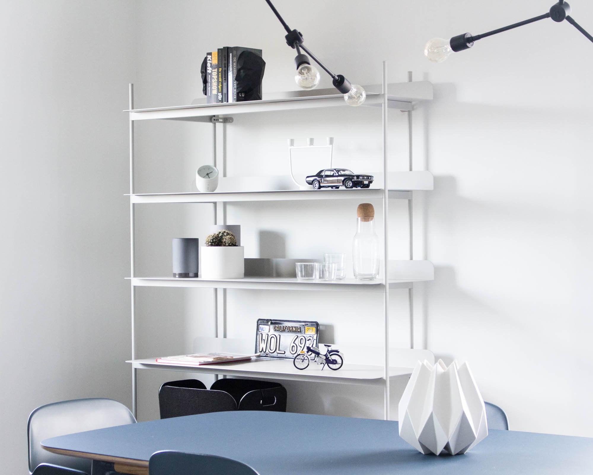
Last week we finished the interior of a very nice apartment in the Strijp area of Eindhoven. We got to style the entrance, the kitchen, the living room and dinning room. Our client was going for a serious, elegant look with a relaxed vibe.


Black wall in the kitchen
He already owned a beautiful white Smeg fridge, which we love, but it was set against an also white wall, which to be honest took a lot of the beauty out of it. And since the kitchen was already black, we thought painting the wall black would make a very big difference. We complimented that wall with a light grey Folded shelf to make the space even more functional.
With the beautiful Edge rug, we made a clear contrast from the grey flooring, and then went back to grey for the couch adding more textures over it with the cushions and throw.

The colour blue in a dark shade, mixes very nicely with the array of grey, black and white all around. The simplicity of the Twin table, mixed perfect with the blue rug and of course the sofa. We set the furniture in place and added the extra touch with accessories. Throws, baskets, vases and beautiful objects that are practically art pieces.

Hallway
The hallway had not been considered as part of the project but once we setup a Framed Mirror and a Folded shelf, this time in black, it not only looked great it felt a lot bigger.
It was a great experience and the client is very happy with his new place. It feels fresh, very masculine and at the same time pretty cozy.