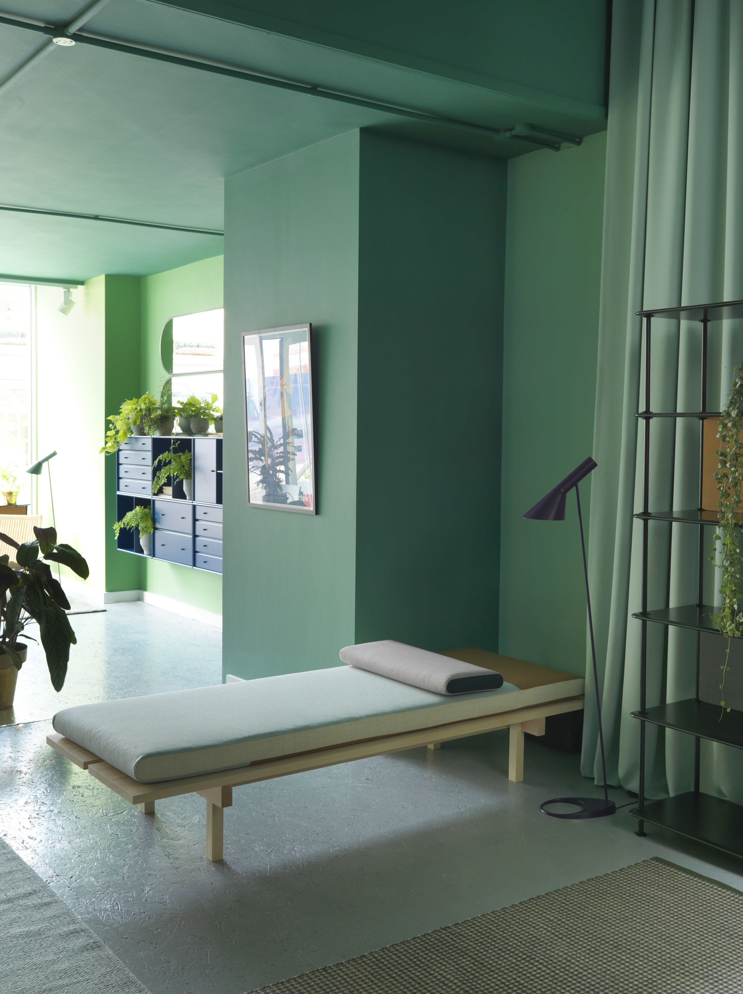
Our top pick from this year's VTWonen & Designbeurs

This year we totally missed the VTWonen & Designbeurs, but of everything we have seen online, this is definitely our top pick.

Amsterdam based Floor Knaapen, designed a “Home” for Eigen Huis & Interieur, a gorgeous minimal space in soft tones, and we spotted some pieces of our favourite brands.

eigenhuiseninterieur-aprilandmay (7).jpeg

Using beautiful objects from MENU and &Tradition, the magazine did an outstanding job.

eigenhuiseninterieur-aprilandmay.jpeg

We love the way Floor used an achromatic palette to create a contrasting backdrop for natural colours, like brass and wood. Love to see the FORMAKAMI pendants lamps from Jaime Hayon, I've had a crush with them for a long time, hope soon you can find them in our collection?

eigenhuiseninterieur-aprilandmay (1).jpeg

A glimpse of the new Androgyne coffee table under a beautiful brass Wall clock designed by Norm Architects.

eigenhuiseninterieur-aprilandmay (4).jpeg

Jaime Hayon’s Formakami lamp for &Tradition as a table lamp.

And what do you think about these mirrors? They are designed by April and May for Loof furniture I totally love the combination and balance between the oak and the mirror, and I find super handy the little shelf where you can keep your favourite things such as jewellery, make-up, keys …..

eigenhuiseninterieur-aprilandmay (10).jpeg
eigenhuiseninterieur-aprilandmay (12).jpeg

Thanks to Elvera van Schaik from April and May for the wonderful images. via aprilandmay.com . Read more about her experience and her thoughts in her blog.

Next year we will make sure not to miss the Beaurs.

What are your thoughts? tell us in the comments.

Until next time!
Enjoy your space.

Giselle

Baux acoustic panels and tiles

We love BAUX. It’s modular, comes in many colours, shapes and sizes, and its a not-so-expensive solution for acoustics if you are actually concerned with aesthetics.
We first found out about BAUX by following Form Us With Love, a Swedish design studio that we absolutely admire.

Ive gathered some images from their image bank, along with their own text, but I can tell you as an already active user of BAUX, they are as good (or even better) as what you see from their own communication.

They are super easy to install (meaning you just have to glue them to the wall) and since they are modular and there are so many possibilities, the end result really depends on your own (or the architect’s) creativity.

You can see a project we did with BAUX here.

Give us your comments or contact us if you want to know more.


Functional + beautiful

BAUX was founded on the belief that building materials should be surprisingly functional and remarkably beautiful. BAUX designs, produces and markets functional construction materials that meet the contemporary expectations of architects, engineers and builders – without compromising tomorrow’s safety and environmental standards.

BAUX-Plank-Reception.jpg

BAUX Acoustic Panels

BAUX Acoustic Panels is an environment-friendly, recyclable material made from wood wool, cement and water. The natural components together provide many functional characteristics. BAUX Acoustic Panels is available in 7 patterns; Quilted, Check, Stripes, Lines, Diagonal, Arch and Curve. All designed to be combined into infinity.

BAUX-Acoustic-Panels-Corridor.jpg

BAUX Acoustic Tiles

These are the basic shapes:

They come in 2 sizes: H = 29 cm and H 59 cm.

They come in 2 sizes: H = 29 cm and H 59 cm.

And these the basic colours, which if you are ordering more than 35M2 you can get your own custom colour.

baux colours.jpg

As you can see, you can go as big and as creative as you want!


Loved by Nature

An environment-friendly, recyclable material made from wood wool, cement and water.

BAUX-Wall-Acoustic-Panels-Factory-Worker.jpg
BAUX-Wall-Acoustic-Panels-Spruce.jpg
This is the natural version, which is later spray-painted.

This is the natural version, which is later spray-painted.

MG_9748.jpg

BAUX is a joint a venture between entrepreneurs Johan Ronnestam and Fredrik Franzon and the founding partners of design studio Form Us With Love; Jonas Pettersson, John Löfgren and Petrus Palmér.

The Danish Home

Recently, we found these incredible pictures via pinterest and totally fell in love with this apartment. The styling and concept by Pella Hedeby is gorgeous and the apartment is breathtaking; from the materials used to the colour schemes and OMG the huge windows giving the perfect light, and what can I say about the view of snowy Stockholm. I mean, who wouldn’t love living here?


the danish home home interior scandinavian design living room minimal spaces 1.jpg

Shades of grey

A selection of luxurious Danish classics: collaboration between interior stylist Pella Hedeby and ELLE Decoration .

“ The mission was a collaboration with the Danish brands Erik Jörgensen, Montana, Georg Jensen Damask, Kay Boyjsen (cutlery), Louis Poulsen and Kähler. A dream mission to put together an interior with genuine design icons.“ - Pella Hedeby

STIL_INSPIRATION_The_Danish_Home_12.jpg
the danish home home interior scandinavian design living room minimal spaces 12.jpg

The apartment was designed by Andreas Martin-Löf, who also designed the kitchen.

STIL_INSPIRATION_The_Danish_home_7.jpg

“My idea of ​​the interior was to create a home that would be truly luxurious, while feeling relaxed and homely”.

STIL_INSPIRATION_The_Danish_home_13.jpg

Most of the furniture is from Erik Jorgensen and Montana. Of course available at crioll.design

The following images and text were taken from the designers’s own article made for ELLE Decoration.

Give us your comments or contact us for more information about any of the products here displayed.

Thanks for reading!

Giselle

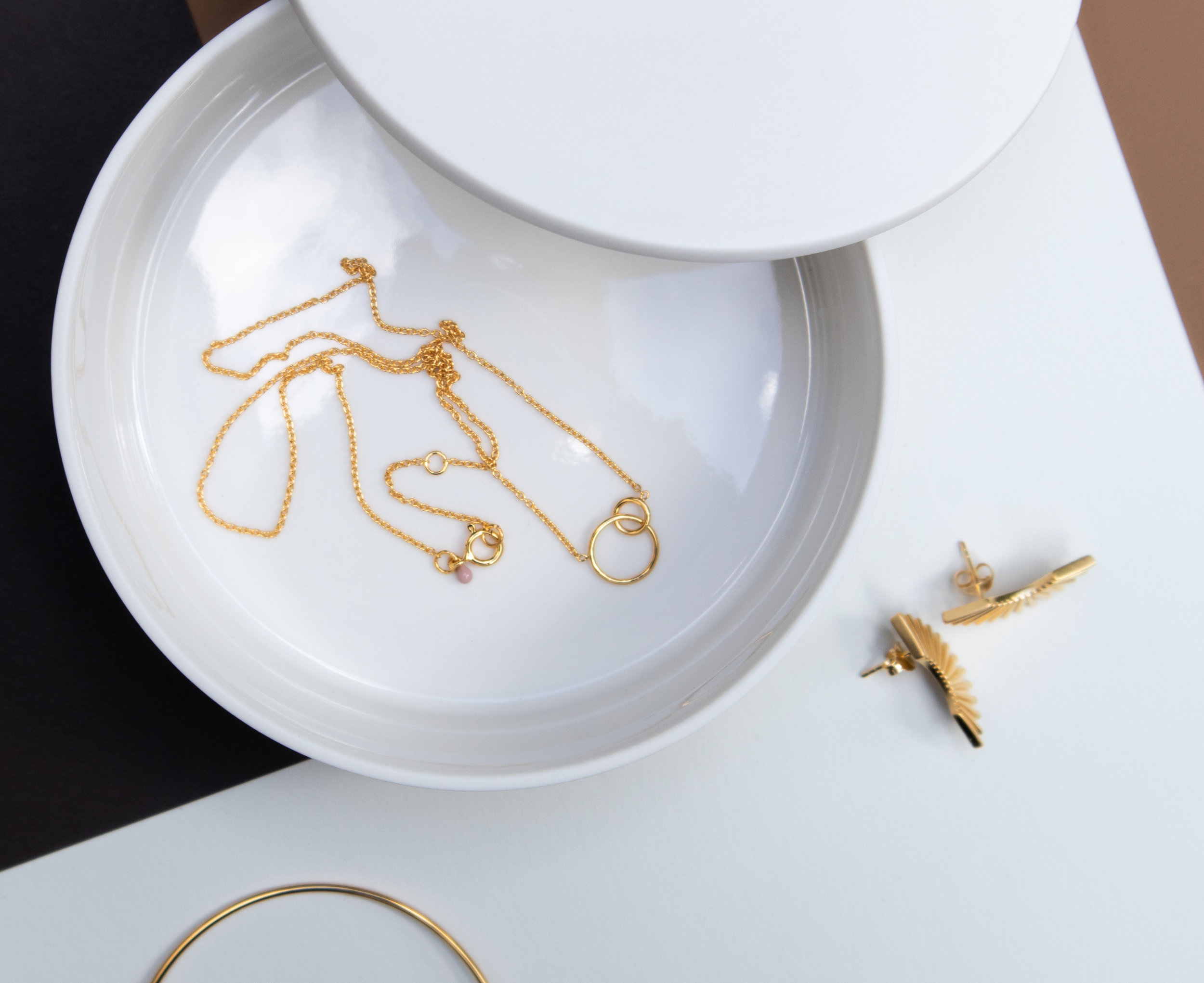
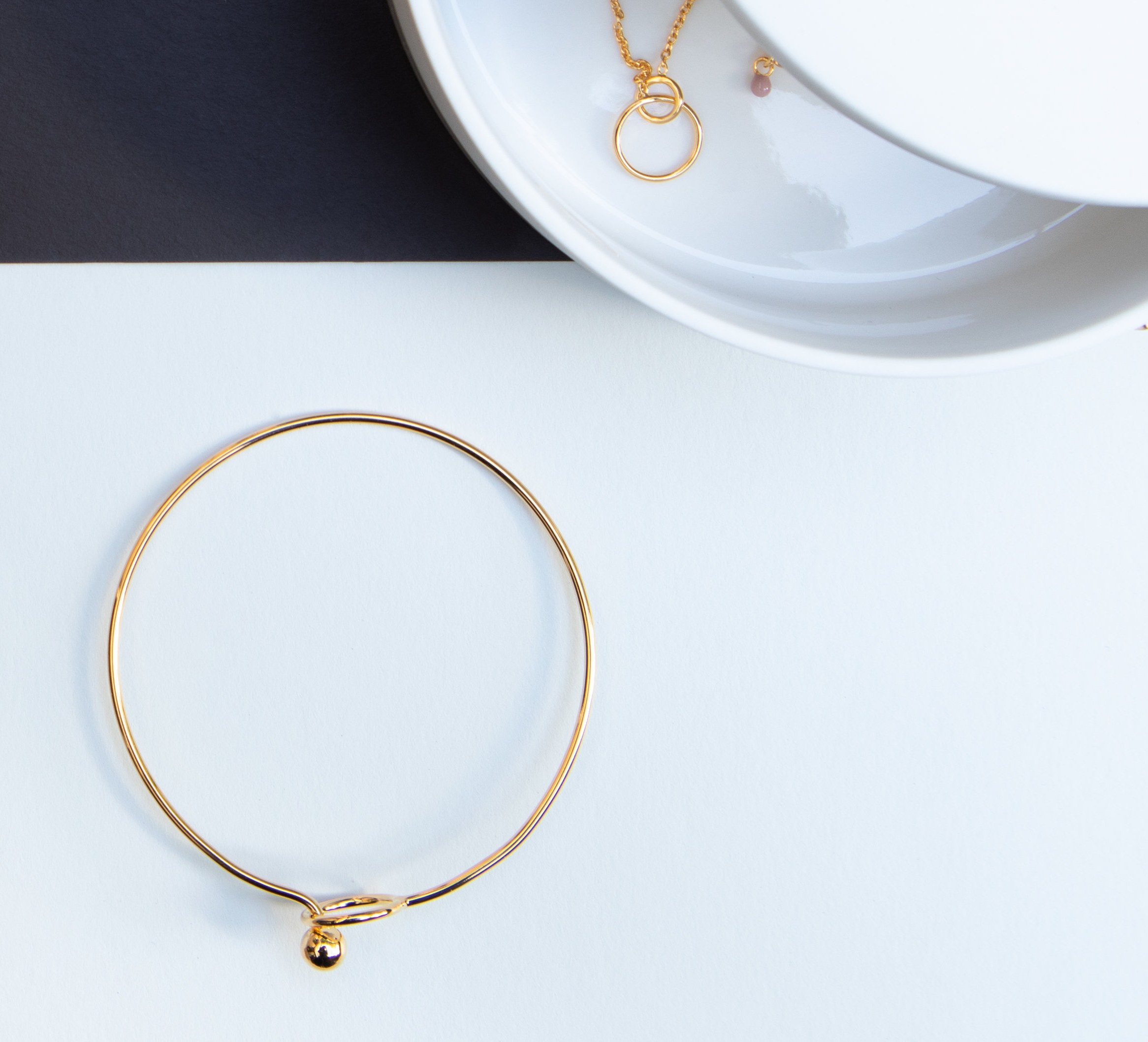
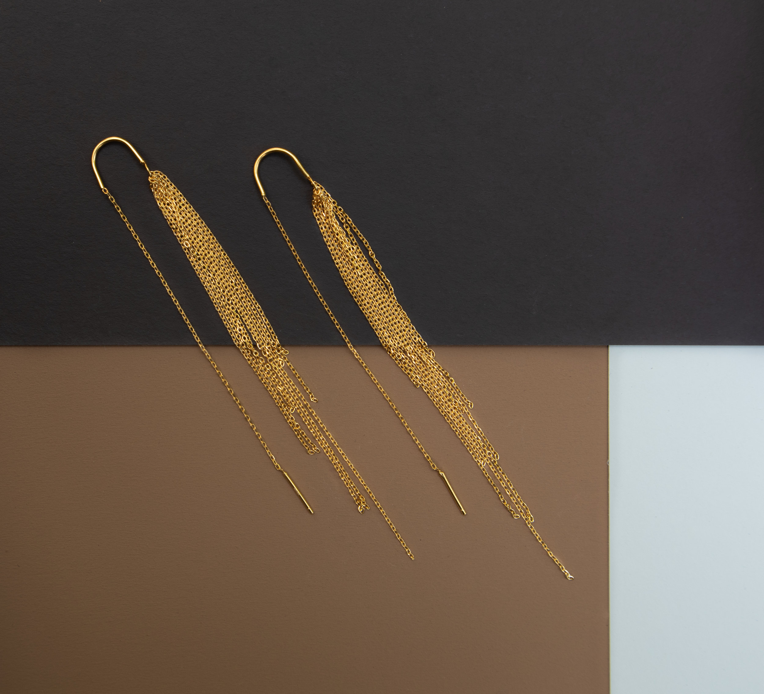
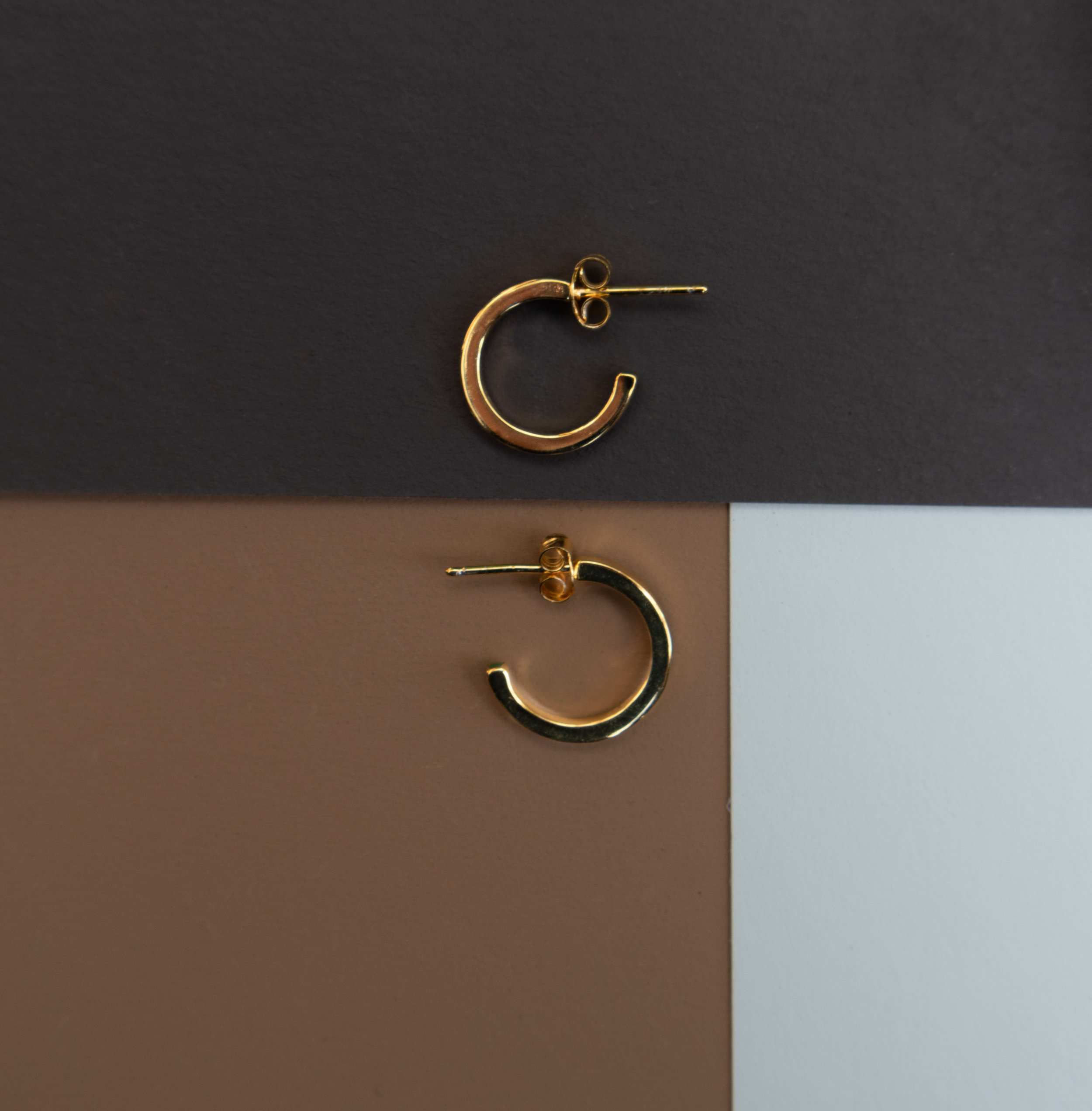
A styling for Enamel Copenhagen.

Deense Kroon just introduced Enamel Copenhagen as part of their collection.

This is a small styling we did for some of their beautiful pieces that just arrived.

Jewerly Styling, display, retail display, Enamel Copenhagen our work for Deense Kroon new collection .jpg
Jewerly Styling, display, retail display, Enamel Copenhagen our work for Deense Kroon new collection 5.jpg
Jewerly Styling, display, retail display, Enamel Copenhagen our work for Deense Kroon new collection 1.jpg

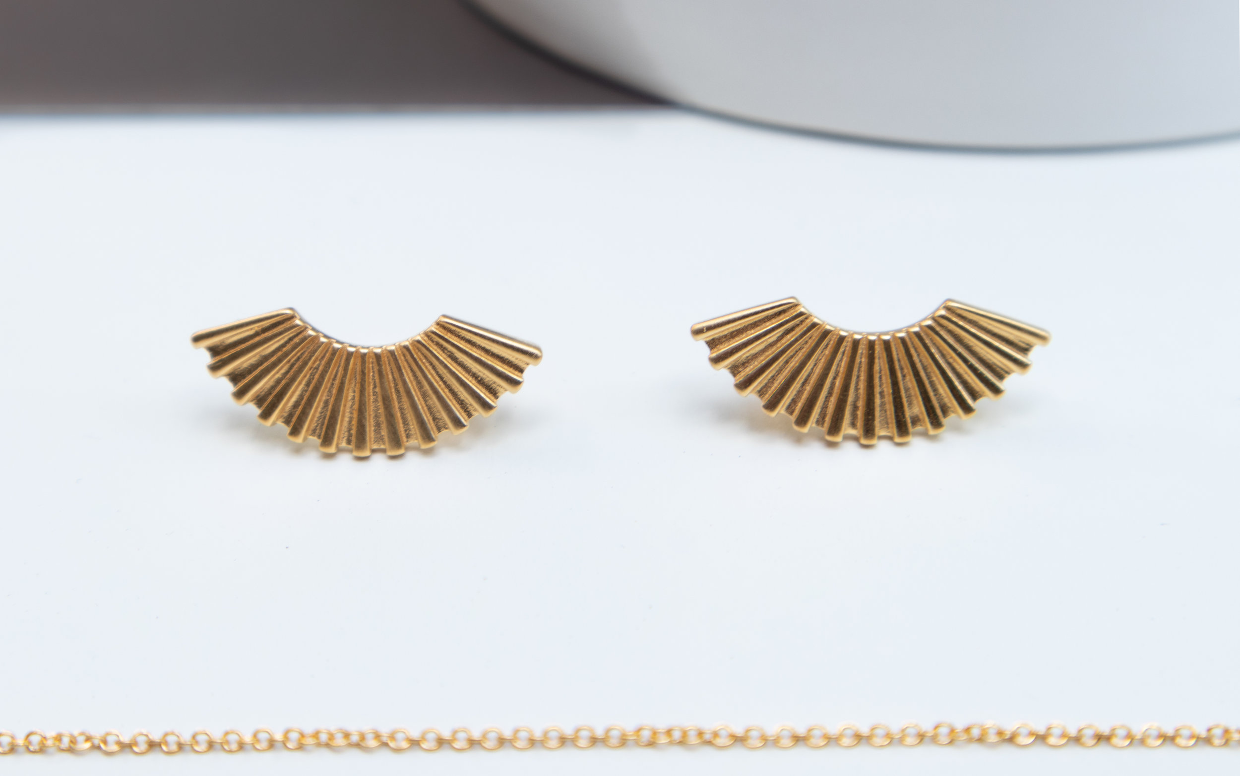
Crushing on this earings

Jewerly Styling, display, retail display, Enamel Copenhagen our work for Deense Kroon new collection 6.jpg
Jewerly Styling, display, retail display, Enamel Copenhagen our work for Deense Kroon new collection 3.jpg

Comments? let us know.

Want to work with us? reach out!

Montana for London Design Week 2018

London Design Festival has just passed and sadly we missed it again. But we’ve done our part to but it together nicely for you.

Montana intervened Skandium’s town house, and together with Skagerak created a beautiful setting in London’s central area. We cant really express how much we love how Montana is constantly playing with colour. Keep it up guys, it keeps getting better and better.

we hope you like it, give us your comments and of course Contact us for any questions regarding anything really. ;)

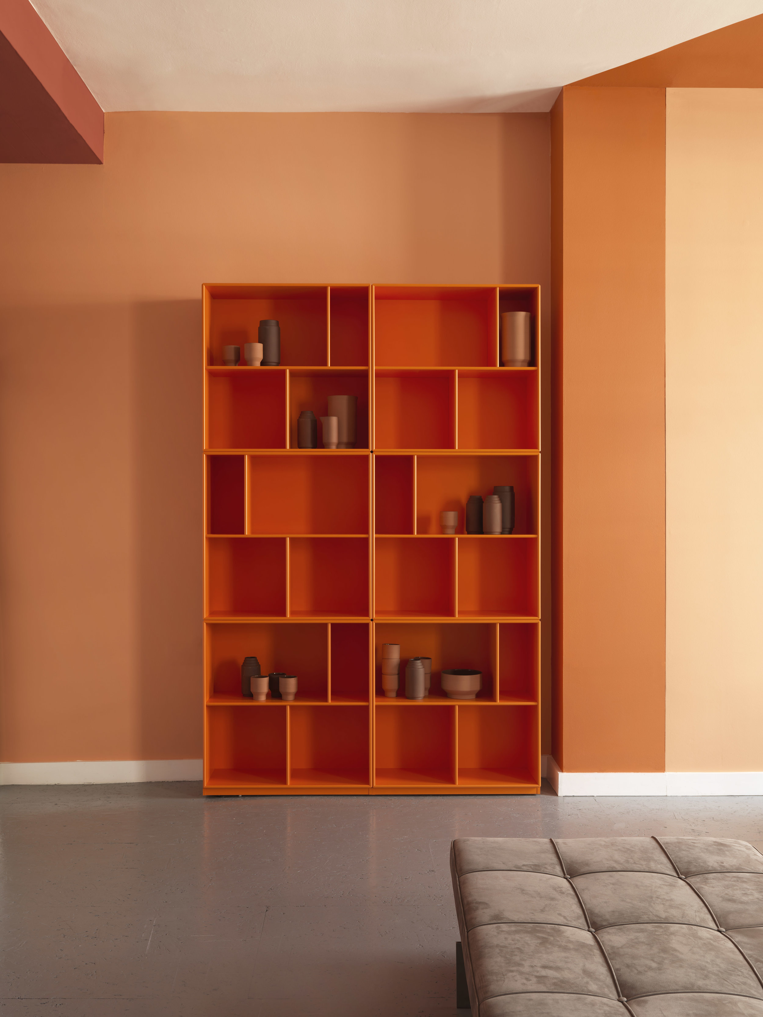
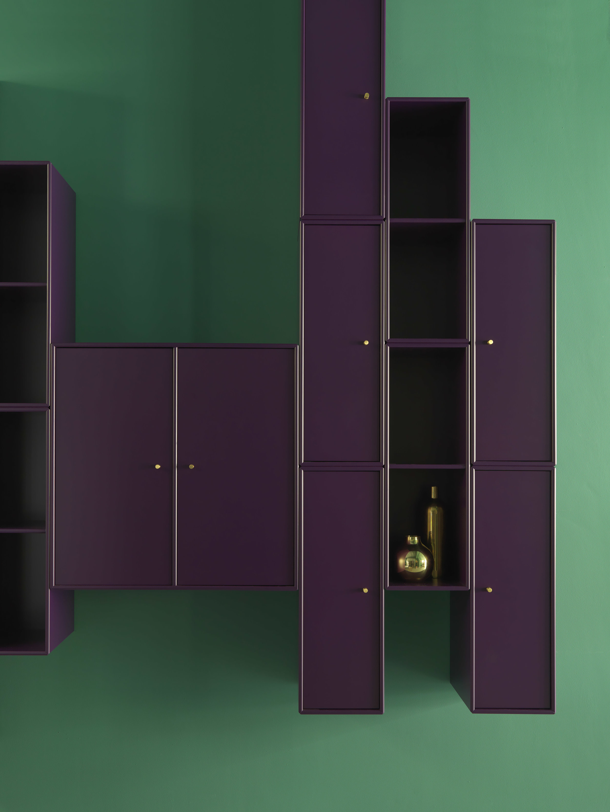
Montana is available in your favourite Designshop. It is modular storage furniture that you can customise completely and create outstanding compositions. We can help you out designing your perfect system.

The following text and images are from the brand’s own communication.


Montana for London Design Festival

This year, Montana was part of FRAME Magazine’s list of 10 exhibitions not to miss at this year's London Design Festival which took place on 15 – 23 September. 

Montana designers Storage and shelving systems London Design Week home interior Scandinavian design Scandinavian home System Marocco.jpg

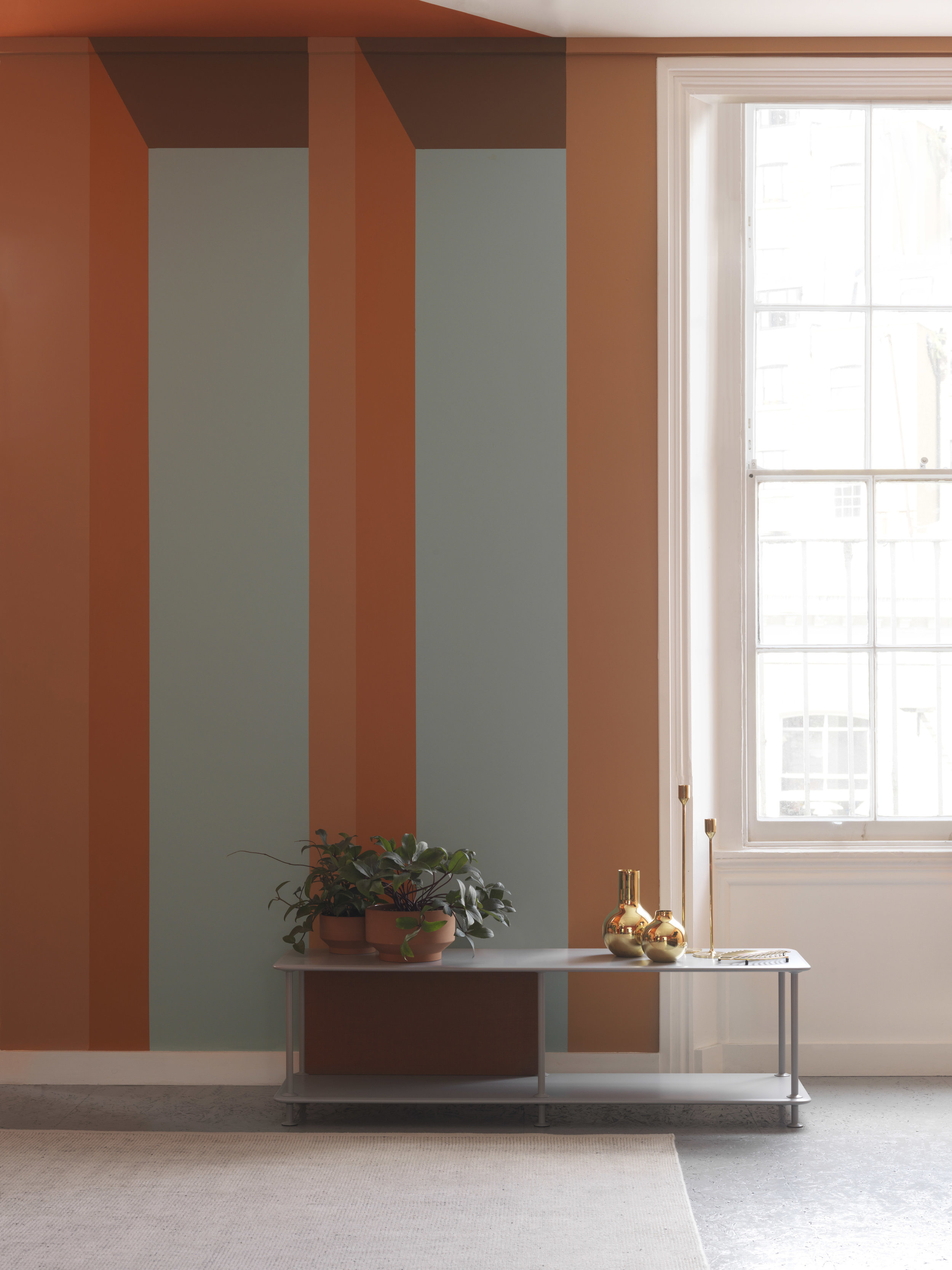
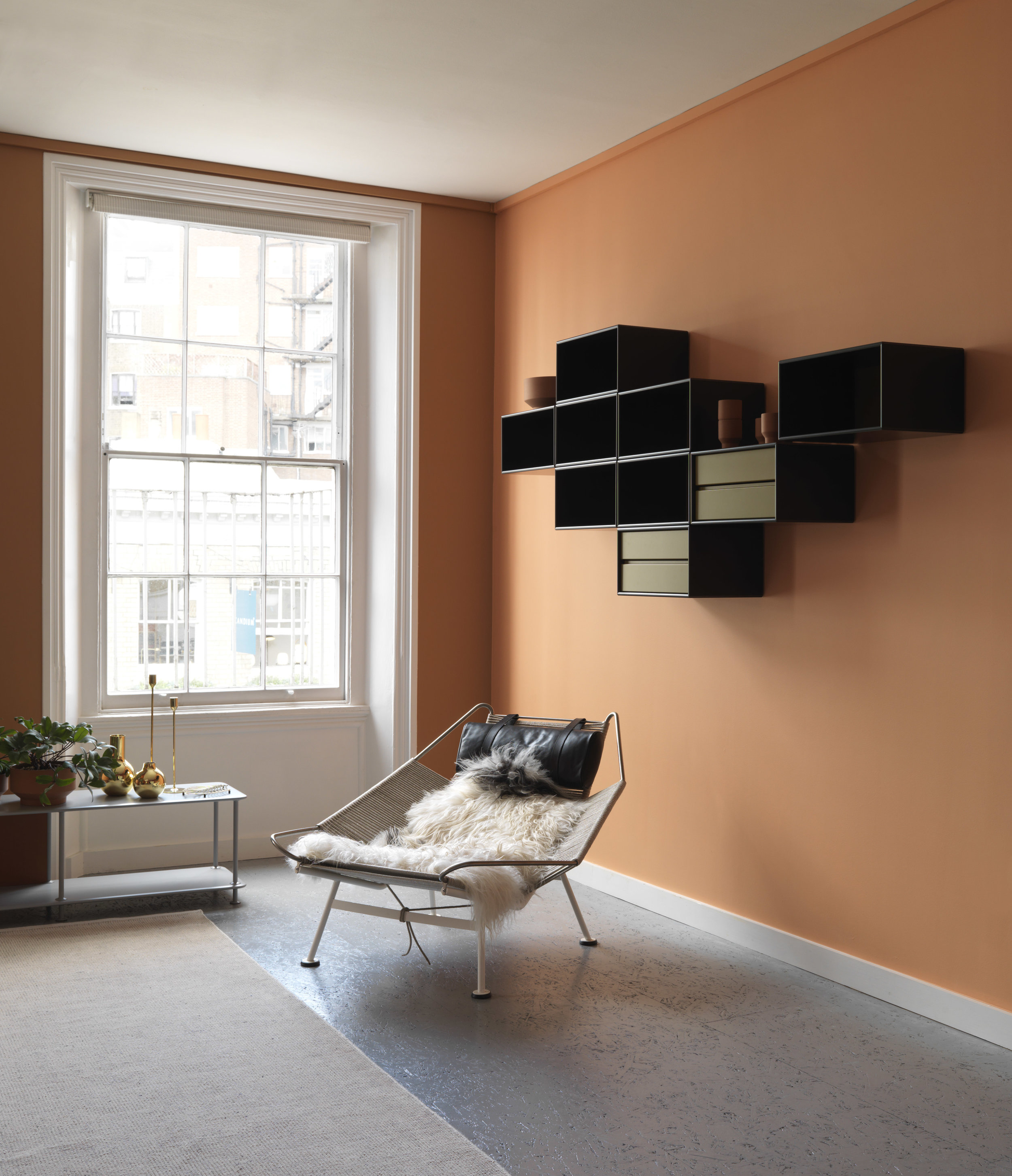
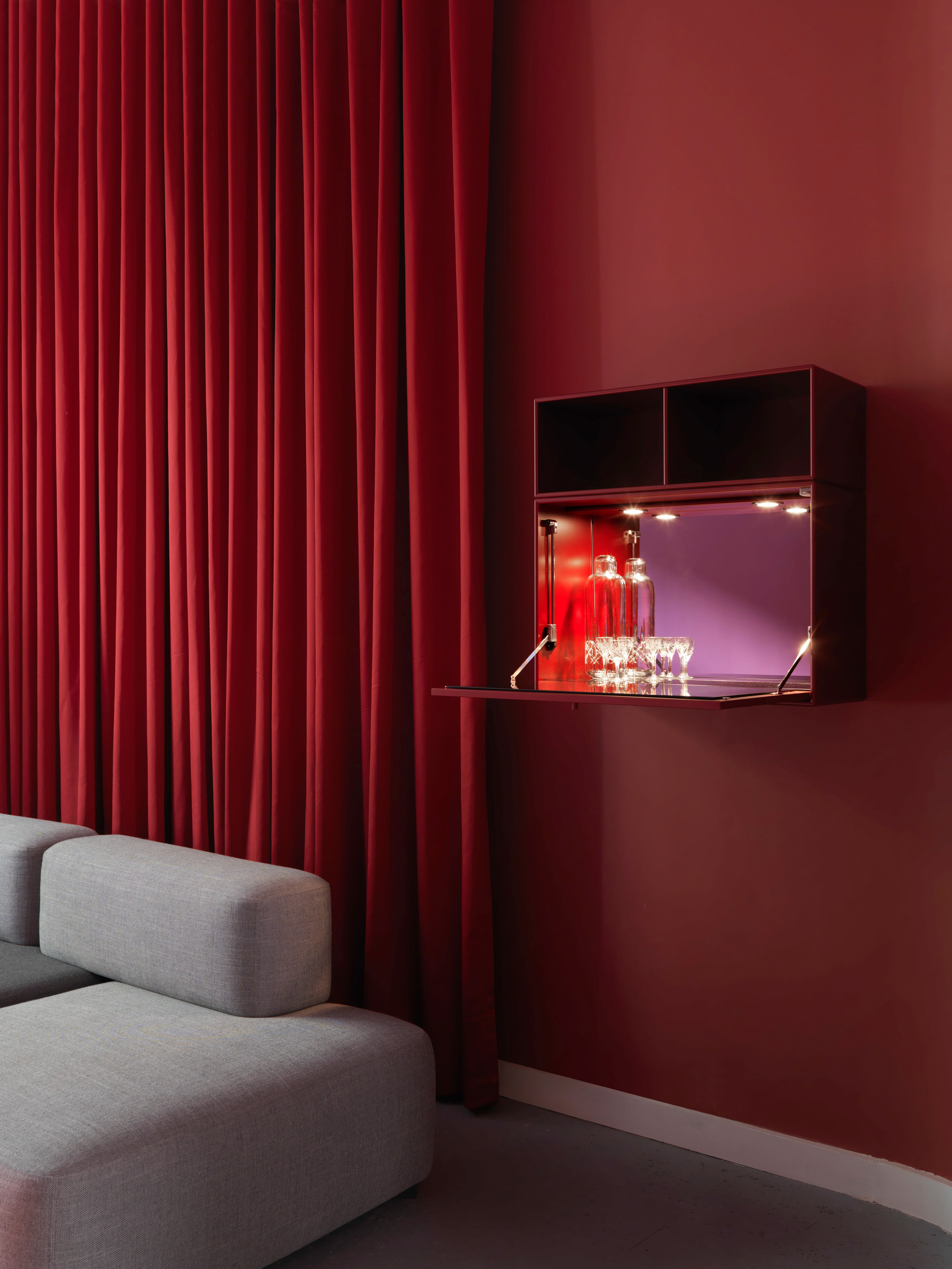
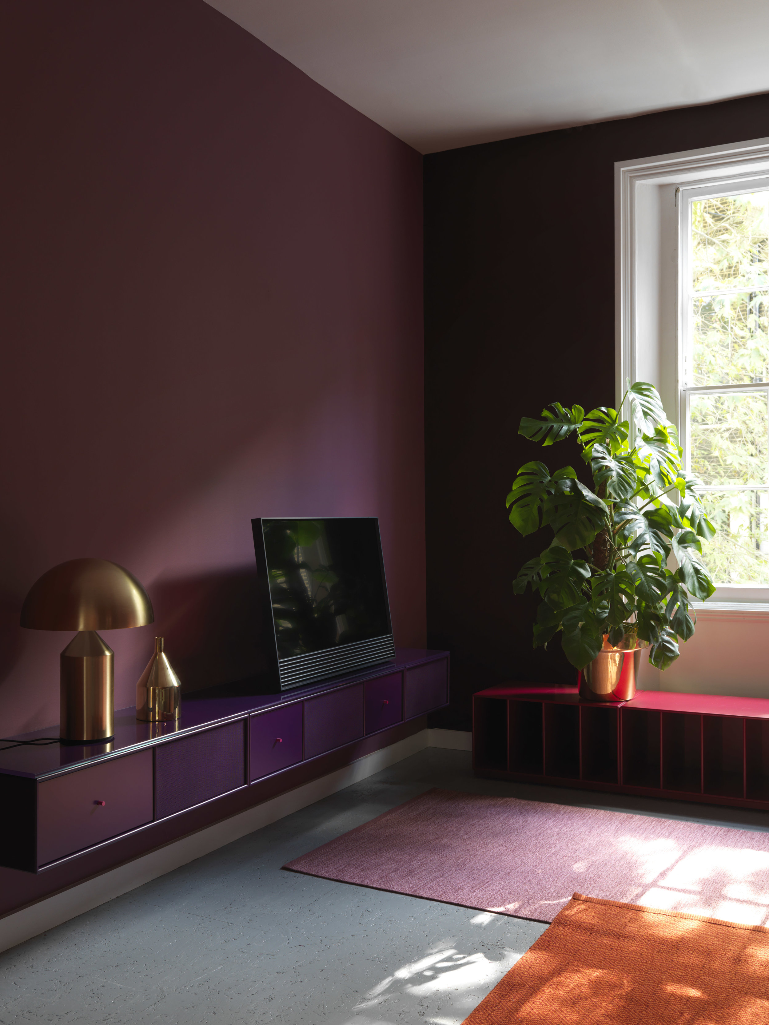
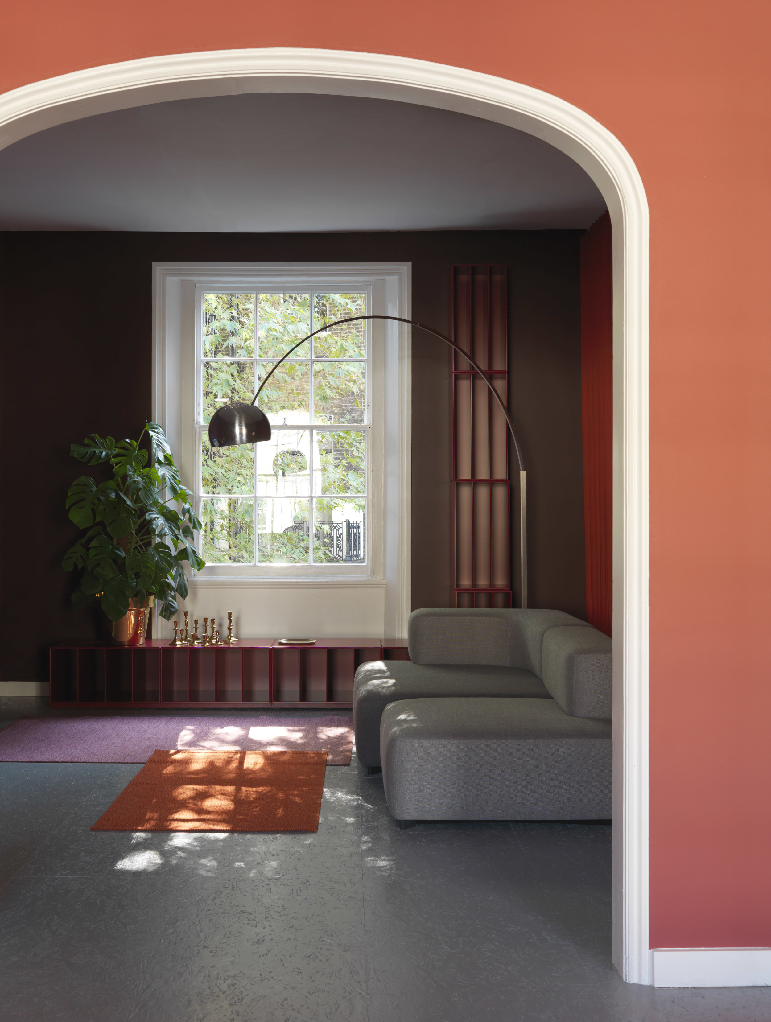
Montana decorated part of Skandium’s four-storey townhouse in South Kensington in connection with London Design Festival under the headline “The Eco Townhouse”, in line with Brompton Design District’s theme of “Material Consequences”.

Montana designers Storage and shelving systems London Design Week home interior Scandinavian design Scandinavian home Livingroom.jpg

An ever-increasing number of people are looking to minimize environmental impact when decorating their homes, turning to sustainable technology, and interior and architectural innovation. Thus, Skandium aimed not just to curate a collection of responsible design, but to demonstrate that it can be a vibrant, beautiful, and liveable solution to interior design.

Montana designers Storage and shelving systems London Design Week home interior Scandinavian design Scandinavian home MontanaFree.jpg
Montana designers Storage and shelving systems London Design Week home interior Scandinavian design Scandinavian home MontanaFree Black.jpg

Montana Free

their newest product! customisable, minimalistic shelving system and must we say: beautiful?

Montana designers Storage and shelving systems System Marocco London Design Week home interior Scandinavian design Scandinavian home.jpg

Architect Helena Laursen, recipient of the Frame Award Milan, designed the two floors assigned to Montana, in their signature bold, captivating colour palettes.

Montana designers Storage and shelving systems London Design Week home interior Scandinavian design Scandinavian home System Montparnasse.jpg