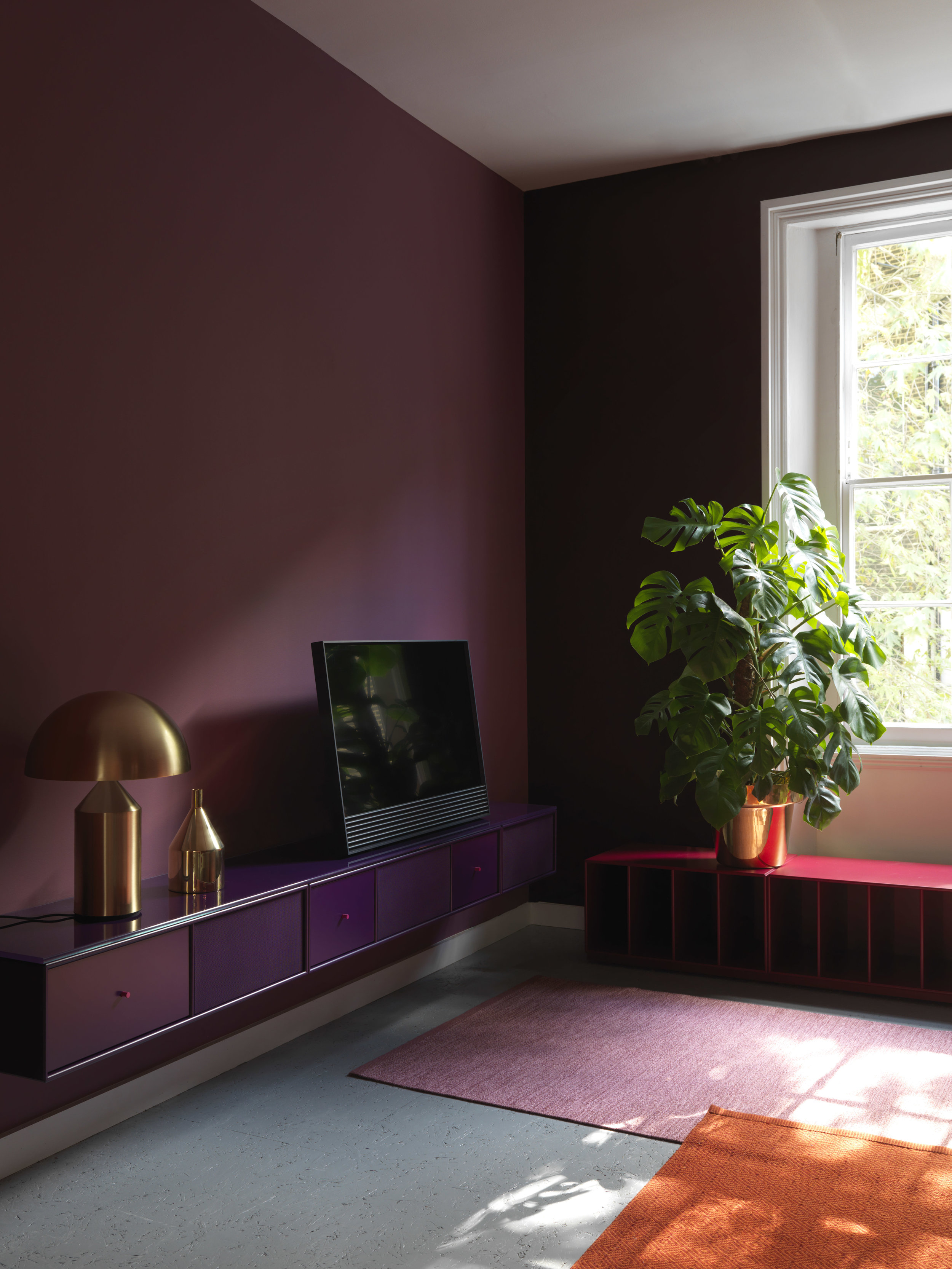
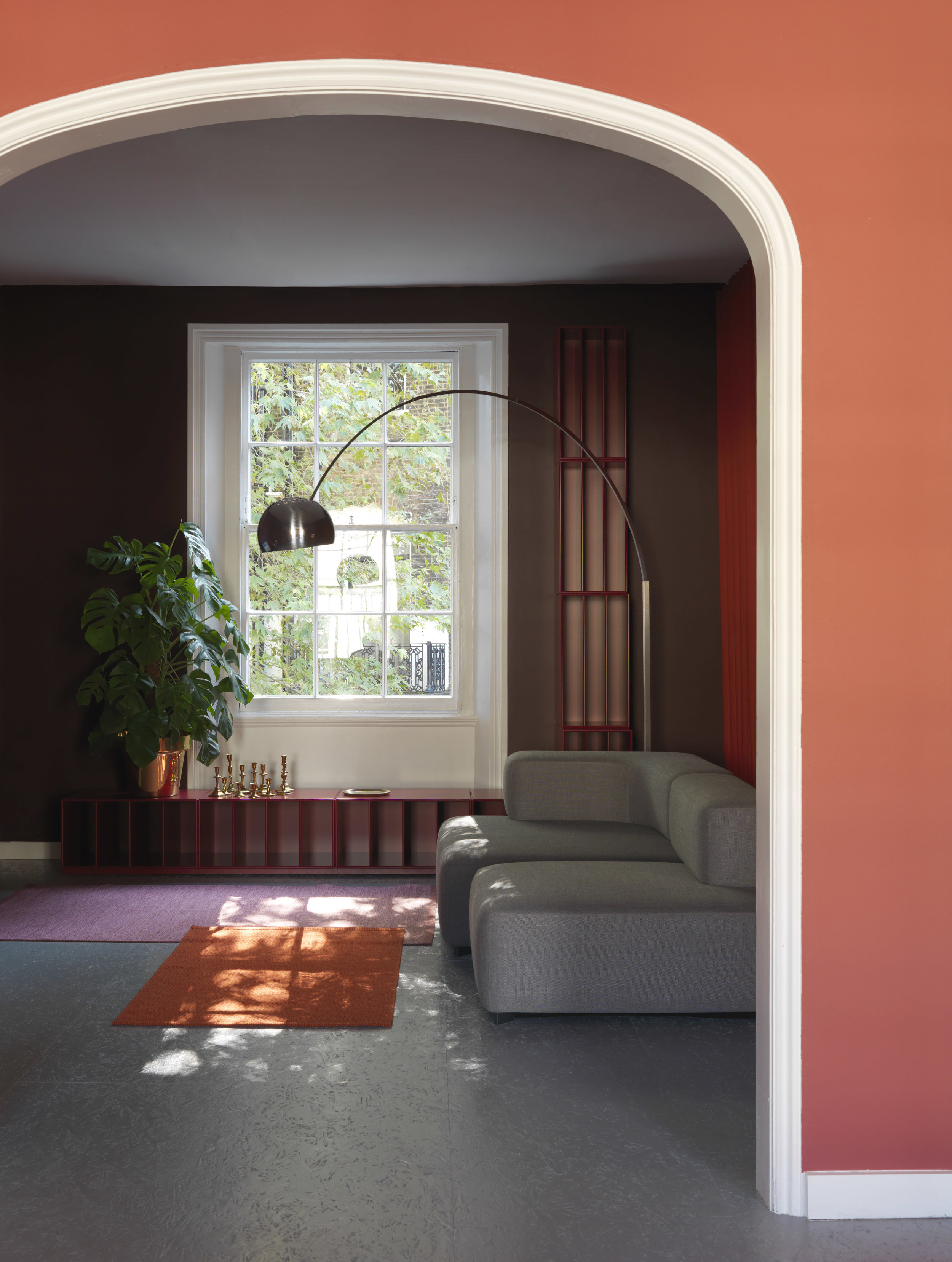
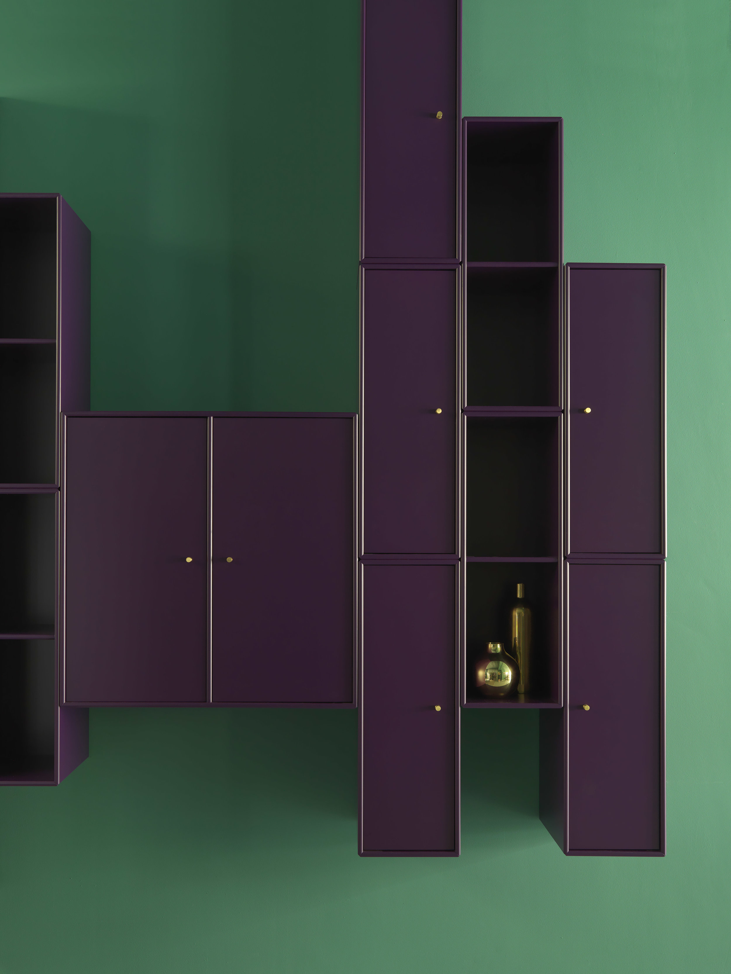
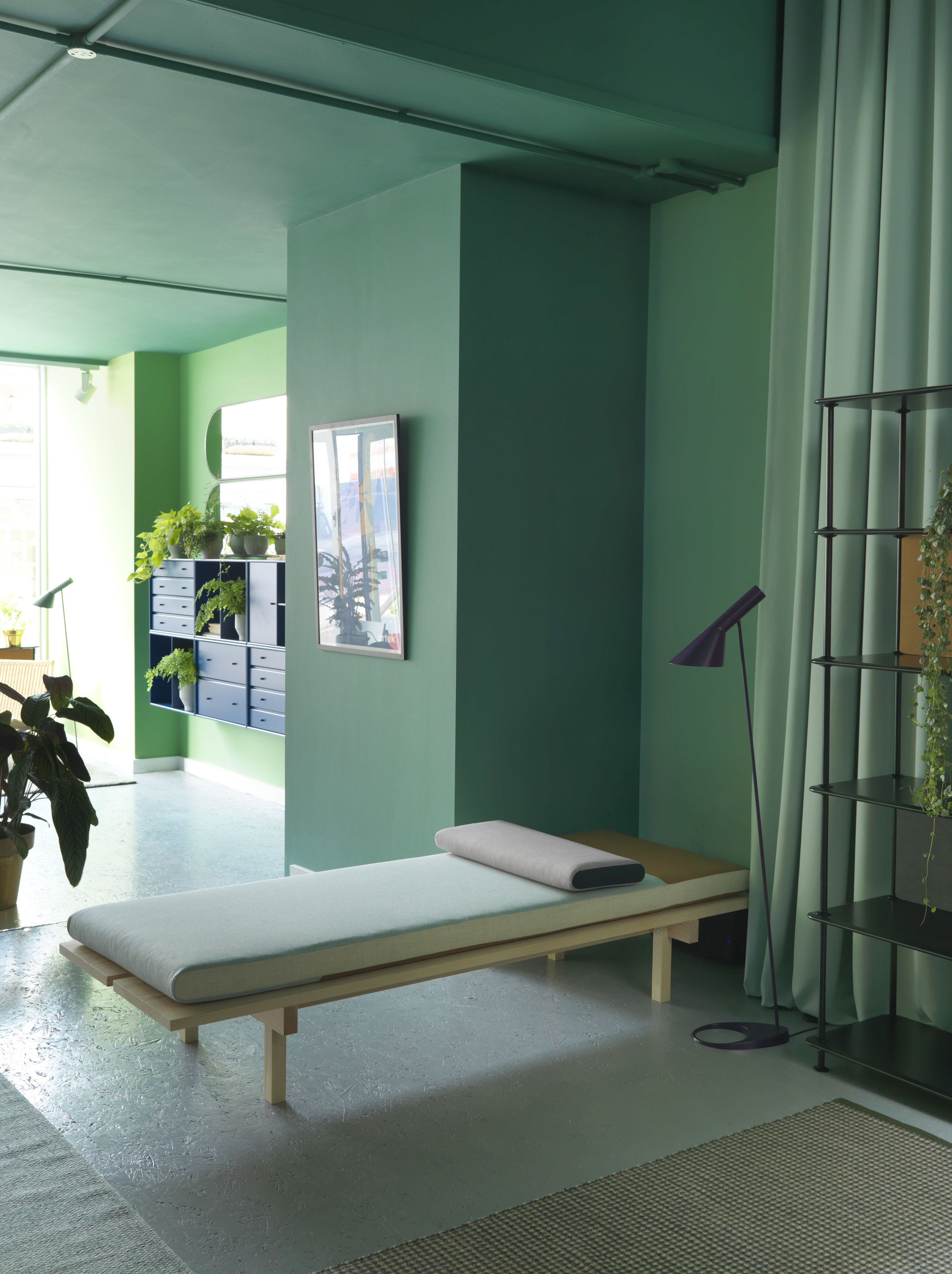
The Danish Home

Recently, we found these incredible pictures via pinterest and totally fell in love with this apartment. The styling and concept by Pella Hedeby is gorgeous and the apartment is breathtaking; from the materials used to the colour schemes and OMG the huge windows giving the perfect light, and what can I say about the view of snowy Stockholm. I mean, who wouldn’t love living here?


the danish home home interior scandinavian design living room minimal spaces 1.jpg

Shades of grey

A selection of luxurious Danish classics: collaboration between interior stylist Pella Hedeby and ELLE Decoration .

“ The mission was a collaboration with the Danish brands Erik Jörgensen, Montana, Georg Jensen Damask, Kay Boyjsen (cutlery), Louis Poulsen and Kähler. A dream mission to put together an interior with genuine design icons.“ - Pella Hedeby

STIL_INSPIRATION_The_Danish_Home_12.jpg
the danish home home interior scandinavian design living room minimal spaces 12.jpg

The apartment was designed by Andreas Martin-Löf, who also designed the kitchen.

STIL_INSPIRATION_The_Danish_home_7.jpg

“My idea of ​​the interior was to create a home that would be truly luxurious, while feeling relaxed and homely”.

STIL_INSPIRATION_The_Danish_home_13.jpg

Most of the furniture is from Erik Jorgensen and Montana. Of course available at crioll.design

The following images and text were taken from the designers’s own article made for ELLE Decoration.

Give us your comments or contact us for more information about any of the products here displayed.

Thanks for reading!

Giselle

Montana for London Design Week 2018

London Design Festival has just passed and sadly we missed it again. But we’ve done our part to but it together nicely for you.

Montana intervened Skandium’s town house, and together with Skagerak created a beautiful setting in London’s central area. We cant really express how much we love how Montana is constantly playing with colour. Keep it up guys, it keeps getting better and better.

we hope you like it, give us your comments and of course Contact us for any questions regarding anything really. ;)

Montana is available in your favourite Designshop. It is modular storage furniture that you can customise completely and create outstanding compositions. We can help you out designing your perfect system.

The following text and images are from the brand’s own communication.


Montana for London Design Festival

This year, Montana was part of FRAME Magazine’s list of 10 exhibitions not to miss at this year's London Design Festival which took place on 15 – 23 September. 

Montana designers Storage and shelving systems London Design Week home interior Scandinavian design Scandinavian home System Marocco.jpg

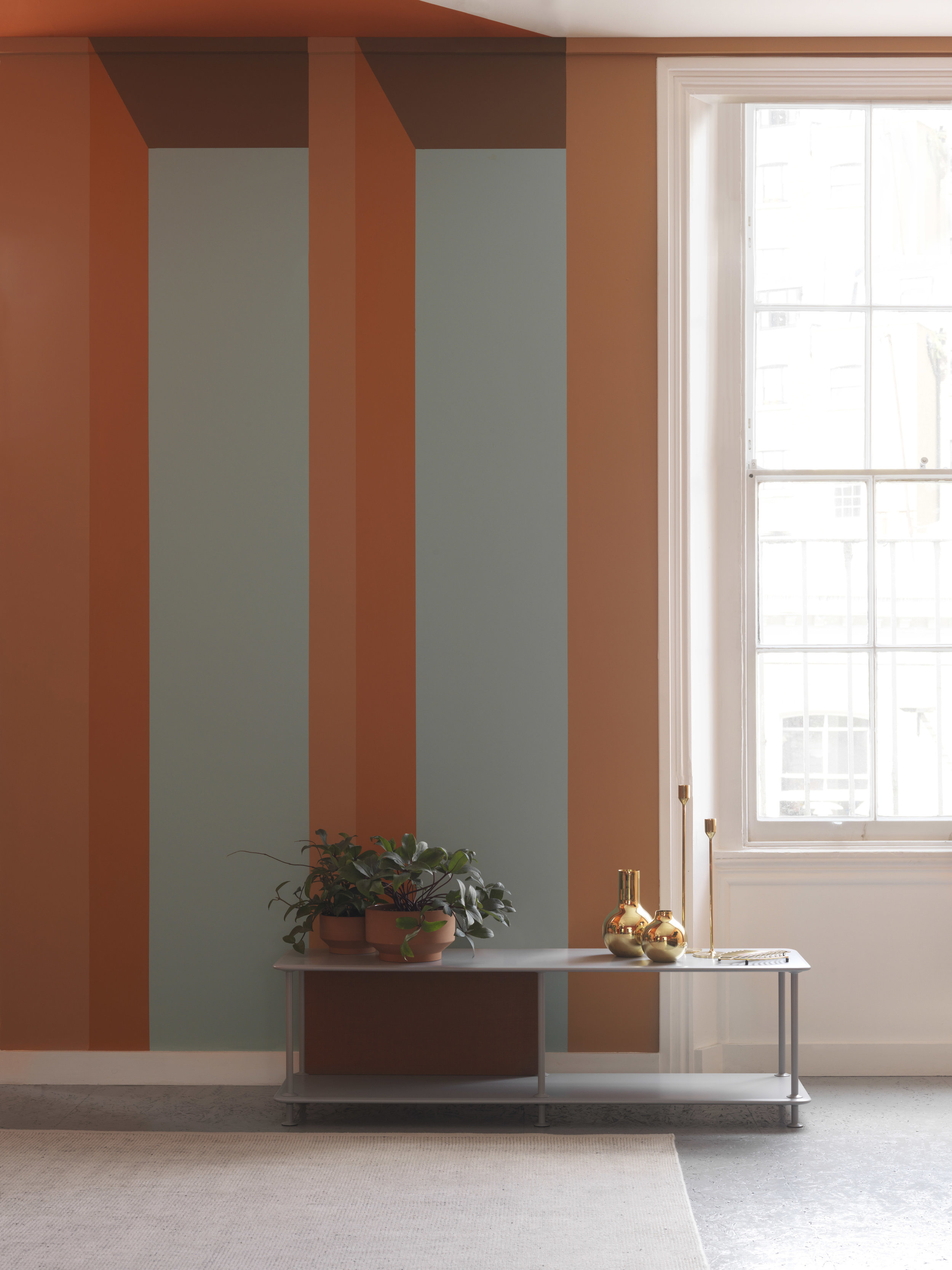
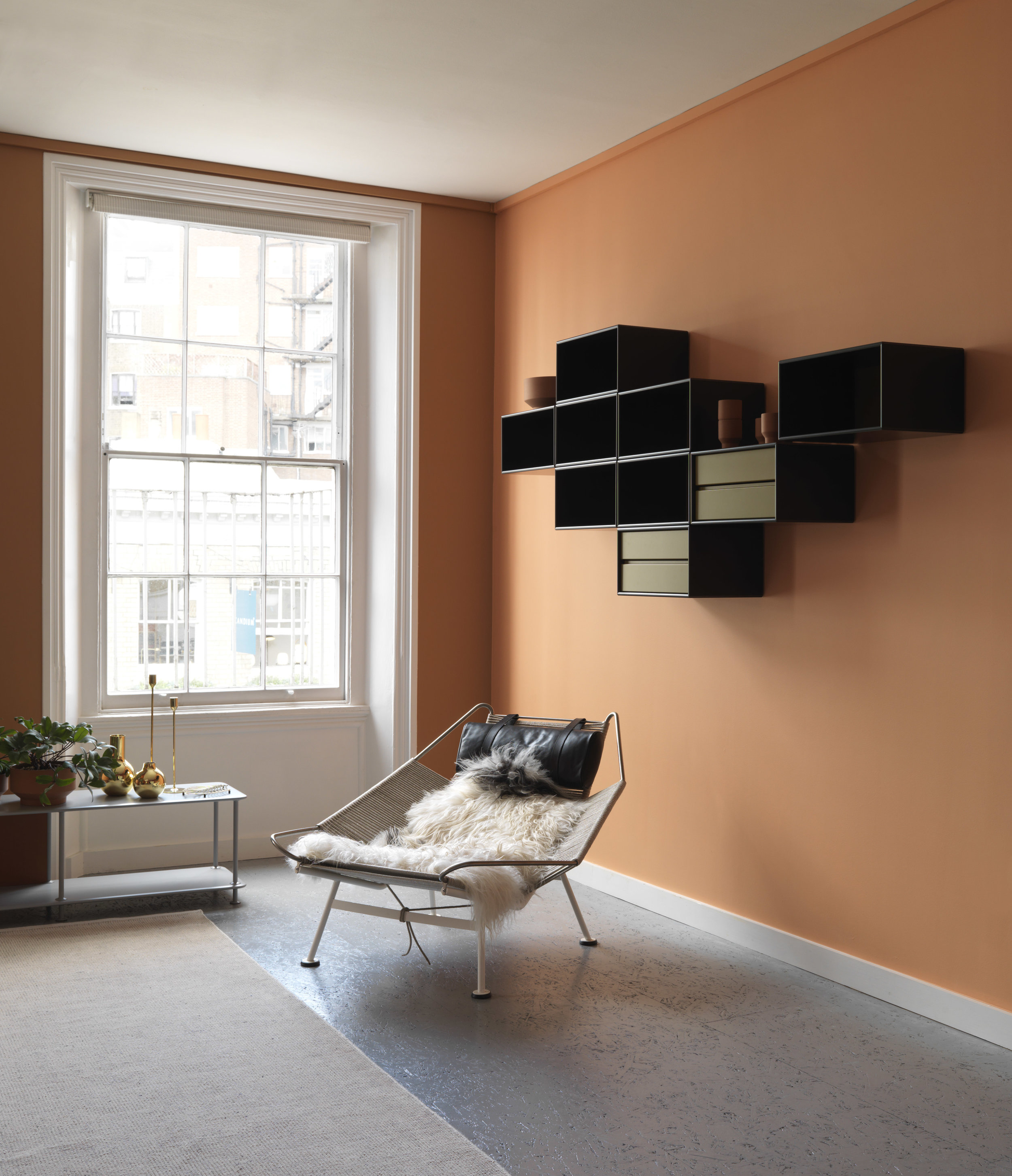
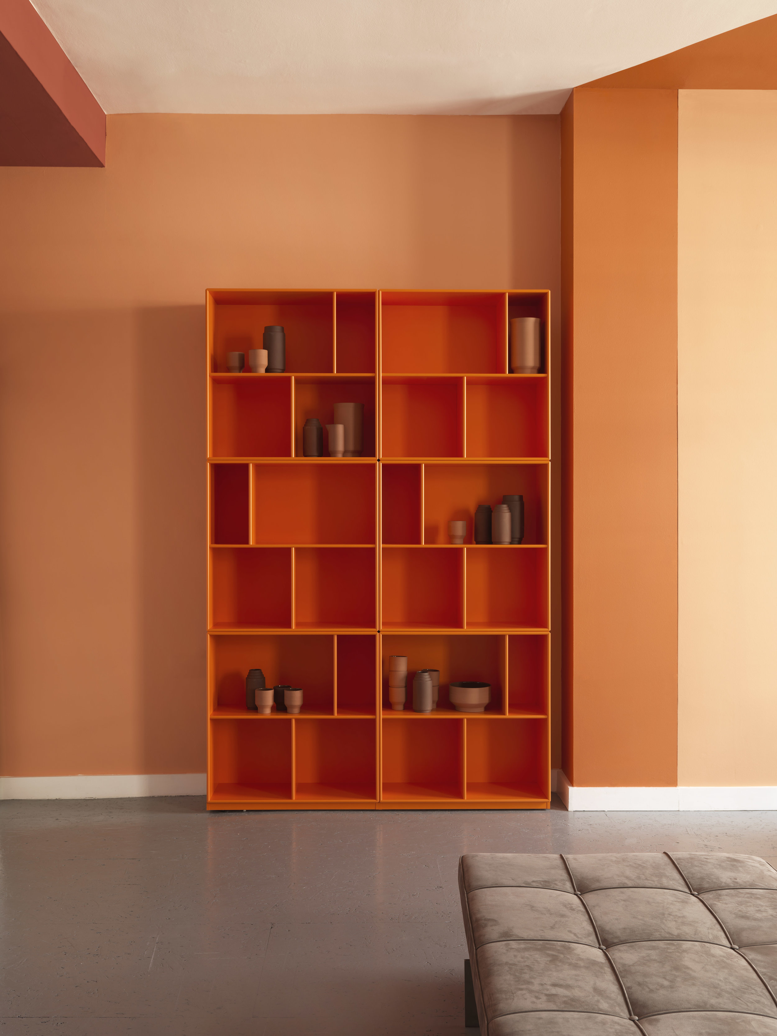
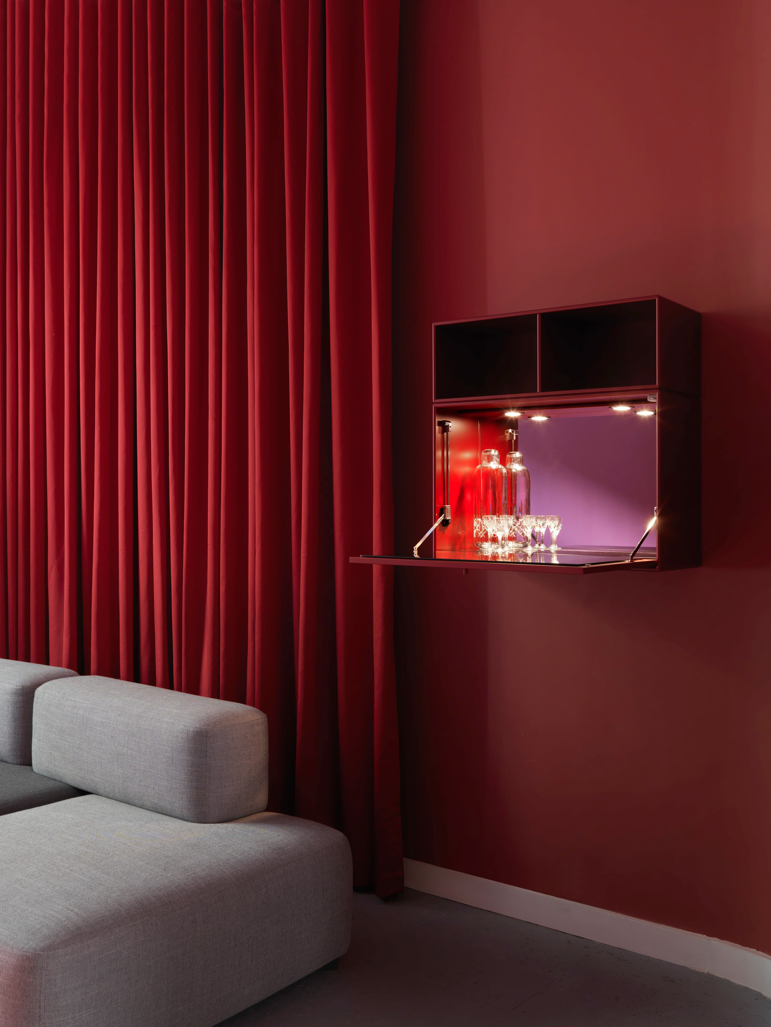
Montana decorated part of Skandium’s four-storey townhouse in South Kensington in connection with London Design Festival under the headline “The Eco Townhouse”, in line with Brompton Design District’s theme of “Material Consequences”.

Montana designers Storage and shelving systems London Design Week home interior Scandinavian design Scandinavian home Livingroom.jpg

An ever-increasing number of people are looking to minimize environmental impact when decorating their homes, turning to sustainable technology, and interior and architectural innovation. Thus, Skandium aimed not just to curate a collection of responsible design, but to demonstrate that it can be a vibrant, beautiful, and liveable solution to interior design.

Montana designers Storage and shelving systems London Design Week home interior Scandinavian design Scandinavian home MontanaFree.jpg
Montana designers Storage and shelving systems London Design Week home interior Scandinavian design Scandinavian home MontanaFree Black.jpg

Montana Free

their newest product! customisable, minimalistic shelving system and must we say: beautiful?

Montana designers Storage and shelving systems System Marocco London Design Week home interior Scandinavian design Scandinavian home.jpg

Architect Helena Laursen, recipient of the Frame Award Milan, designed the two floors assigned to Montana, in their signature bold, captivating colour palettes.

Montana designers Storage and shelving systems London Design Week home interior Scandinavian design Scandinavian home System Montparnasse.jpg

Frama store Copenhagen

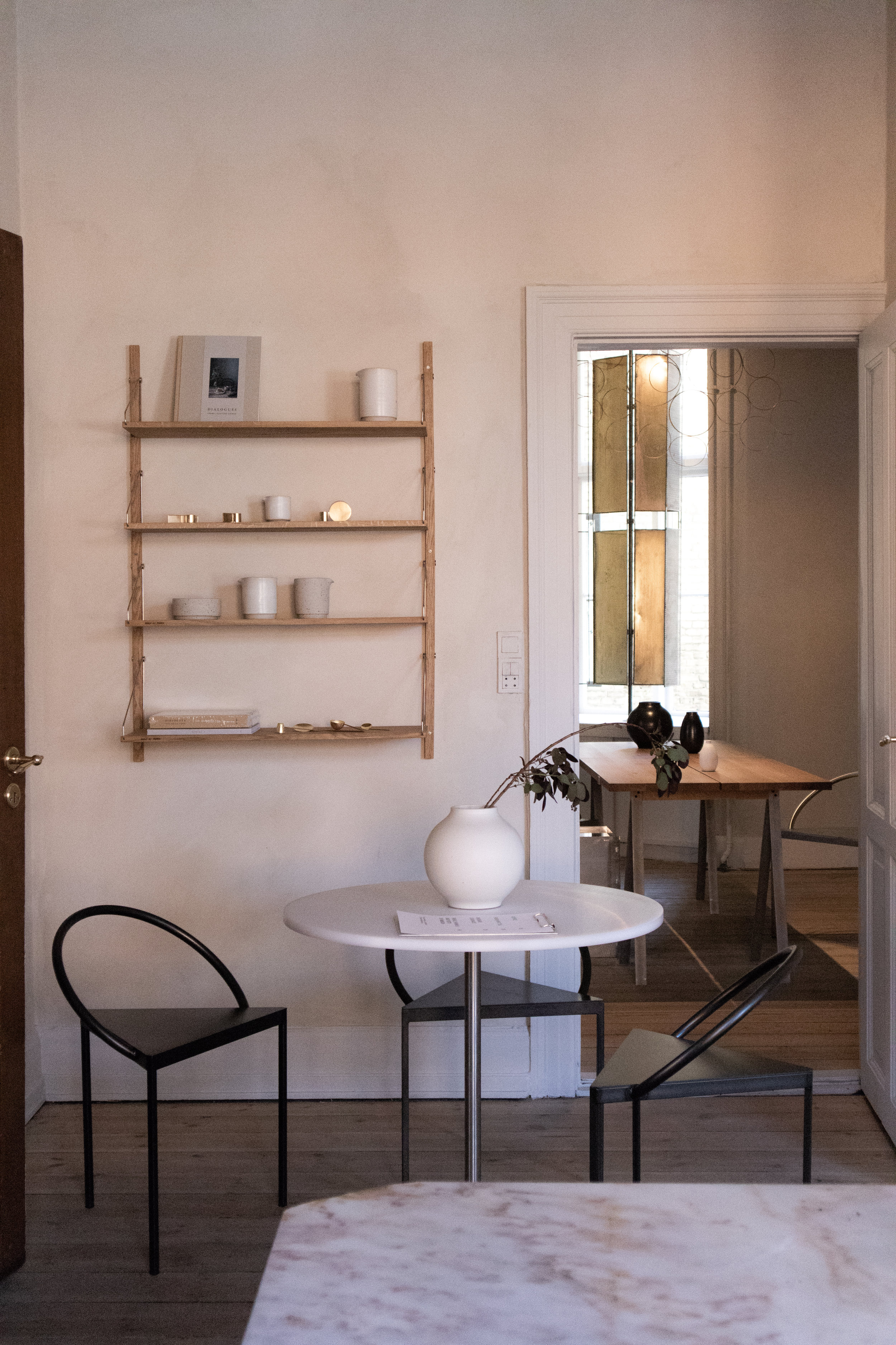
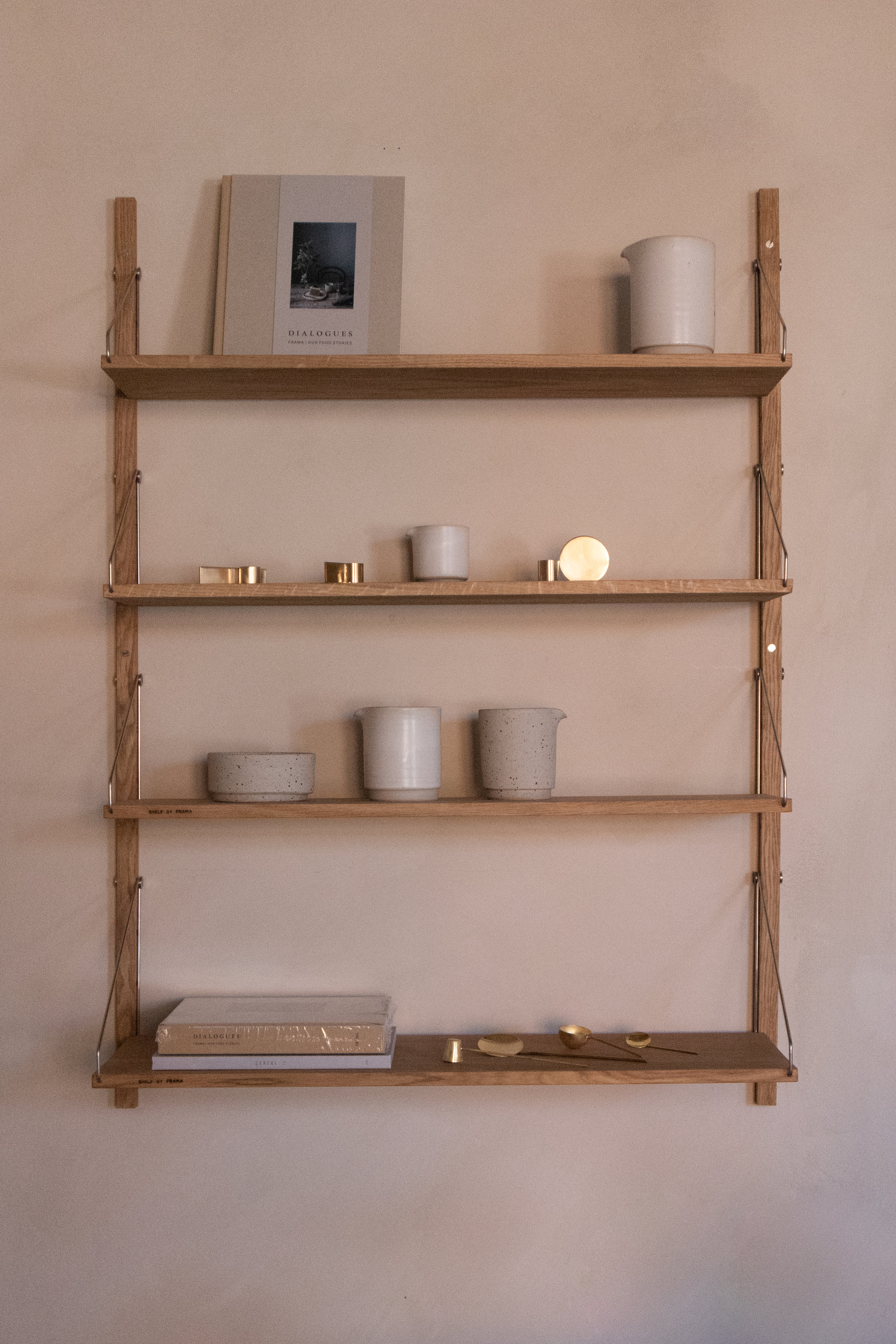
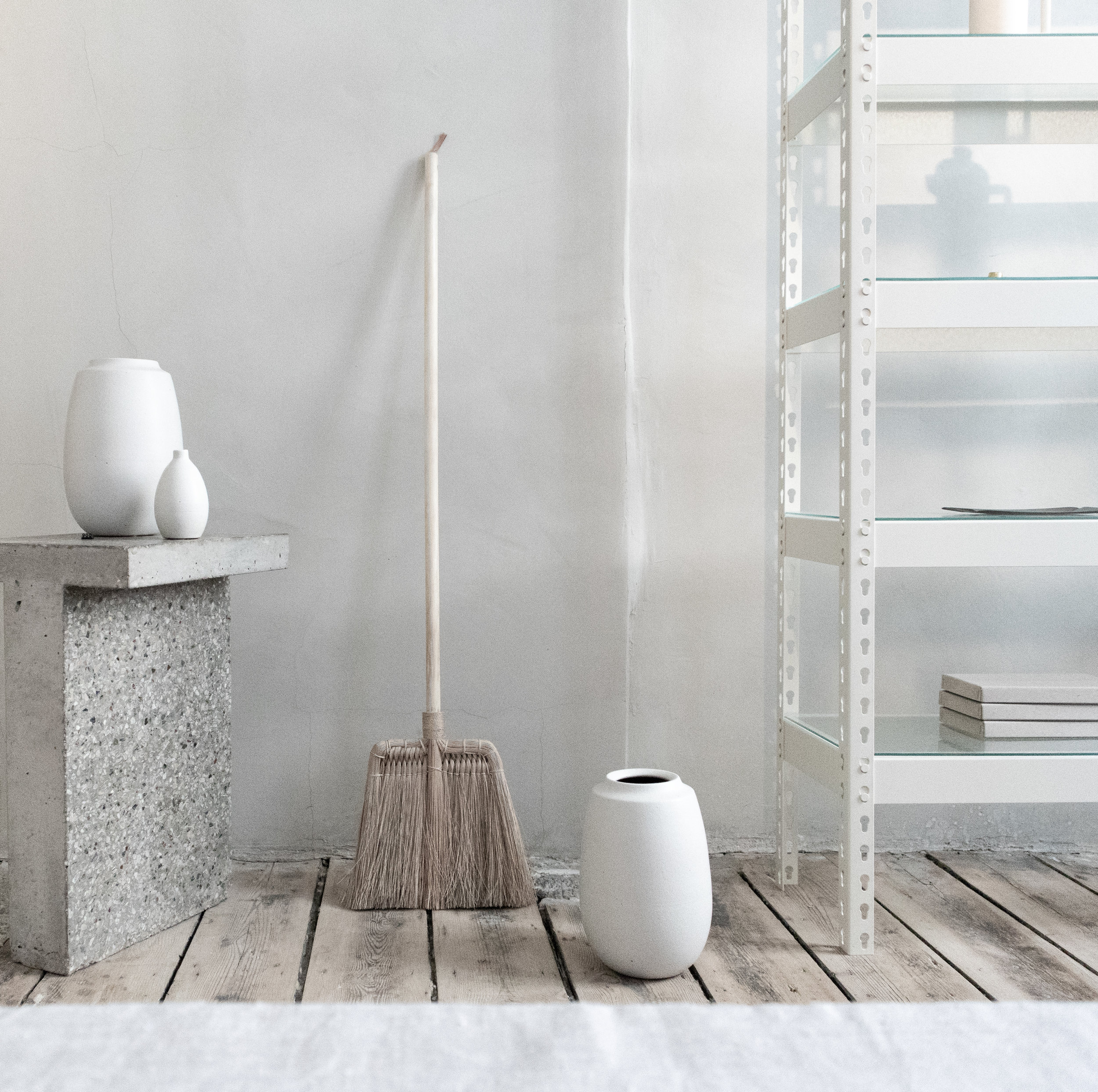
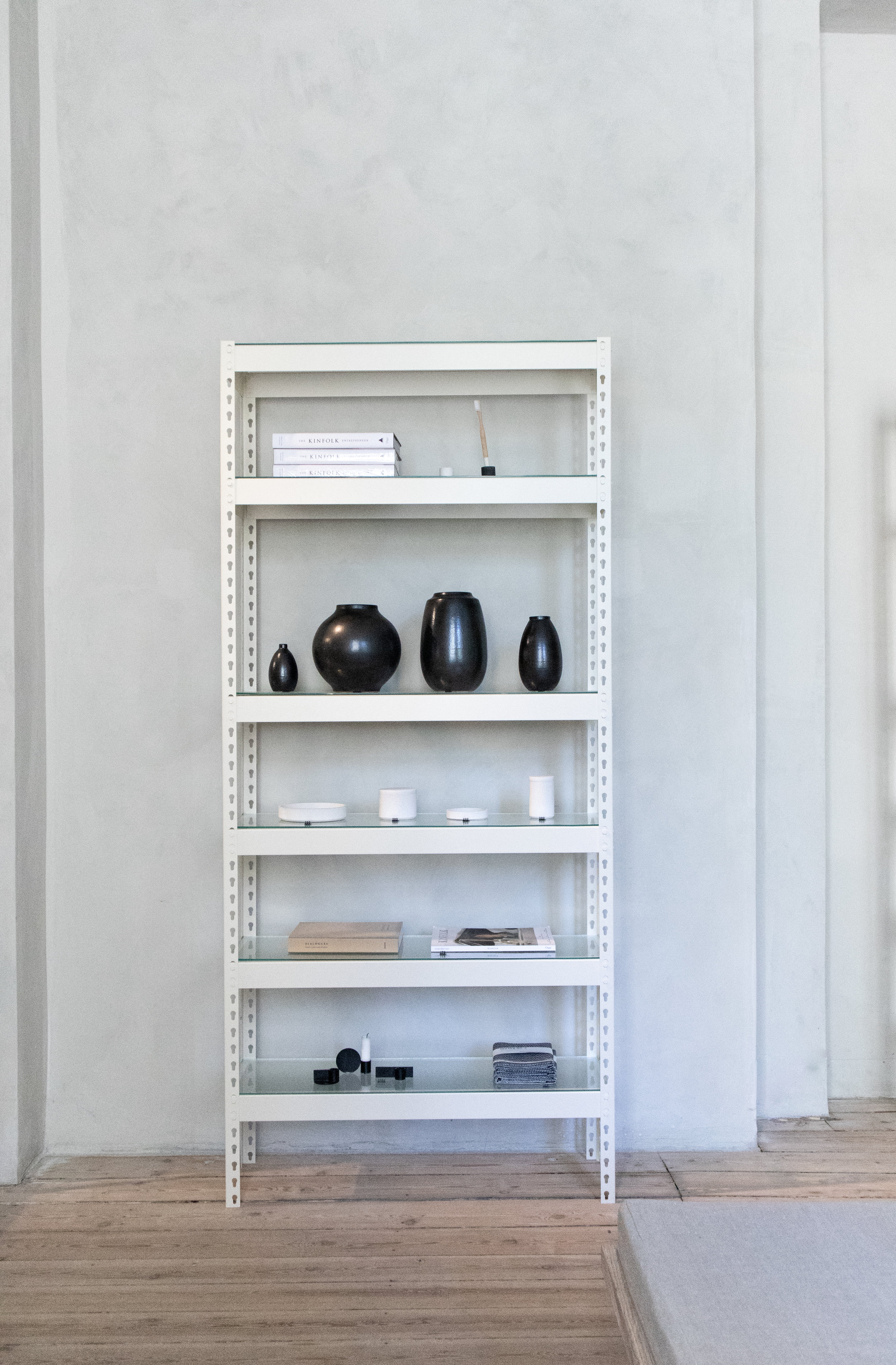
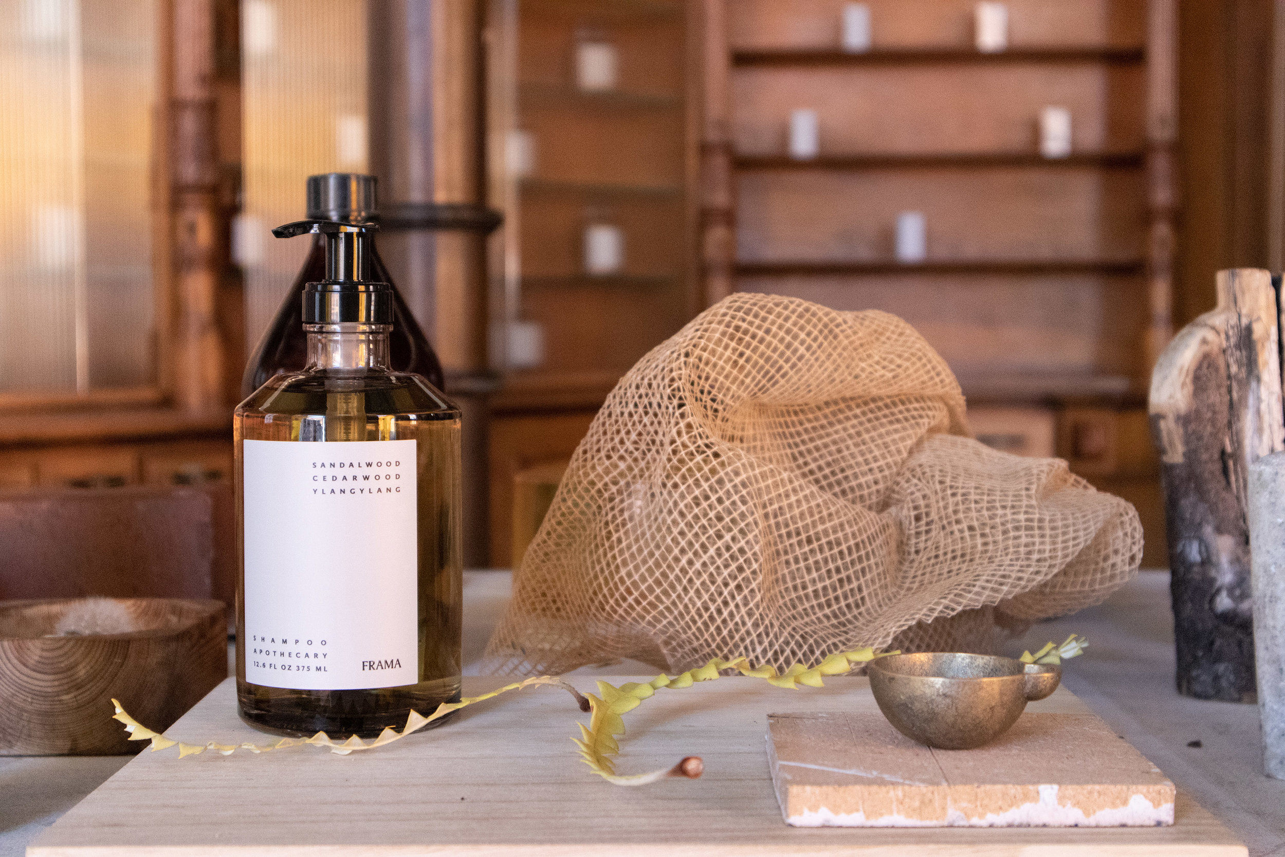
A few months back, I had the fortune to be able to attend 3 Days of Design in Copenhagen and visit Frama Copenhagen’s Studio Store. I was blown away by the setting the moment I walked in. It’s an amazing space where old and new clash creating an amazing atmosphere. These are a few pictures of my visit along with some text from Frama’s website.
Have you been there? please, give me your comments! it would be lovely to hear what you think of the space.

frama apothecary copenhagen store, interiors, scandinavian design 4.jpg

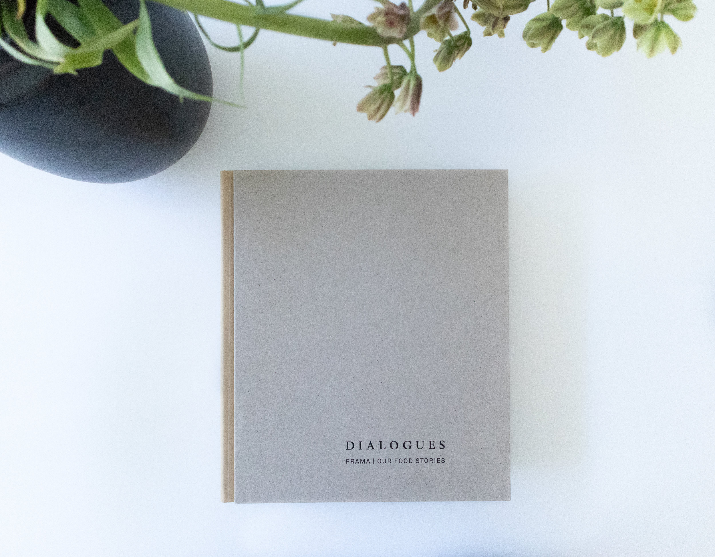
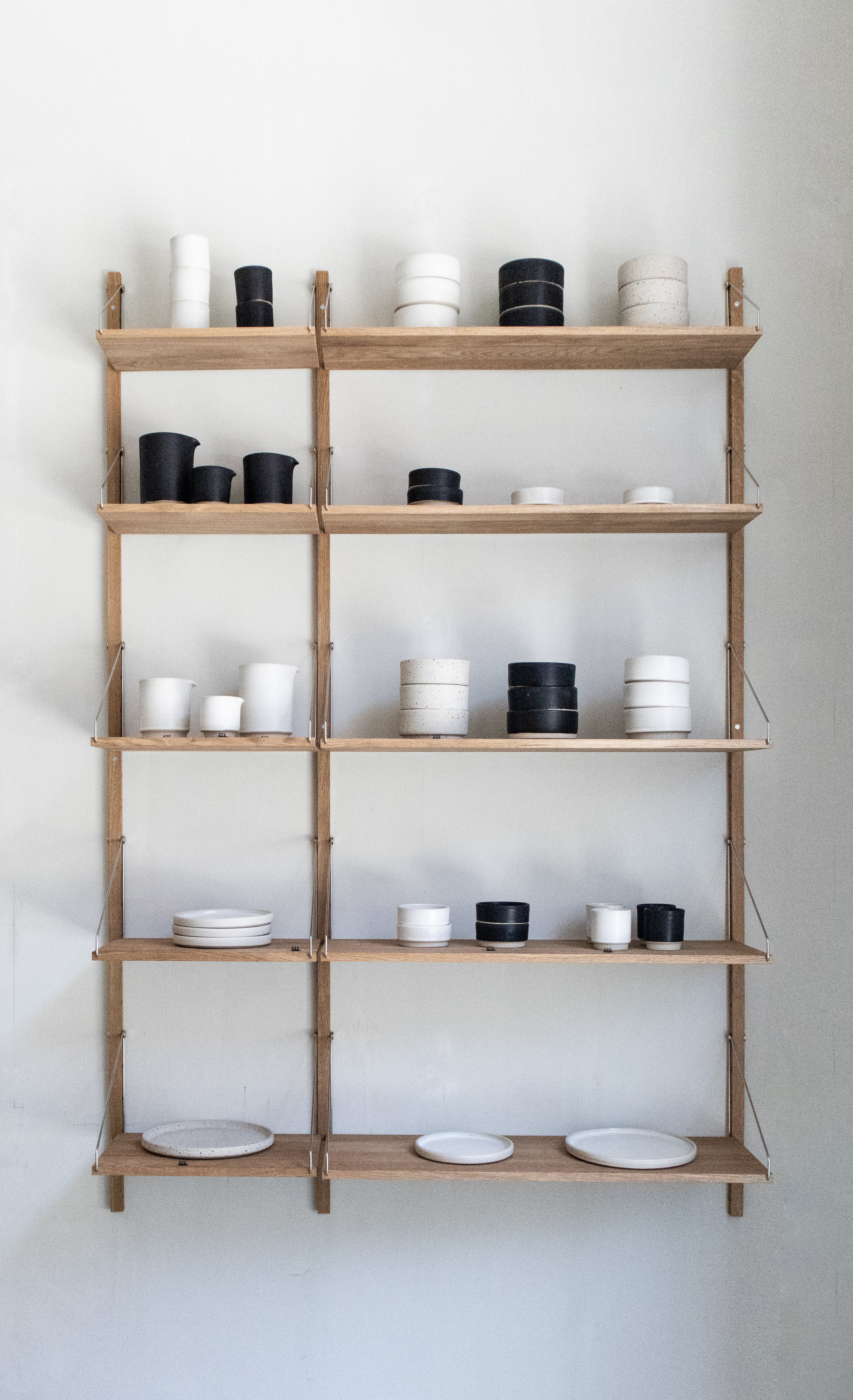
The Frama headquarters and Studio Store is located in central Copenhagen within the historic and protected neighbourhood of Nyboder. Former home of the St. Pauls Apotek established in 1878. The synergy between the past and present elements of the space is a direct link to how Frama defines their main interest within the creative field as a dialogue between two opposite poles; classical and contemporary approach – between digital and analogue production.

frama apothecary copenhagen store, interiors, scandinavian design .jpg

“The interior aim of the 250m2 spaces was to work on the larger surfaces and not be orientated towards details and larger improvements. In a spartan way the many square meters was renovated in a atelier kind of way with basic constructions and methods.”


frama apothecary copenhagen store, interiors, scandinavian design 2.jpg

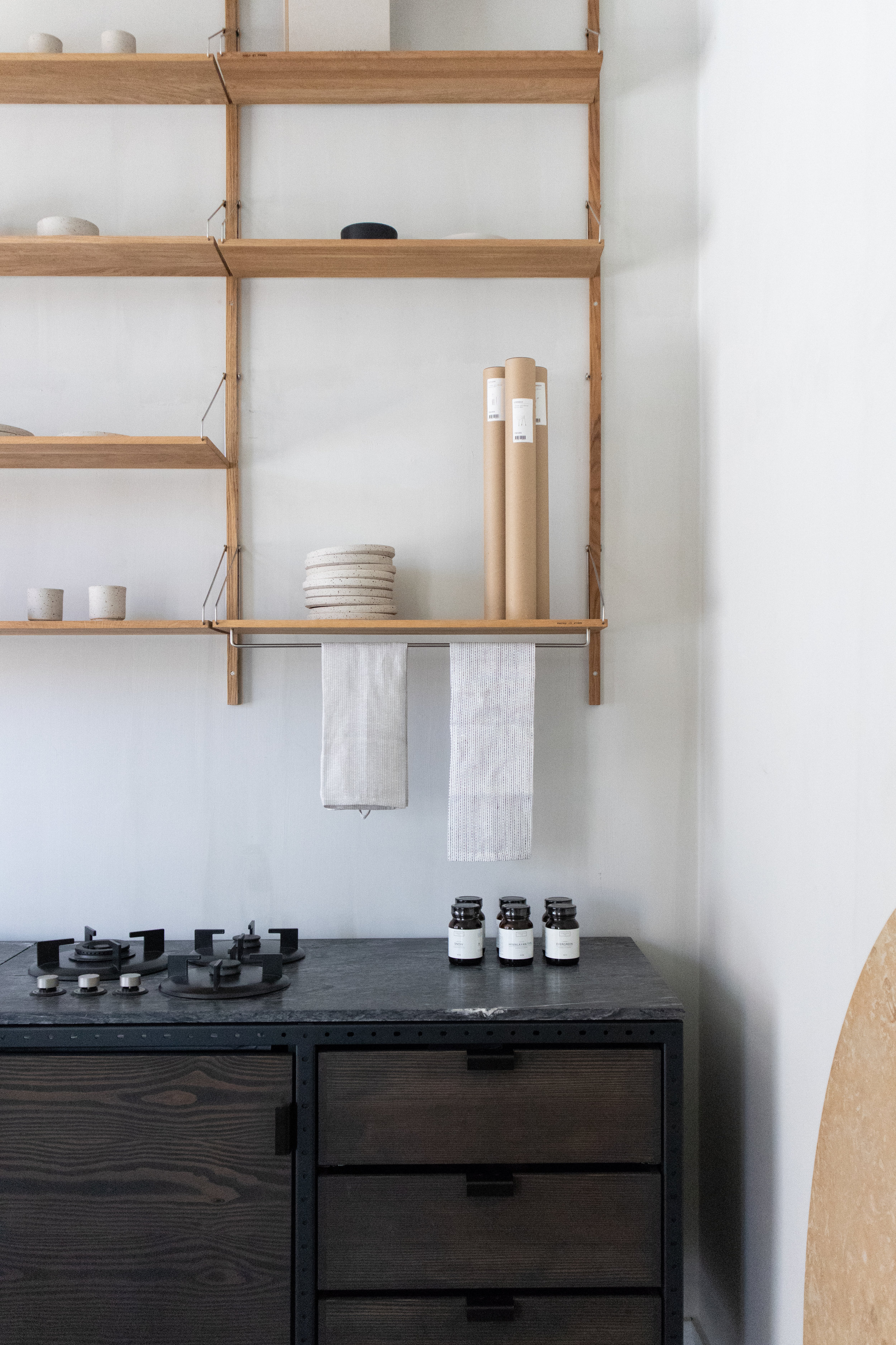
The kitchen is made up of free standing elements, in hard wood and steel frames that accentuate an industrial feeling.

frama apothecary copenhagen store, interiors, scandinavian design 23.jpg

Modern minimal contours contrast with the old original furniture from the old days.

frama apothecary copenhagen store, interiors, scandinavian design 28.jpg

Their line of body lotions and hand cremes pay homage to the Apothecary times of the space.


frama apothecary copenhagen store, interiors, scandinavian design 6.jpg

White spaces give a feeling of lightness and maintain a fresh look, while the floors remind us of the past and history of the building.


frama apothecary copenhagen store, interiors, scandinavian design 13.jpg

Th space invites the user to experience peace in many of its areas always playing with the contrast between old and new. between modern and classic.

frama apothecary copenhagen store, interiors, scandinavian design 21.jpg

Thanks for reading!

Giselle.

Muuto introduces a small Under the Bell pendant lamp.

For those of us who have known Under The Bell for a few years now, it’s really like: it’s about time! This lamp has been one of my favourite lamps from Muuto’s collection but it was always so difficult to be able to place, it’s a BIG lamp, but fortunately they decided to scale it down. thanks Muuto, big is not always better.

Apart from the new size, Under the Bell is now also available in a very nice “white melange” which to my eyes is more like a very light-grey. the following images are from Muuto’s own image bank and the text comes from several (Muuto) sources. We just put it together to make it nicer ;)

Thanks for reading. If you have any questions you know you can just contact us, we will be more than happy to help out.

Of course all versions of the lamp are available at your favourite designshop.

until next time!

Andres

Under the Bell Ø55

Characterised by its cupola-like lampshade and sound-absorbing felt material made using recycled PET plastic fibres, the Under The Bell Pendant Lamp is now available in a smaller version with a diameter of 55 cm, making it perfect for a residential space.

Muuto Under the bell 55 lighting home interior scandinavian design.jpg

With its raw and distinct surface texture, the lampshade adds a modern sentiment to its surroundings while absorbing the sound underneath with its distinct form.


This smaller version of the popular lamp allows for use in any home or contract space for a contemporary and functional pendant lamp that can be hung on its own or in clusters as well as in more stringent formations. The Under The Bell Pendant Lamp Ø55 comes in three colours: Black, Grey and (the new) White Melange.


Under the bell Ø 82, available in black & grey and (soon) in white melange.

Under the bell Ø 82, available in black & grey and (soon) in white melange.

Muuto Under the bell 55 lighting home interior scandinavian design 6.png

Under The Bell is a pendant lamp that is multi-functional as the design not only provides an ambient light but also enhances the acoustics of the room. Under The Bell is a prime example of modern design with hints to Scandinavian values.

Muuto Under the bell 55 lighting home interior scandinavian design 8.jpg
Muuto Under the bell 55 lighting home interior scandinavian design 5.jpg

After multiple prototype testing, the final shape of Under The Bell was reached. Boris Berlin says: "Under the Bell was designed to be much more than a standard lampshade, housing a light source and reflecting it down. The design aim was to develop a shade that hangs over the centre of the table to create a spatial inclusion within a room—both physically and psychologically. It's akin to a dome encasing a building. "

order it today from shop.crioll.design

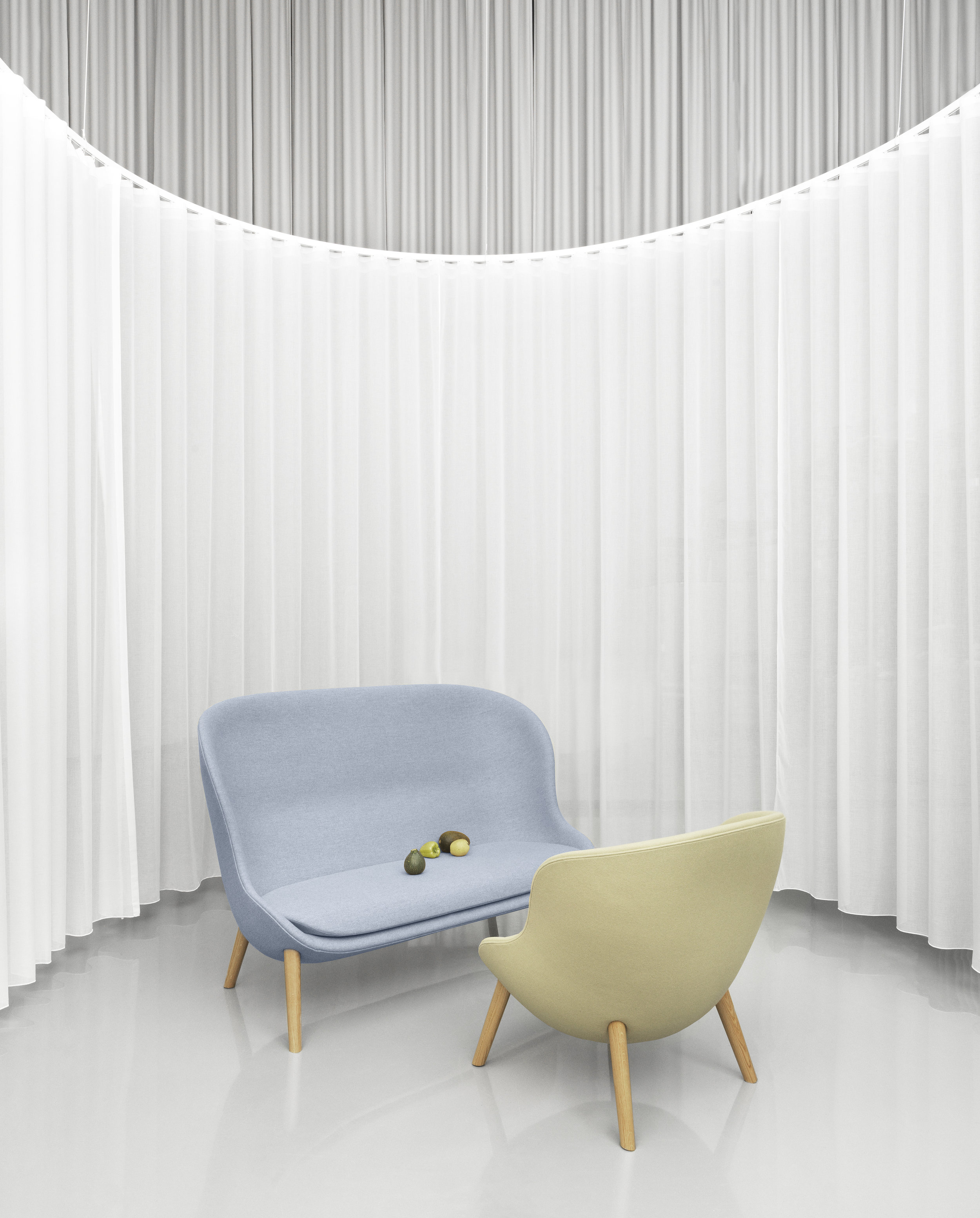
HYG, the new sofa & lounge chair from Normann Copenhagen

Yes, once again Simon Legald designing for Normann. And this time, it comes in cozy, cute forms.

You know where to get you own HYG.
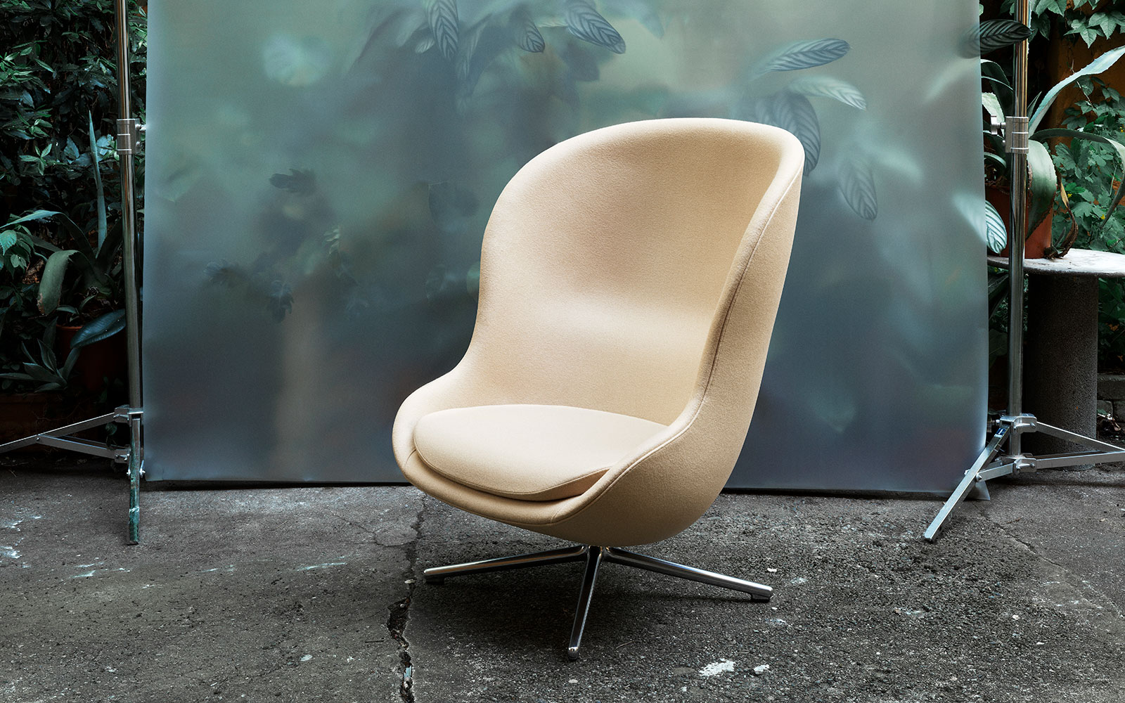
Customise it and make it your own. You can choose: the size, the fabric and the base. My favourite: the swivel lounge of course, in Leather + the footstool. What’s your? Give us your comments!
You can also contact us for any questions. What do you think about Normann’s new lounger and sofa? I can see it very well placed, especially in public spaces. So maybe well find it in an airport soon….

The following images and text come from Normann’s own communication.

Enjoy.

Andres


Hyg

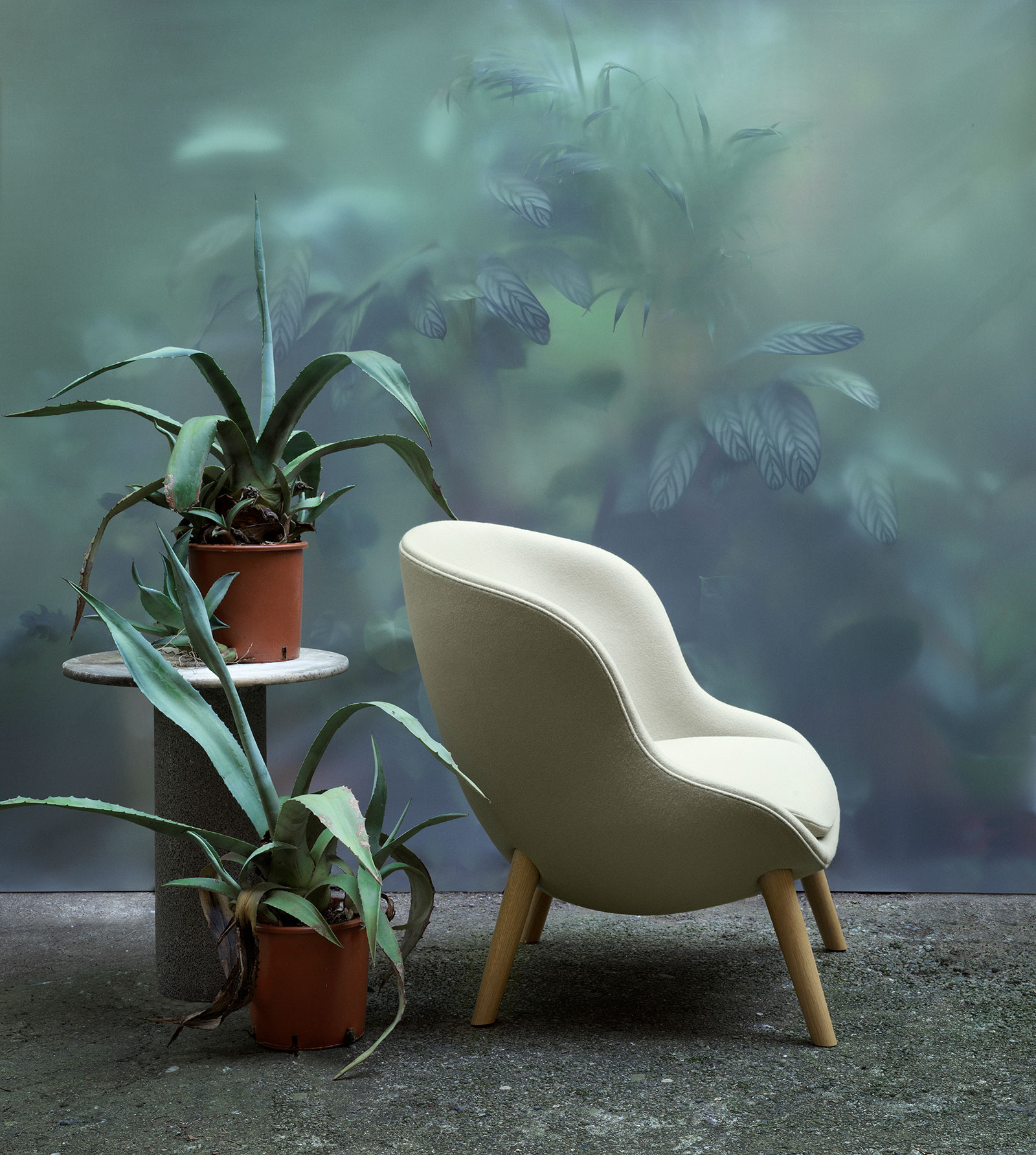
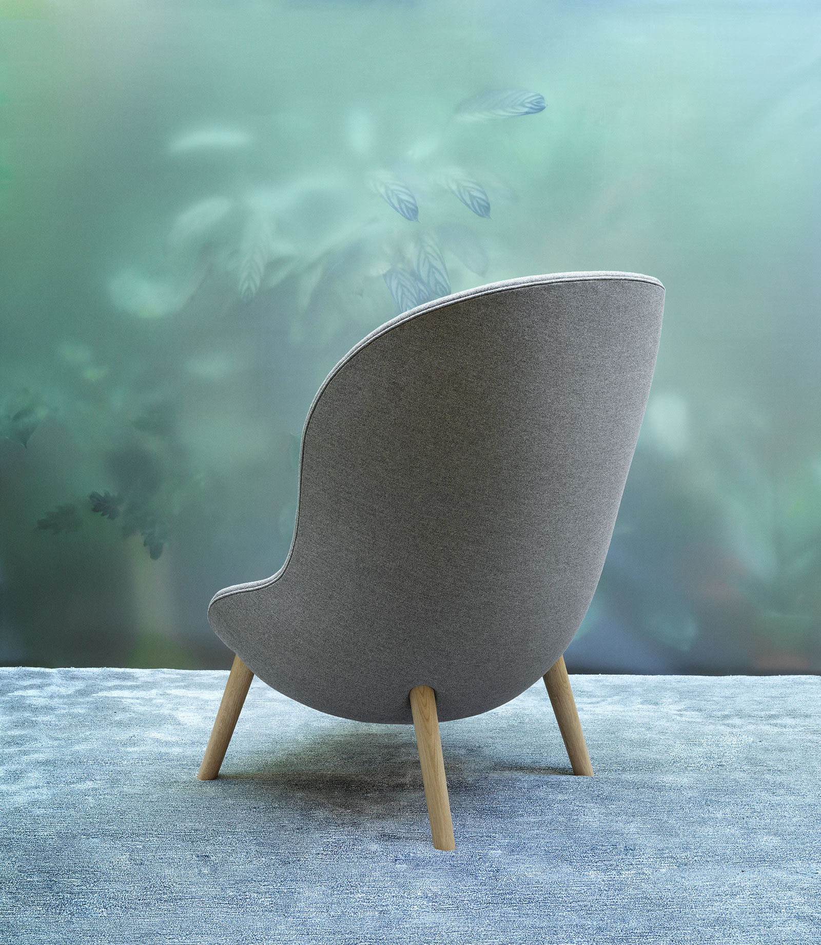
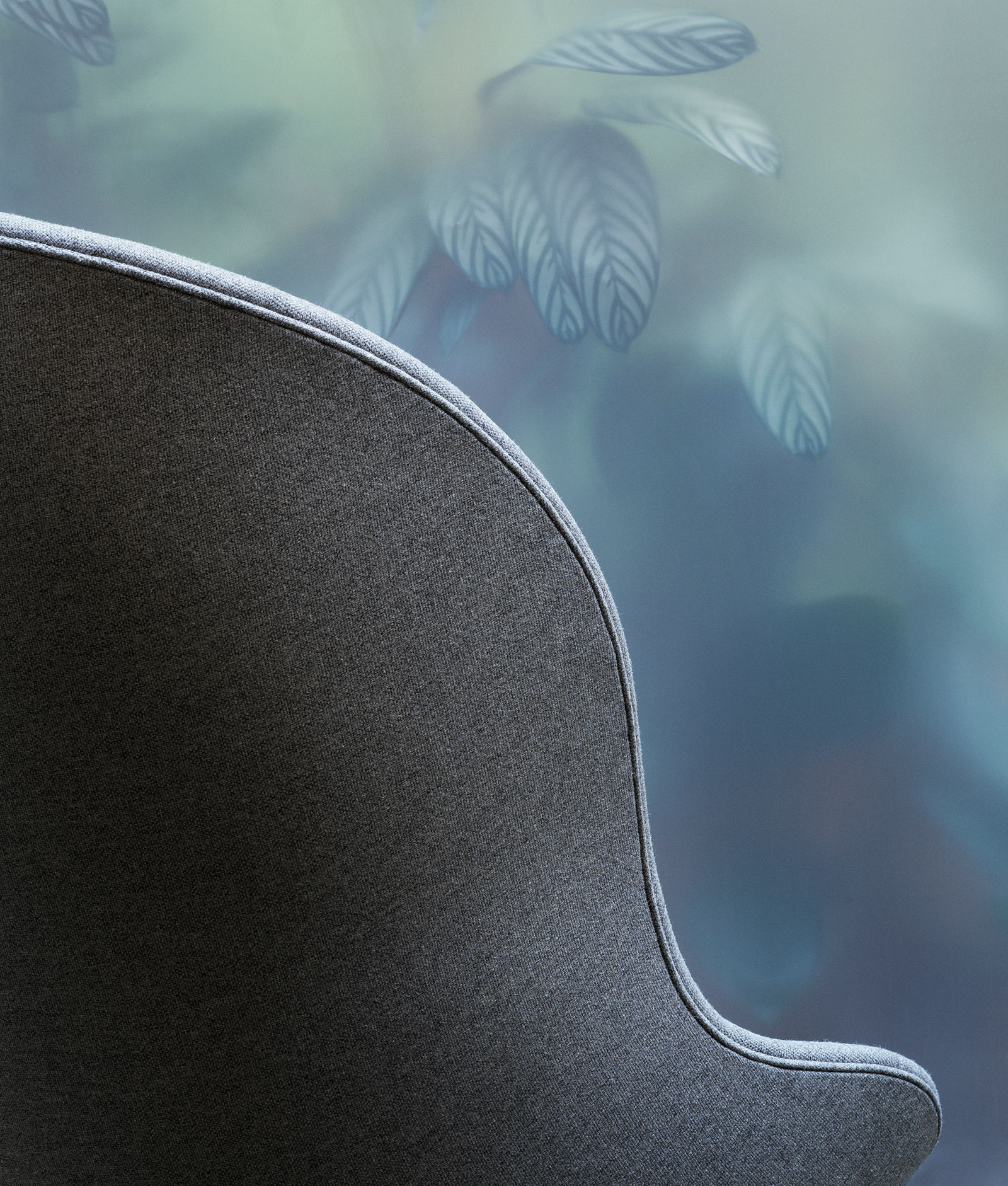
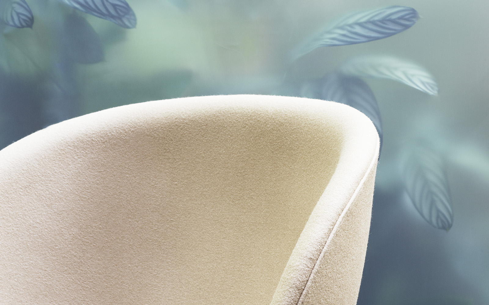
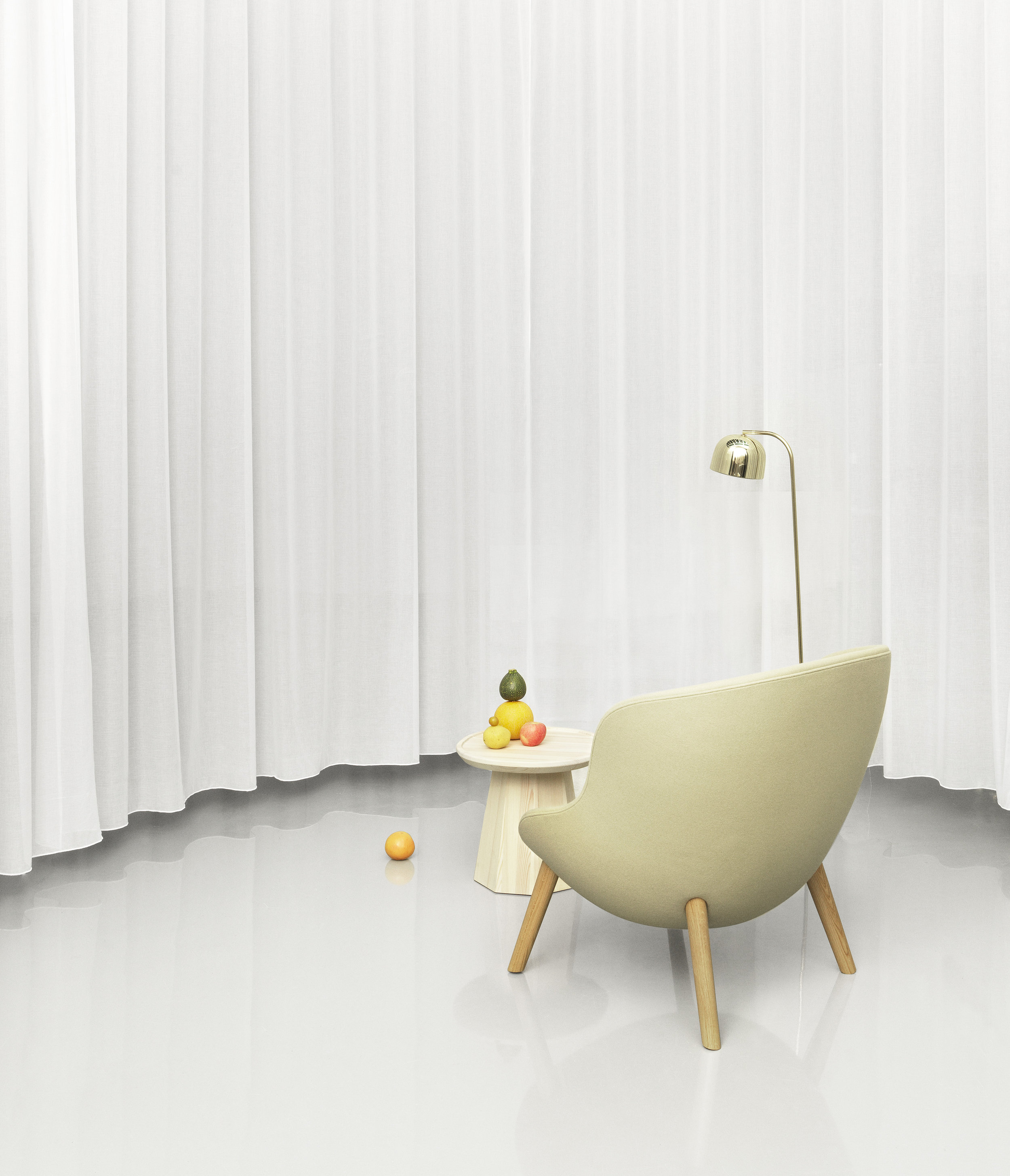
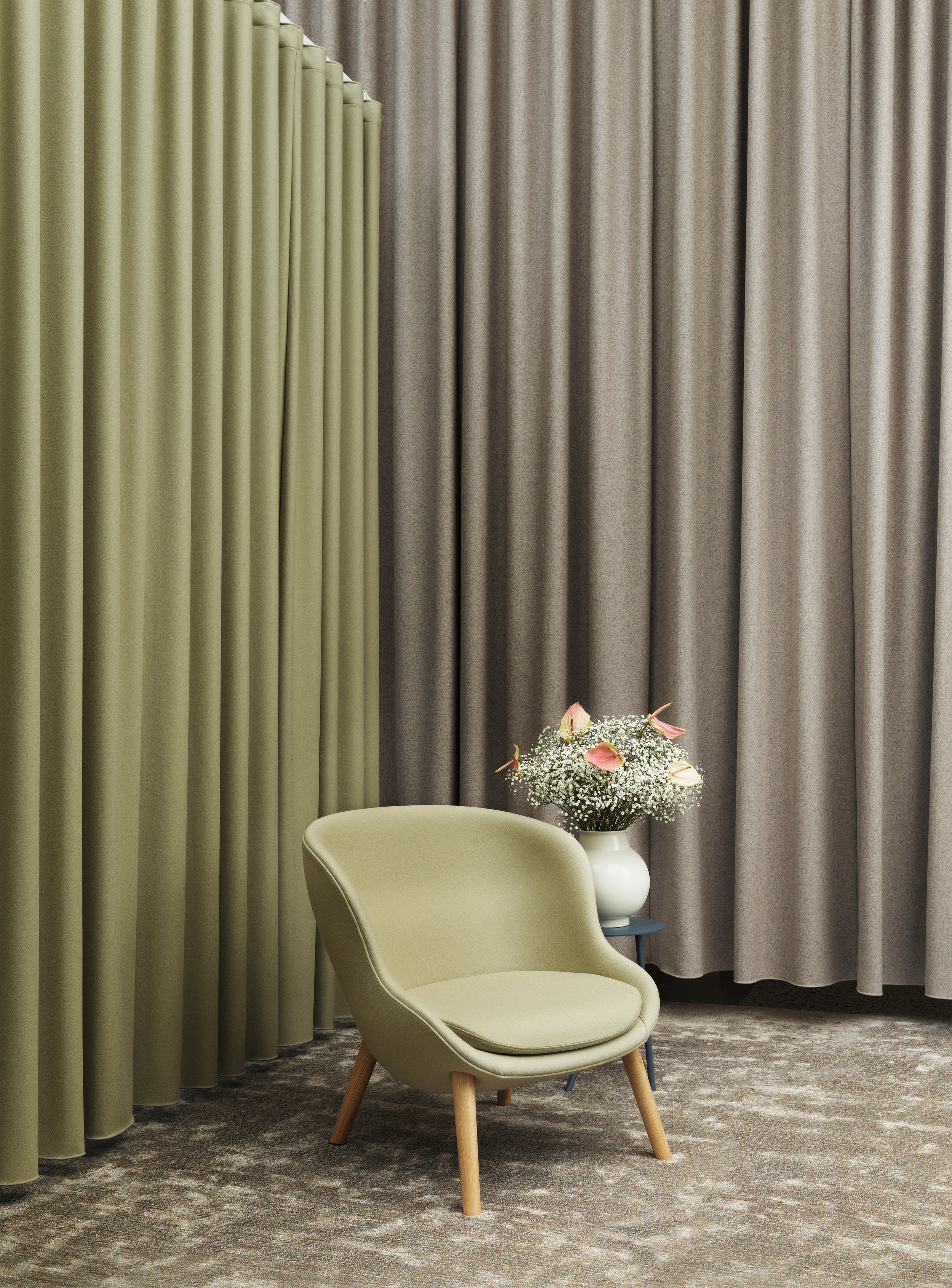
Hyg is an exclusive lounge series, inspired by the Danish concept of hygge - a word associated with true cozyness and comfort- and manufactured with strong care for materials and attention to detail. A true all-around talent for offices, hotels and homes.

norman copenhagen hug lounge chair living scandinavian home.jpg
norman copenhagen hug lounge chair Simon Legald Designer.jpg

“The Hyg range is an interpretation of hygge, but in its own way, it is also a product of hygge. As an integral part of Danish culture, hygge emerges in the trustworthy and informal atmosphere that permeates our working culture.

— Simon Legald, Designer

FABRICS AND CONSTRUCTION

Hyg is everyday luxury of the highest caliber. Its construction and careful choice of materials is thought through to the last meticulous detail. The level of attention paid in its making can be seen and felt, and the armchairs are even available with a tilt function, which can be customized according to the user’s weight. 

A steel framework ensures stability and strength, while molded PU foam provides cushioning comfort and good lumbar support.


norman copenhagen hug lounge chair living.jpg

Leather is supplied by Sørensen Leather who fulfils the strictest environmental requirements in the industry. Furthermore, having a furniture piece upholstered in leather allows it to last an average of three to four times longer than furniture produced in other materials, and thereby prolonging the product’s life cycle. 

norman-copenhagen-hug-lounge-chair-living-scandinavian-home-texture-variations.jpg

Hyg is made to order and produced according to your specific choices of fabric and color. 

Meet the Co Chair - the perfect office chair

The new Co Chair, has just been launched this week at London Design festival. It was the result of a collaboration between MENU , Norm Architects and The Office Group: a company providing design-led offices and co-working spaces in the UK.

Co Chair The Lab Menu, modern furniture, chair, scandinavian design, scandinavian home 11.jpg
Co Chair The Lab Menu, modern furniture, chair, scandinavian design, scandinavian home 8.jpg

working together

“The creation of the Co - Chair has been a truly collaborative process in our mission to design the perfect stackable, comfortable, good looking chair, intended to suit a variety of workspaces” - The Office Group

We wouldn’t mind sitting here for a long day’s work, in such a cool space, how about you?

Co Chair The Lab Menu, modern furniture, chair, scandinavian design, scandinavian home 4.jpg

“We put a lot of time and consideration into the design and fit out of our workspace interiors according to the ways our clients and members use spaces” - The Office Group.

Co Chair The Lab Menu, modern furniture, chair, scandinavian design, scandinavian home 6.jpg
Snaregade table, Co Chair The Lab Menu, modern furniture, chair, scandinavian design, scandinavian home.jpg

Hope to hear more about these this beauties soon. I can’t wait to see them up close!

Scroll down too see the 3 amazing TOG’s offices in London where the Co-chairs are now.


Co Chair The Lab Menu, modern furniture, chair, scandinavian design, scandinavian home Tintagel 6.jpg

The Chard

The gridiron building

Co Chair The Lab Menu, modern furniture, chair, scandinavian design, scandinavian home Gridiron project London.jpg

One thing I love about social media specially Instagram is to be able to see everything that is going on in real time! Follow @menuworld, @normarchitects & @theofficegroup and get to know more about their news and events.


Hope we’re able to visit London Design Festival next year. It has become a must and there’s no bad excuse for not visiting London. ;)

Keep it coming MENU! we like a lot.

until next time!