Branding and creative still life photography for SERGIO cocina gourmet
Read MoreAlex Medina 2020 Drop Crotch Pants
Alex medina new collection, 2020 summer, Long shorts.
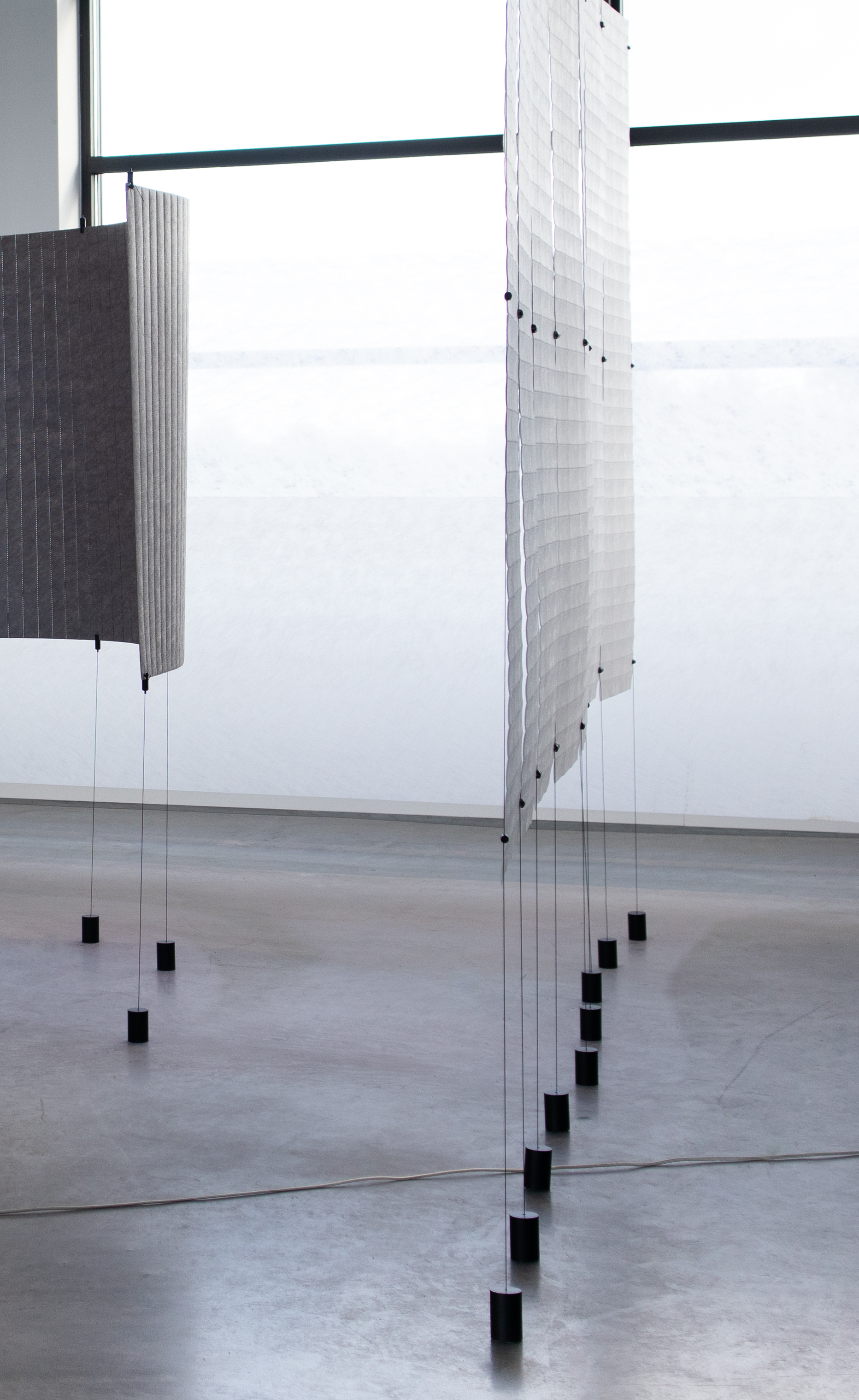
Read MoreDaphna Laurens - Colfront
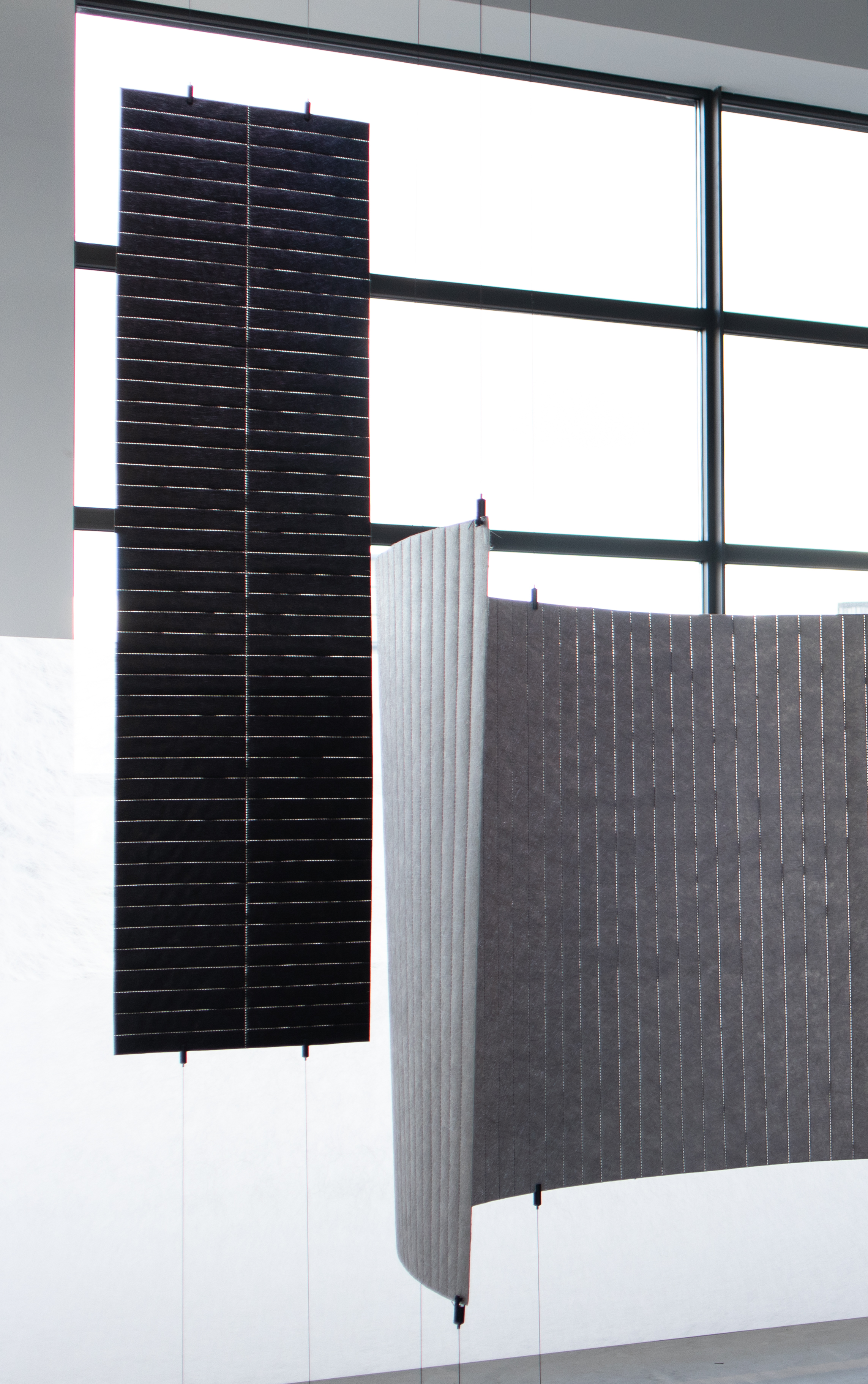
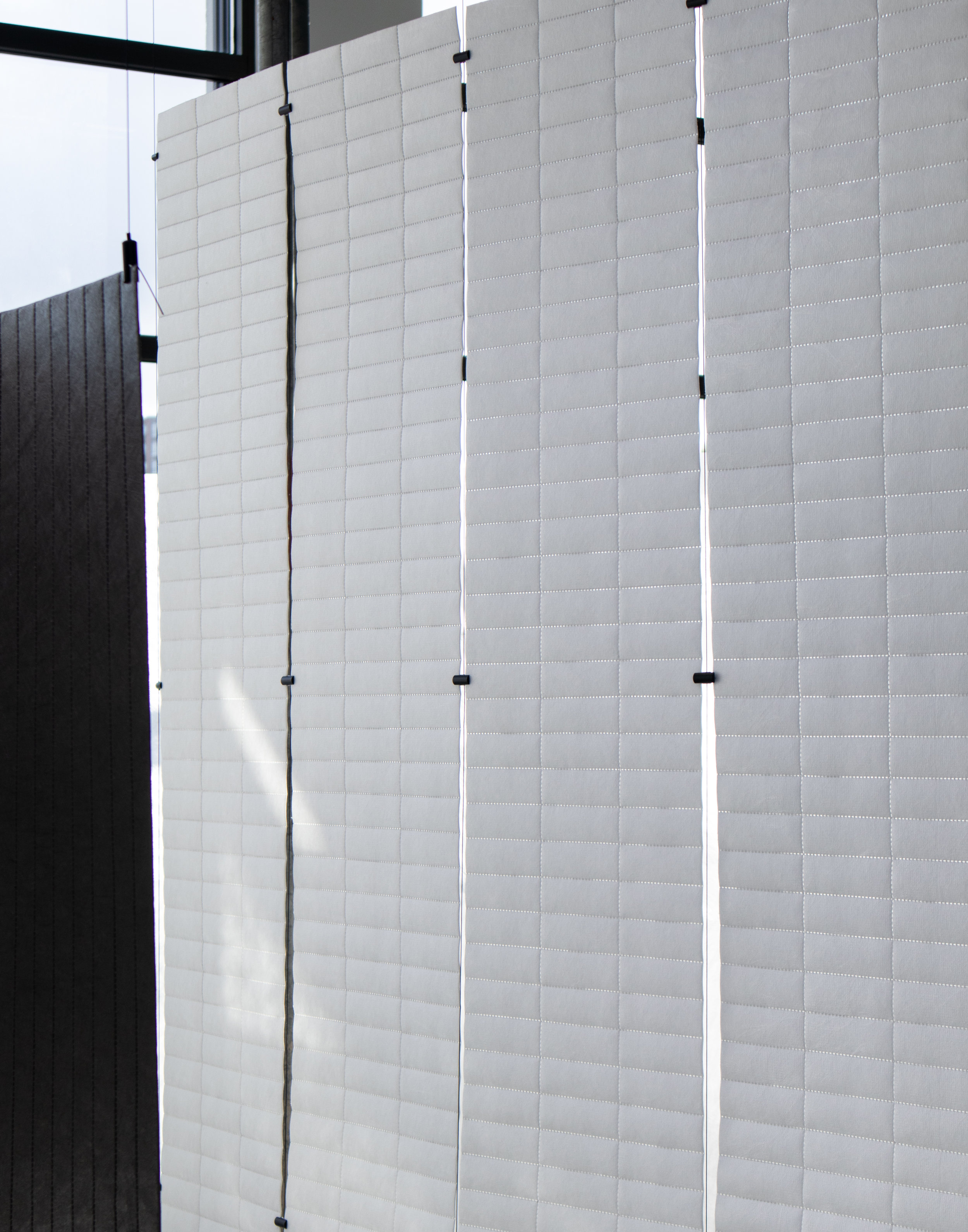
This Year, Daphna Laurens made several apparitions throughout the city during DDW. One of our favourites was their Colfront installation in the newly renovated building of Strijp T in Eindhoven.

By experimenting with a very well known industrial product - Colback - a textile used for millions of applications that you never see, meaning it’s always applied “under the hood”, Daphna Laurens have created a set of room dividers and curtains that where put together using several layers of the material and combined using ultrasonic welding!
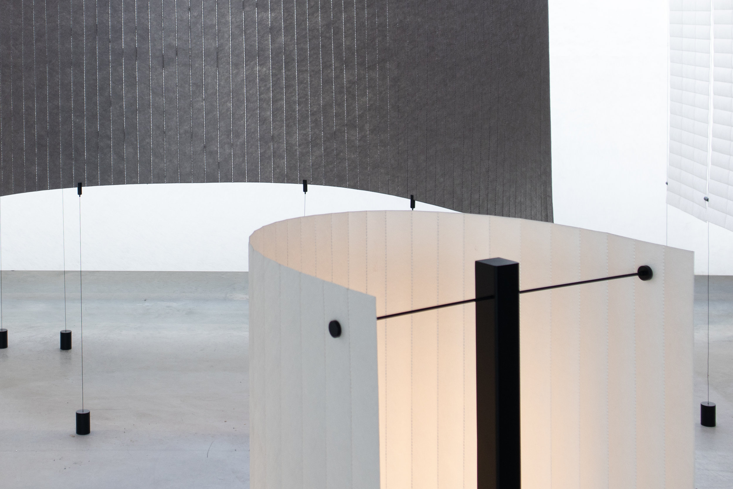
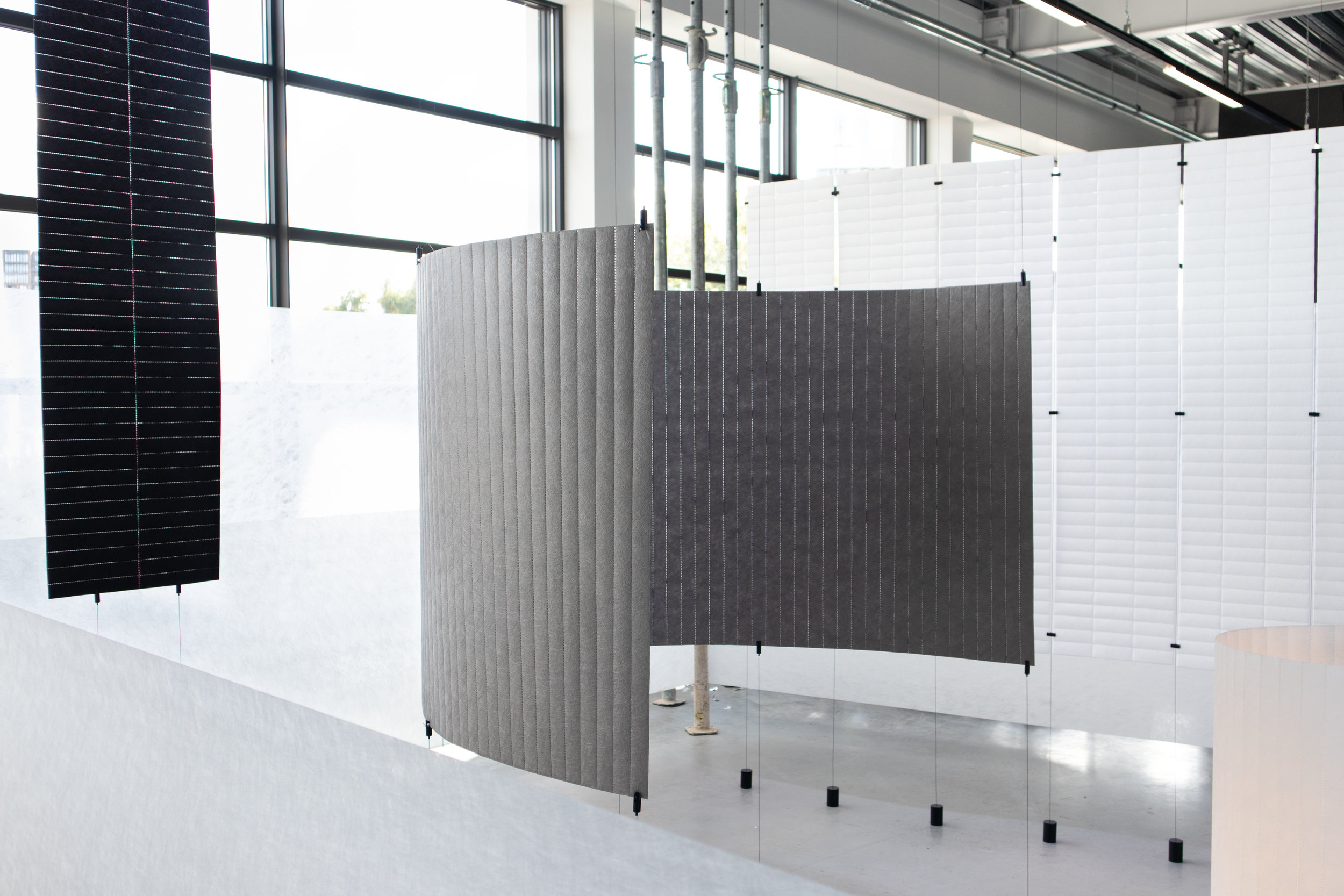
The terms sound super technical but for us it was a beautiful, extremely simple set up that proved once again that by experimenting with known materials in a different way, we can create new textures that can be used in many different ways.

Congratulations guys! the installation looked beautiful. Its always exciting to catch you for DDW.
Os & Oss - Body of work
Os & Oss is a design studio based here in Eindhoven and this year for DDW they where able to showcase their best work created since they began more than 7 years ago in a beautiful location inside the newly renovated building in Strijp T.
Body of work
Body of work encompasses their best projects developed in the last 7 years, since the studios conception in 2011.

Their objects include lamps, a desk, chairs, mirrors, coffee tables and a very humorous lounge chair that was created for the danish label Please Wait To Be Seated.


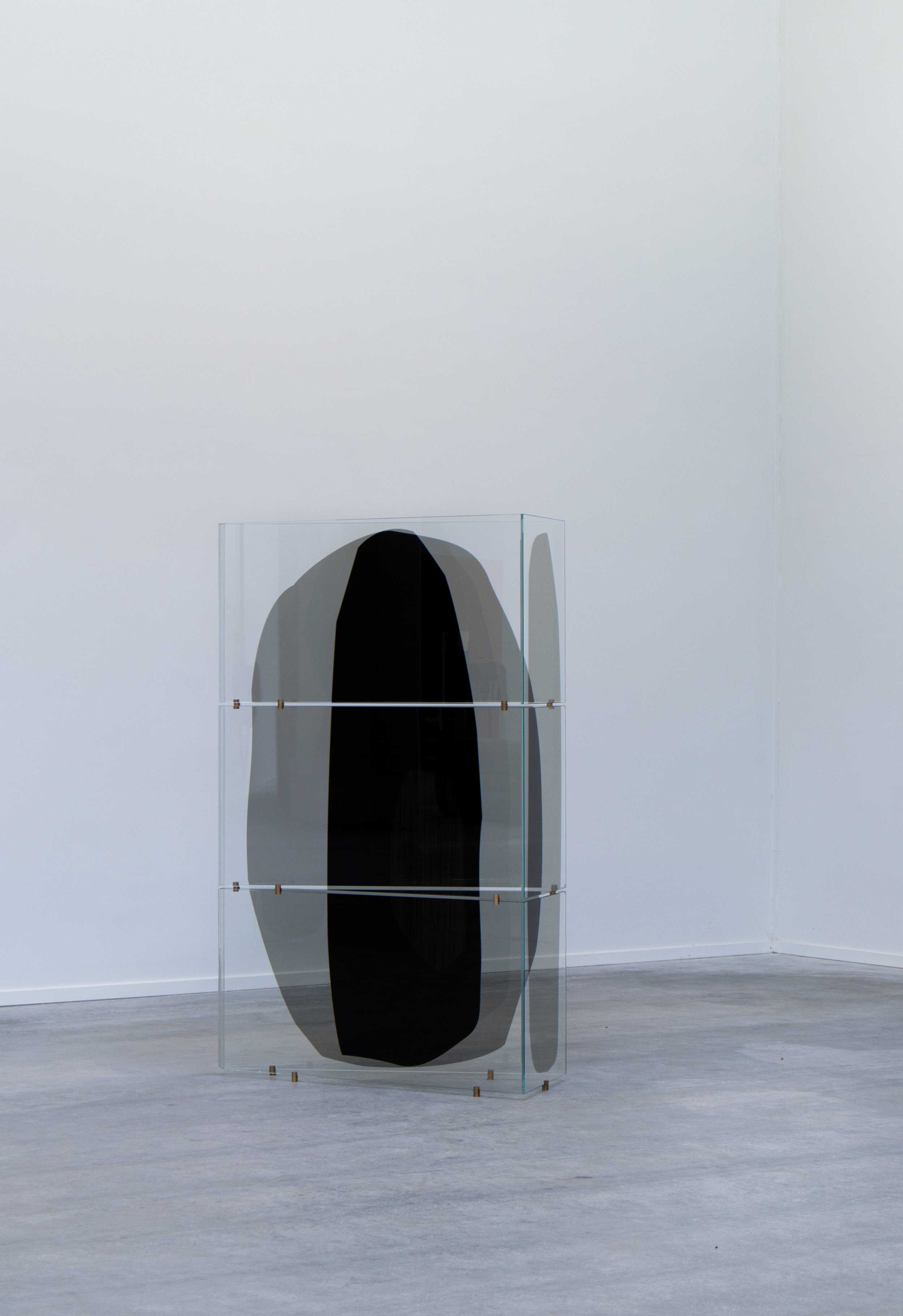
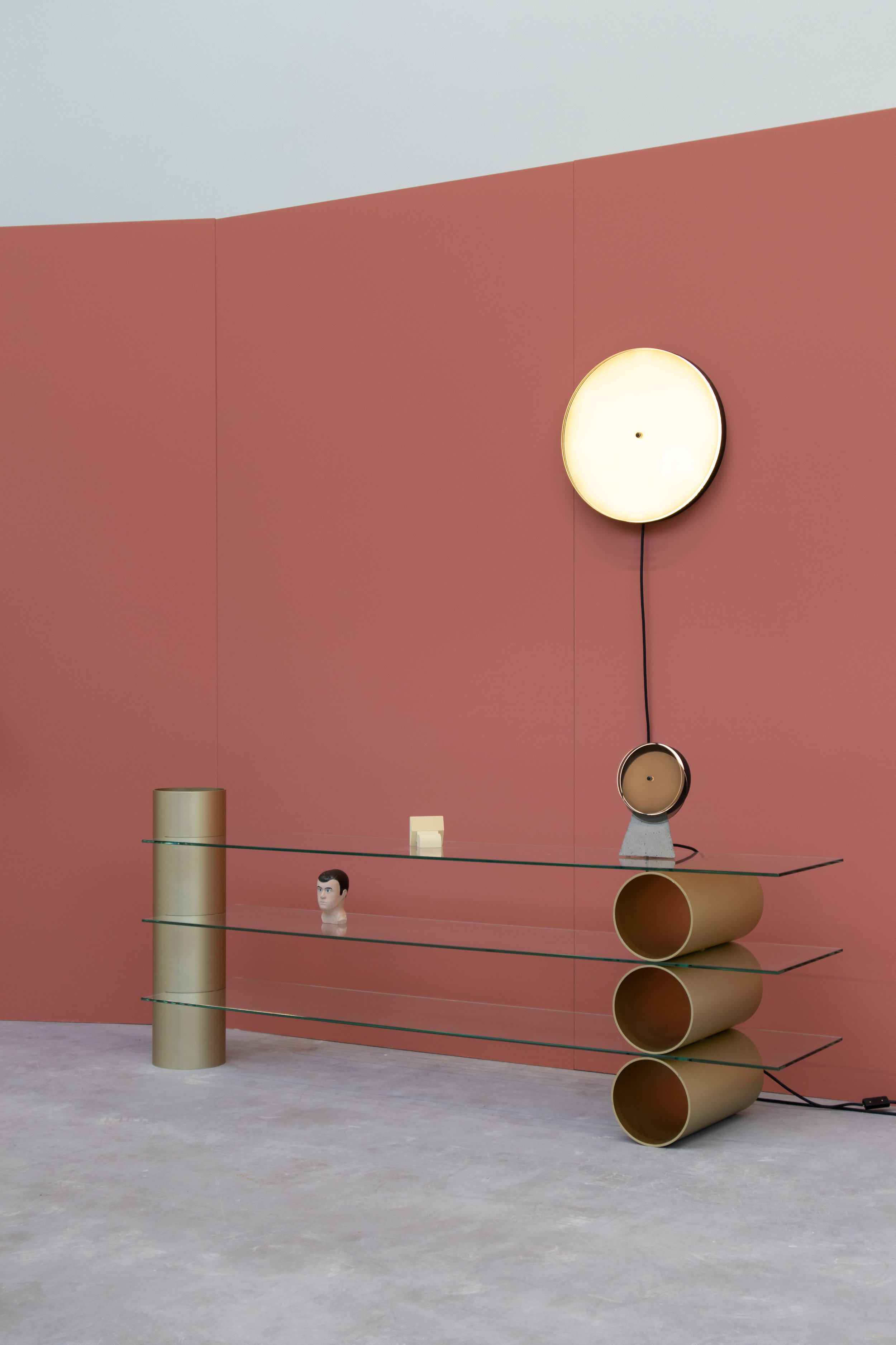
Matrix
A showcase of surfaces, seating and lighting that together show a broad application of the concept, to showcase the possibilities as well as the visual aesthetic.


Repeated Mirrors
Perspectives
A technique of depicting volumes and spatial relationships on a flat surface can be referenced to the viewer’s perspective or ‘point of view’. As the viewer begins to perceive the objects it becomes apparent that no two perspectives yield the same visual effect. For the juxtaposition of the light filtering foils in combination with the glass surfaces can create moments of deep density or contrasting transparency and all the variations there within.
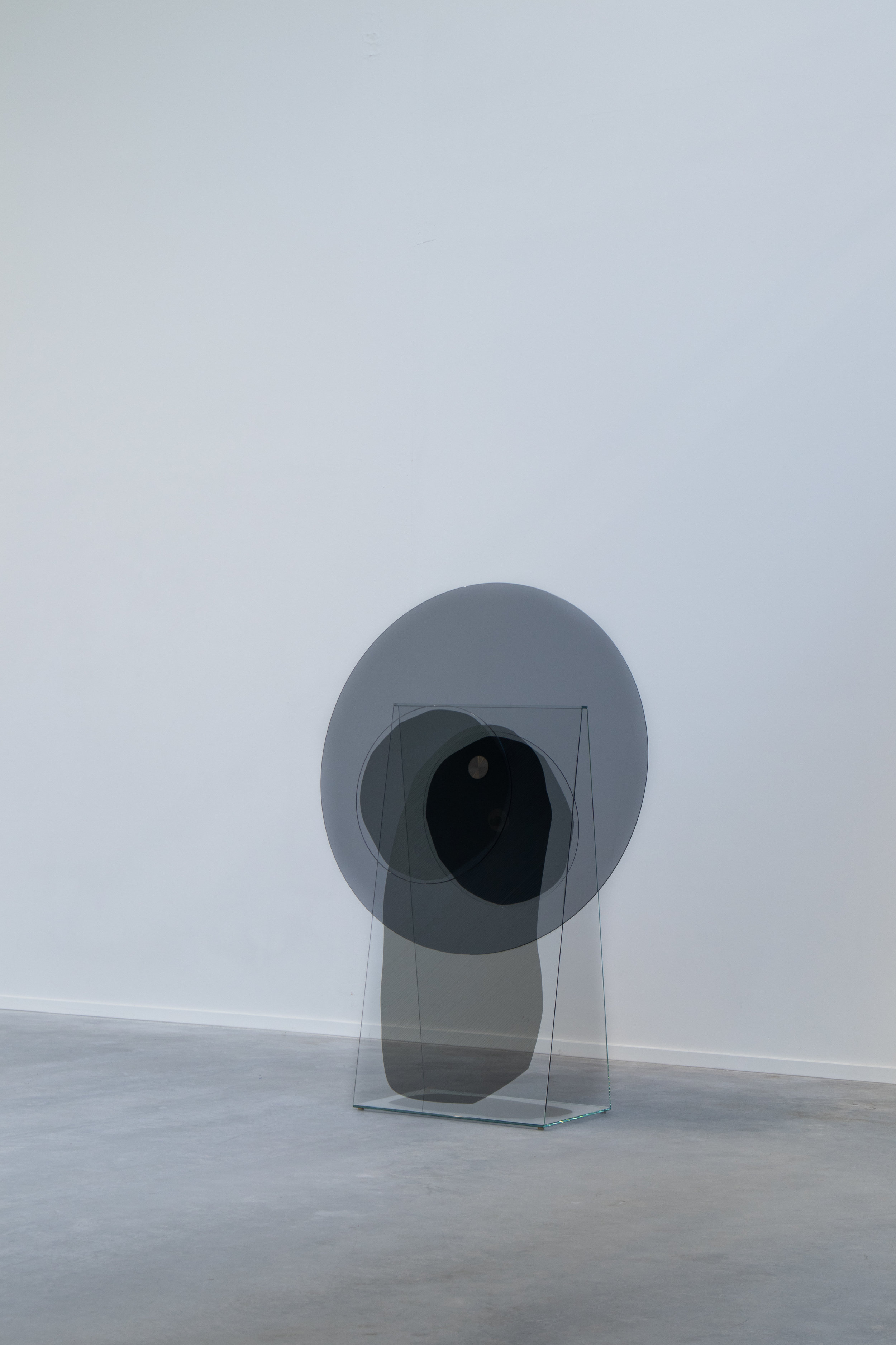


Syzygy: Eclipse


Syzygy: Occultation
An occultation occurs when an apparently larger body passes in front of an apparently smaller one.
And on the top floor:
Beautiful collection from AND LIGHT was also presented for the first time in the Netherlands, part of this collection is designed by Lukas Peet (brother of Oskar) who lives in Vancouver Ca.


overall, one of our favourite things we saw this year at DDW.
Hope you liked it as much as we did!
Comments? as always, let us know!

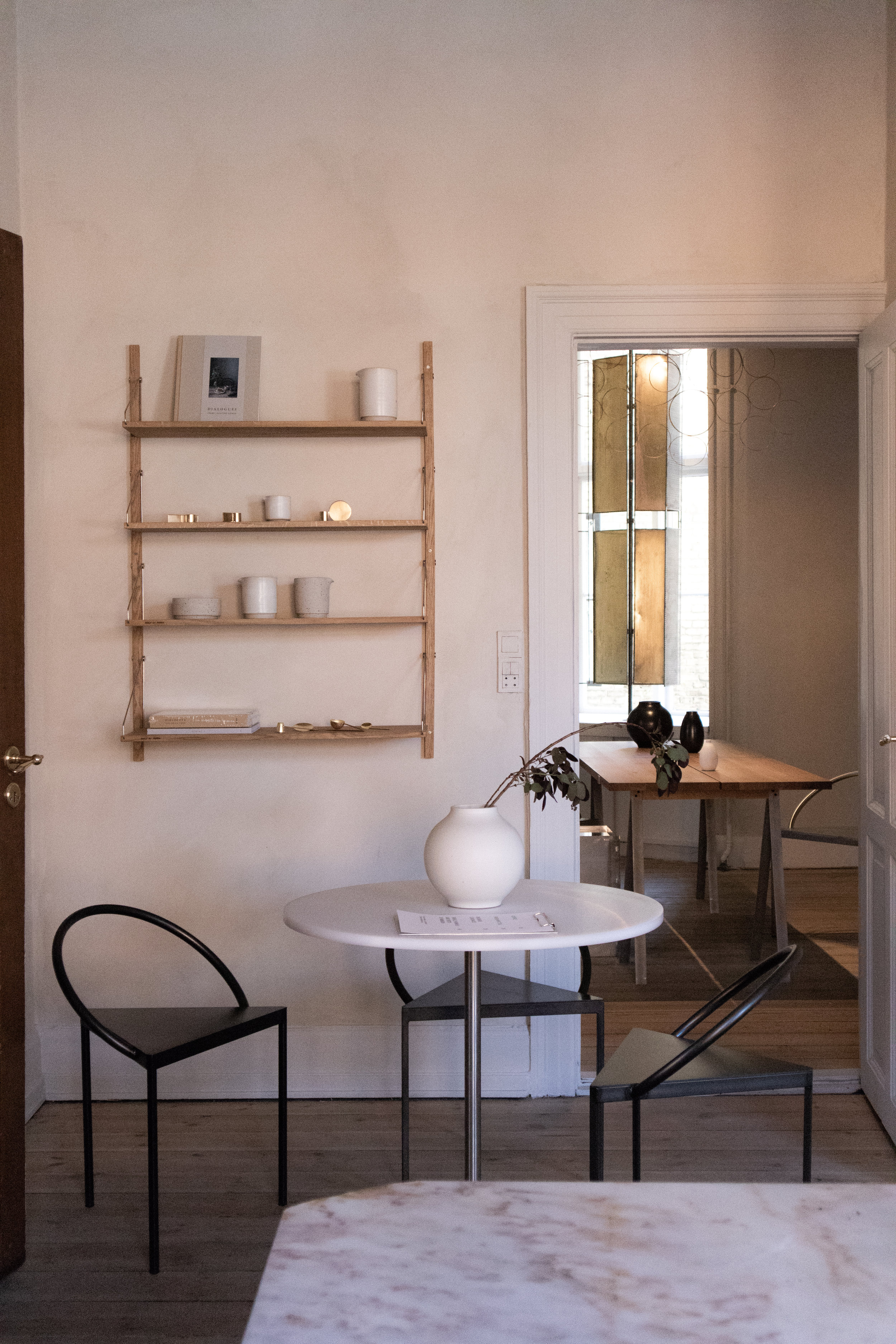
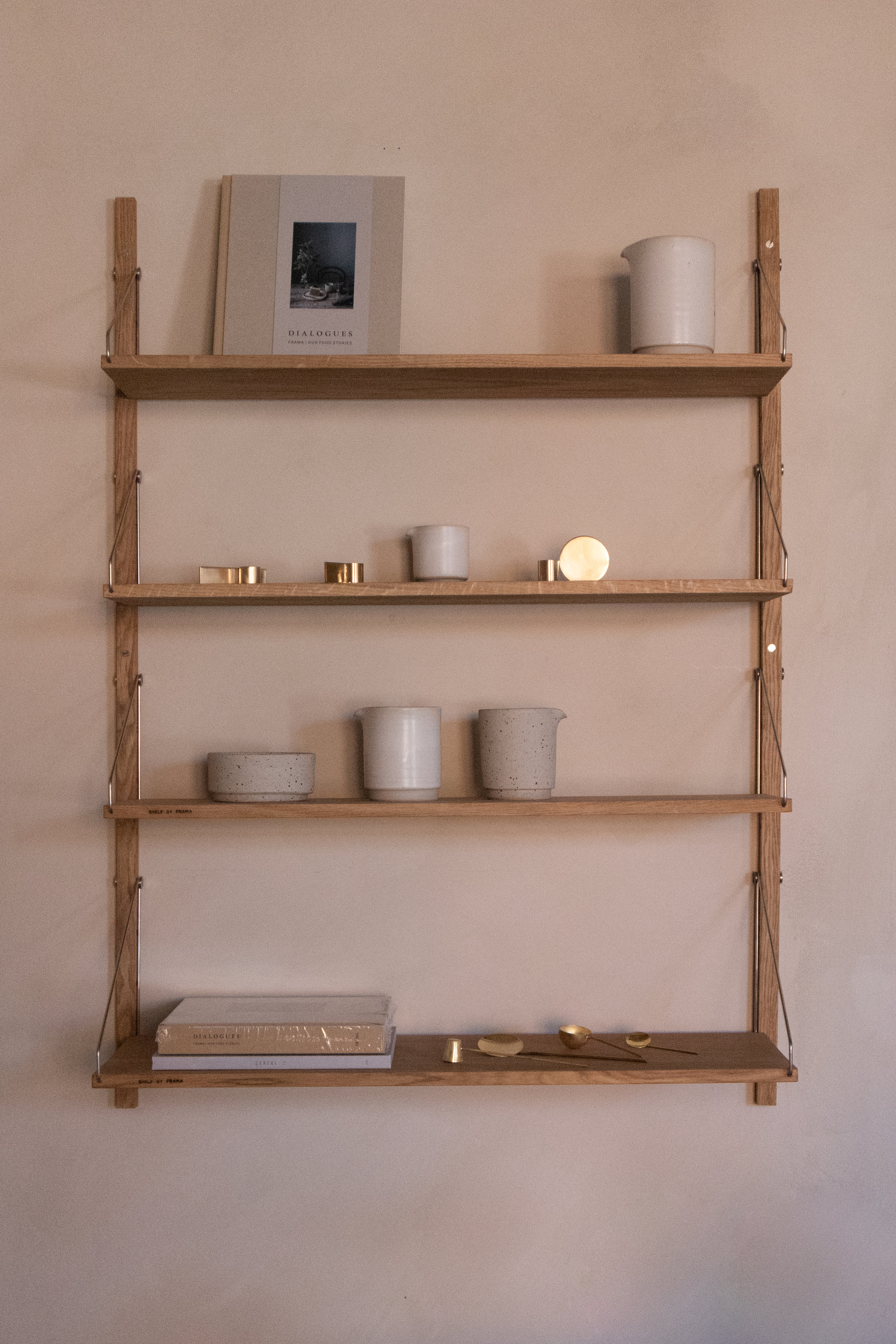
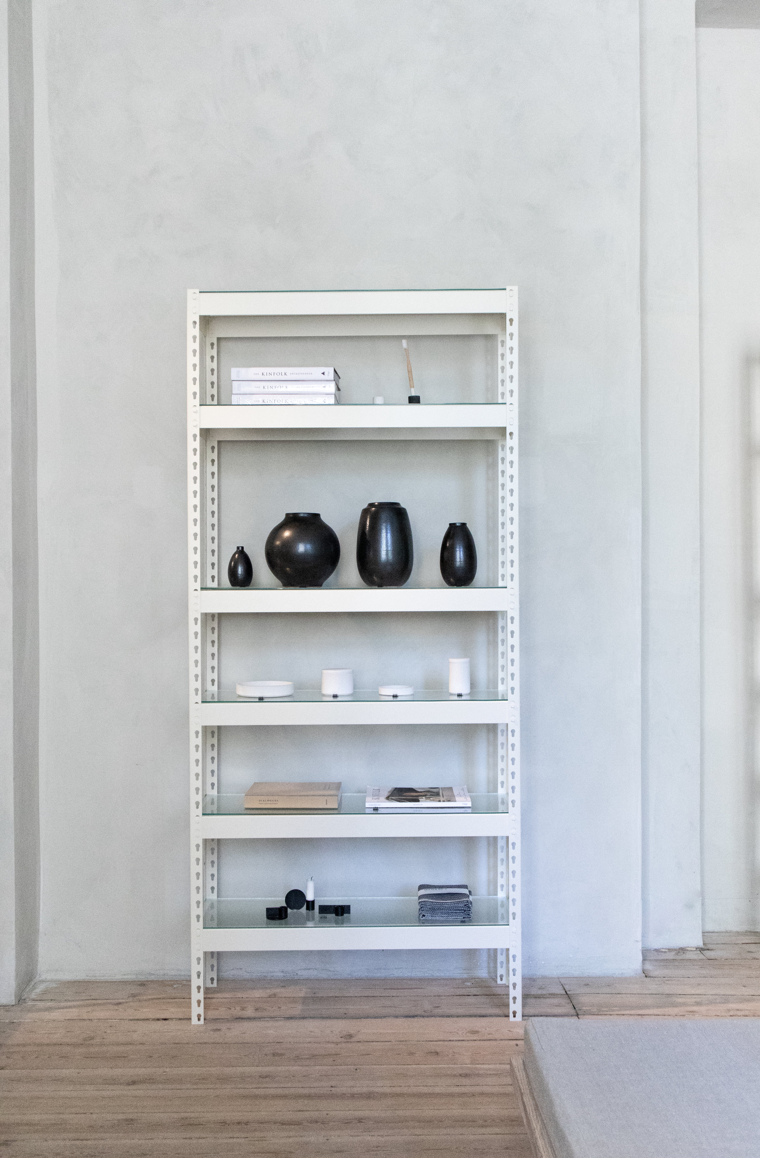
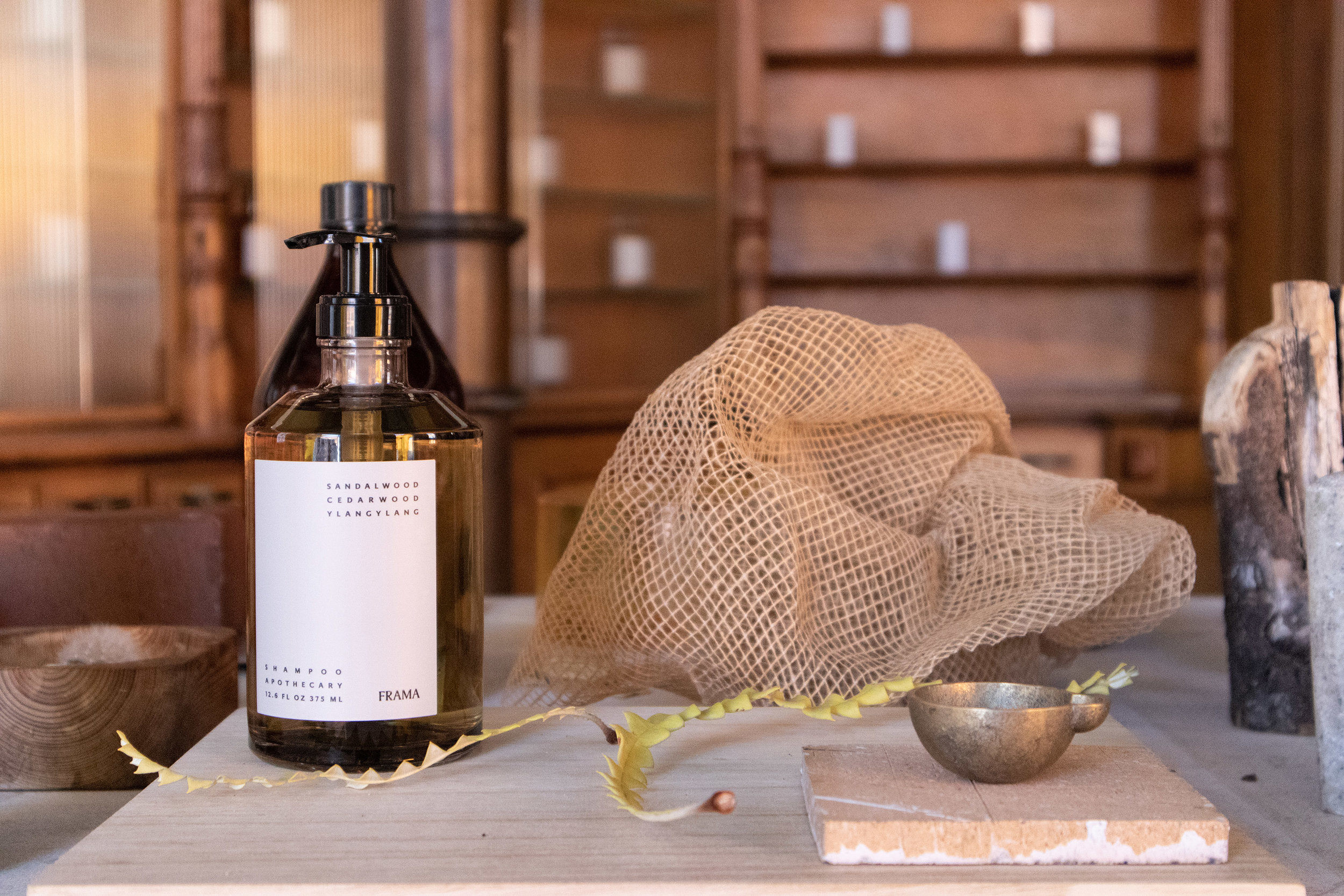
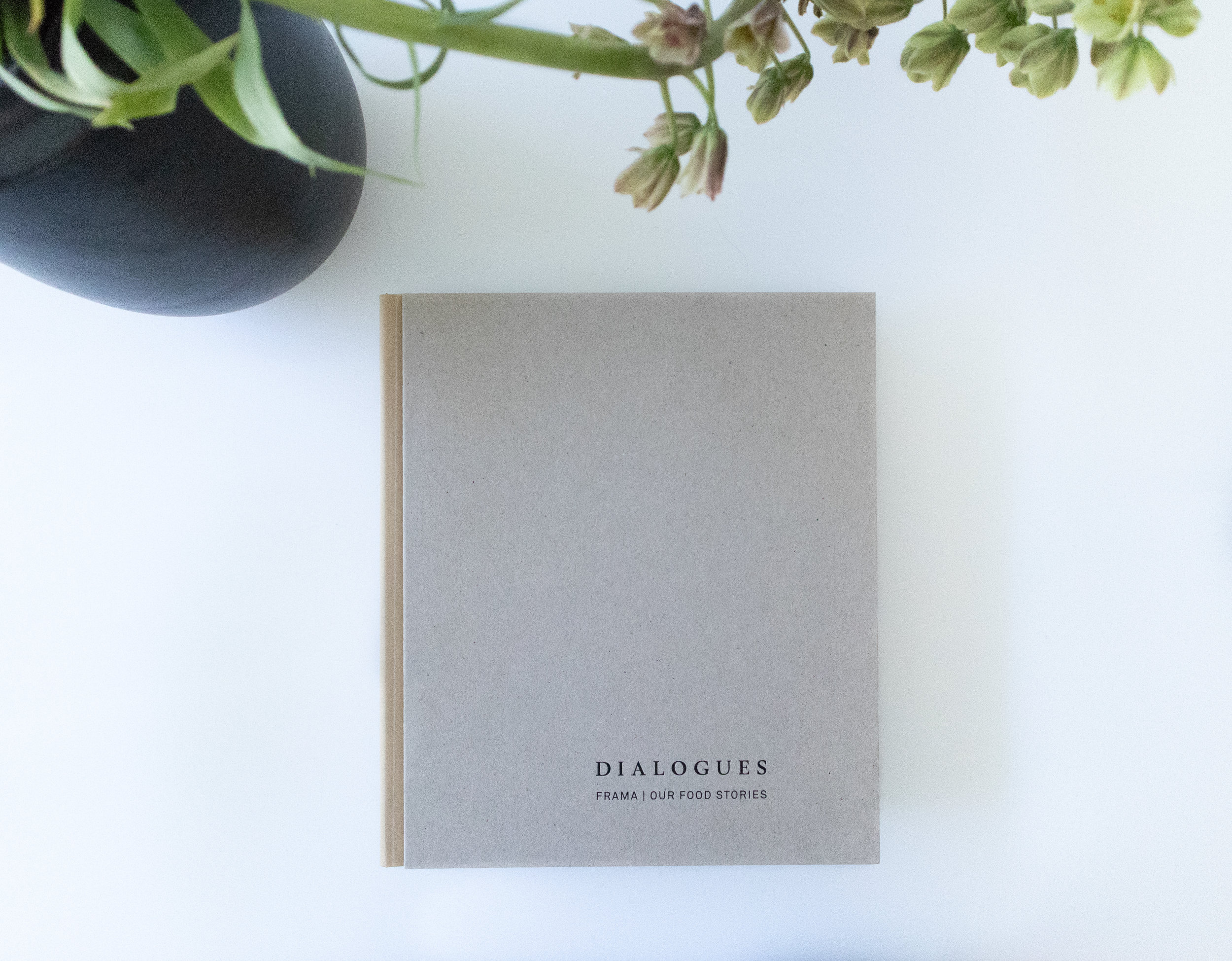
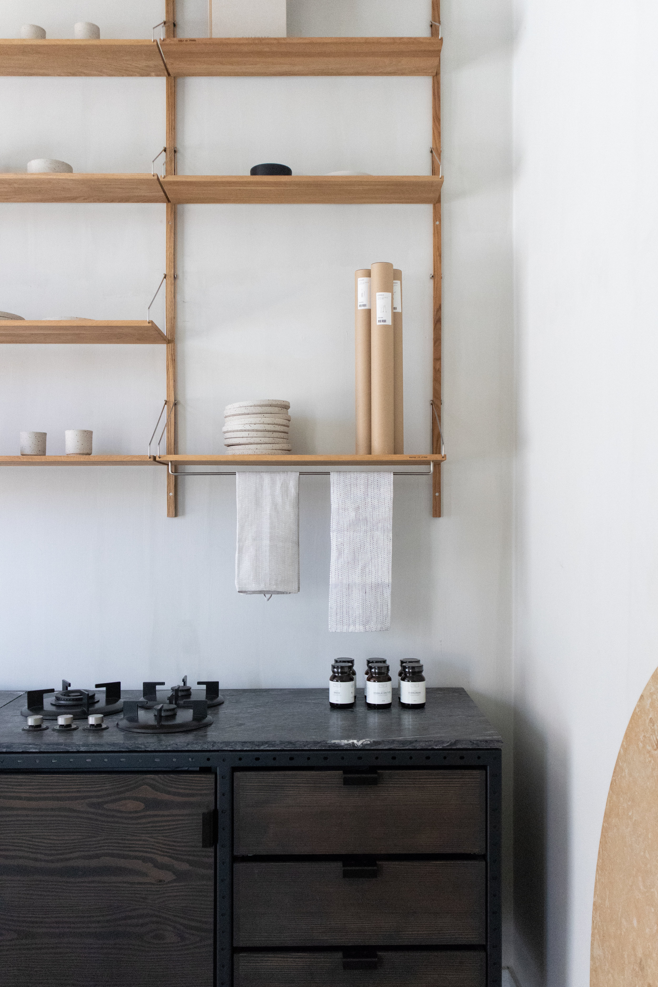
Frama store Copenhagen
A few months back, I had the fortune to be able to attend 3 Days of Design in Copenhagen and visit Frama Copenhagen’s Studio Store. I was blown away by the setting the moment I walked in. It’s an amazing space where old and new clash creating an amazing atmosphere. These are a few pictures of my visit along with some text from Frama’s website.
Have you been there? please, give me your comments! it would be lovely to hear what you think of the space.

The Frama headquarters and Studio Store is located in central Copenhagen within the historic and protected neighbourhood of Nyboder. Former home of the St. Pauls Apotek established in 1878. The synergy between the past and present elements of the space is a direct link to how Frama defines their main interest within the creative field as a dialogue between two opposite poles; classical and contemporary approach – between digital and analogue production.

“The interior aim of the 250m2 spaces was to work on the larger surfaces and not be orientated towards details and larger improvements. In a spartan way the many square meters was renovated in a atelier kind of way with basic constructions and methods.”

The kitchen is made up of free standing elements, in hard wood and steel frames that accentuate an industrial feeling.

Modern minimal contours contrast with the old original furniture from the old days.

Their line of body lotions and hand cremes pay homage to the Apothecary times of the space.

White spaces give a feeling of lightness and maintain a fresh look, while the floors remind us of the past and history of the building.

Th space invites the user to experience peace in many of its areas always playing with the contrast between old and new. between modern and classic.

Thanks for reading!
Giselle.
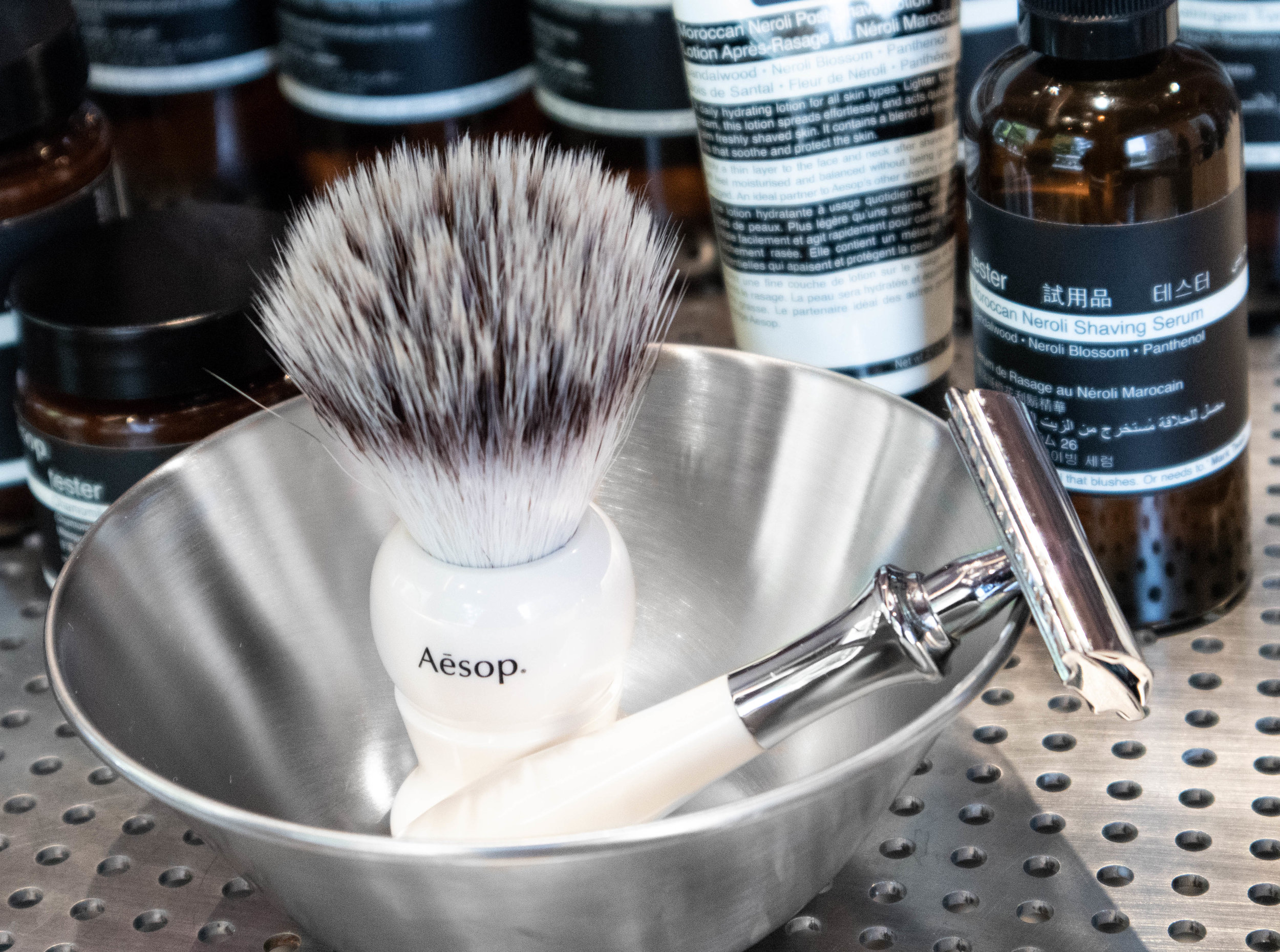
Aesop Duke of York Square - London
While in our visit to metropolitan London, we passed by this amazing space situated in Duke of York Square, right next to the incredible Saatchi Gallery, which is also an excelent place to visit.
Aesop is a Melbourne based skin & body care company that has through all of it's locations always been pushing good design and retail display. their aesthetic language has been part of their marketing since quite some time now. It is one of those companies that have understood for a while that creating beautiful environments make people want to come inside even if they don't know what the shop is about.
This store in Chelsea was designed by their long time partners Oslo-based architects Snøhetta and was inspired in part by the opening scenes of classic James Bond films. Silvery shiny materials agains earthy down to earth wall tones create a focus point on the products themselves, playing with repetition and symmetry, Snøhetta really captures the essence of the brand in this location taking advantage of capacious dimensions to effect dramatic, clearly defined forms and material contrasts.


Earthy tones in the walls create a matt base where everything else contrasts and stands out. the water in the fountain creates a mirror that reflects the amazing multiple stem column arches up to envelop the entire store giving the user the feeling that he is stepping inside a cave.
These sweeping structures create zones of intimacy around a large circular demonstration sink, 4.2 metres in diameter, that seems to hover in space, inviting visitors to experience an Aesop product consultation. The sink is edged by a shallow reflective pool; during the night, light reflected off the water shimmers on the walls.
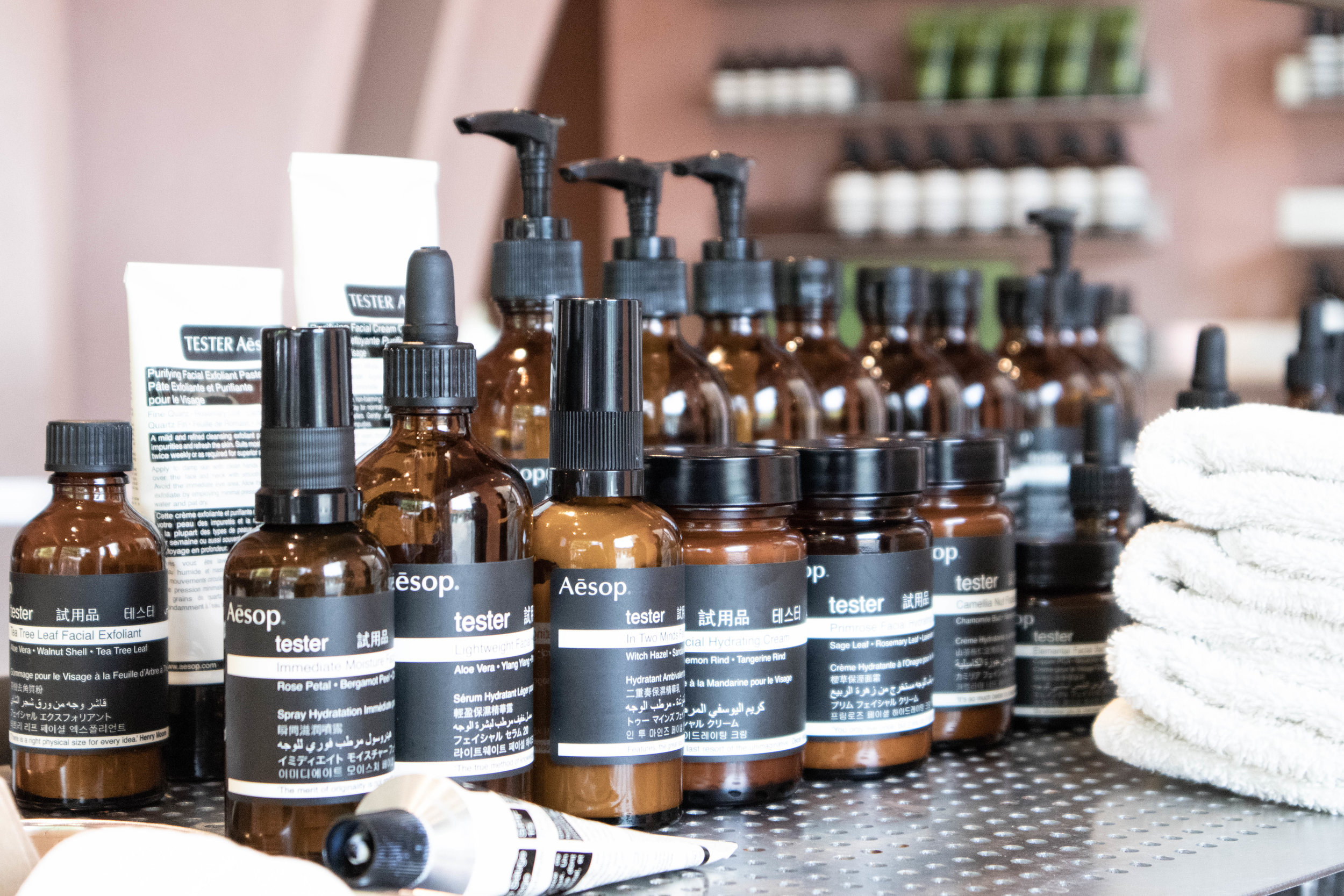


Repetition of Aesop's own products create rhythm and beautiful patterns...
