Androgyne Side Table, Distinguished by its playful yet elegant silhouette, the Androgyne Side Table was first designed for the Menu Space cafe but quickly went into production for a larger audience.
Read MoreBolon
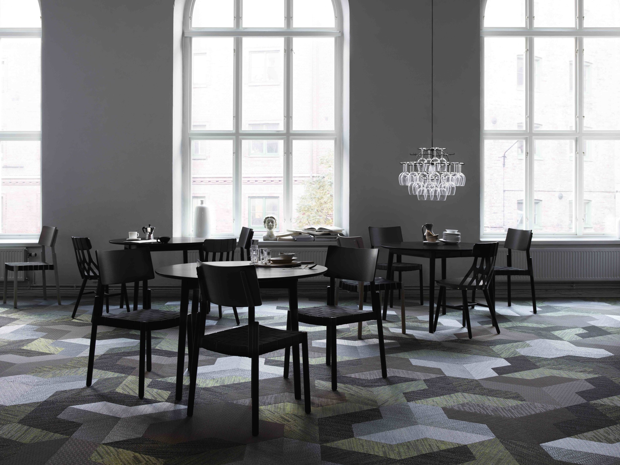
Bolon floors are 100% recycled plastic rugs for use in areas where there is constant traffic. The company was established over 60 years ago when founder Nils-Erik Eklund began reusing textile waste to create rag rugs. Today the brand works with world-class architects & designers developing new tiles and patterns used in projects around the world.
The company's main focus is sustainable innovation, using vinyl waste to create tile rugs. Since then, sustainability has been an integral part of Bolon. Today all products are designed and produced in Ulricehamn, Sweden, where they recycle their flooring.
Bolon tiles
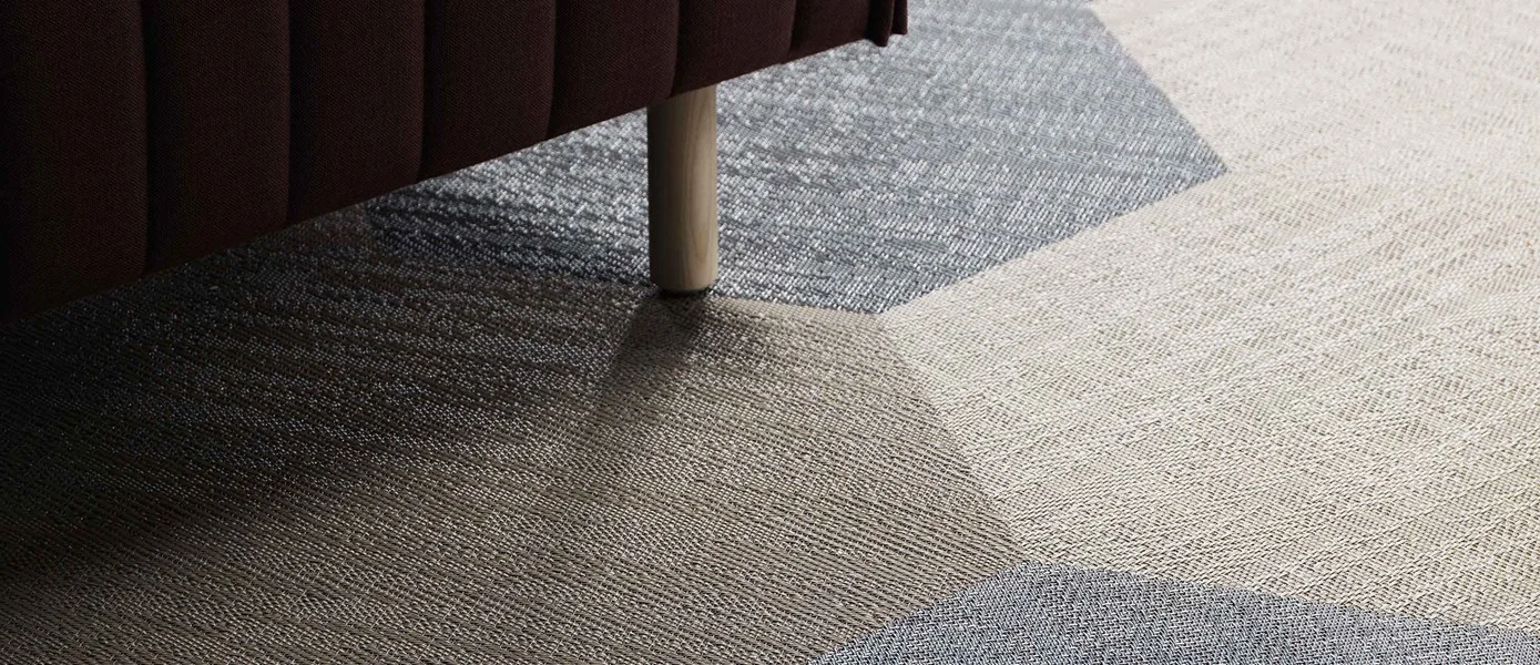
Tiles are a versatile and innovative design element. They allow for the creation of dynamic interiors where flooring becomes an integral yet subtle part of an exciting whole. Bolon tiles are available in different shapes, colours and patterns.
Shapes of Bolon tiles
Scale is the first from Bolon to feature an organic form. Soft and rounded, the design has a form reflecting the natural, glistening beauty of fish skin. The shape offers exciting interior possibilities particularly in combination with creative use of their colour palettes.
Soft and rounded, Scale’s naturally fluid shape offers exciting interior possibilities particularly in combination with creative use of our exciting colour palettes.
Wave, Inspired by the curvature of terra cotta rooftop tiles. Its graphic profile and organic curvature make it a fluid, versatile flooring tile that can be combined in a wide variety of colours and patterns for a playful yet elegant expression.
With its innovative form, Wave can be laid in different directions and repeated at half distance. Its graphic yet organic shape means the design versatility of this tile is almost unlimited.
Wing is a flooring tile that allows architects and designers to combine several of the collections and elevate them to a new level. The design facilitates new dimensions for small interior design environments.
Wing’s strong architectural form harmonises beautifully with other interior details.
Deco was launched together with the Create collection and in that special combination, true magic happens. Deco conveys the elegant feeling and flourishing movement of Art Deco into contemporary floors. Smooth and classy looking when cut in the same flooring, while geometric and sparkling when cut in a combination of collections.
Recreate a classic design era with this elegant, geometric patterned tile – mix colours and collections for a unique look that strikes a clear design note every time.
Triangle comes in three different sizes and is a strict geometric, yet playful flooring shape that offers architects and designers endless possibilities. Sophisticated surfaces are easily created when simply turning triangles cut in the same collection whereas colourful surfaces with geometrical patterns of rhombuses and triangles can be seen when mixing collections.
Strictly geometric yet still flexible enough to allow for playful creativity, Triangle represents endless design possibilities and delivers head-turning results.
Rectangle is a stylish flooring shape that can mimic the patterns of classic wooden parquet flooring. The rectangular form is iconic and works well with all kind of interior design styles. Work with the floor as a painting and build up the pattern design by combining different collections, colours and structures.
With its iconic form, Rectangle can be laid in different directions and repeated at half distance. Its graphic yet organic shape means the design versatility of this tile is almost unlimited.
Hexagon is a true classic when it comes to tile floors. With Hexagons from Bolon architects and designers get a totally new take on this classic. The shape builds up honeycomb patterns in all imaginable environments. The structure is fixed while the colour combination and direction of the shape in the installation is open to visionary dreams in the creative process.
Hexagon allows for the design of attention grabbing honeycomb formed visual structures. Lay this tile in different directions and use contrasting colours to create stunning interiors.
The 50 x 50 Square Standard Tile are punched out as squares and stored as warehouse items. The 50 x 50 tile are always available in selected designs of their collections.
Bolon Rug
Rugs are made from their own original material – vinyl reinforced by adding glittering yarn. The rug has a soft look and feel, and is highly durable.
The standard size is 2 x 3 metres. If this size doesn’t suit your needs, they offer custom-made rugs – with bindings – in several sizes and shapes.
They have 2 collections Duet and Villa la Madonna.
Bolon in projects around the world
ADIDAS - Shanghai Headquarters
CISCO MERAKI - San Francisco
ETIKHUS OFFICE - Sweden
TAPWACHT - Rotterdam, The Netherlands
GOOGLE - London office
CGU - Melbourne, Australia
THRILLED - Malmo, Sweden
DANIEL WELLINGTON - Hollywood
DR WINTERFELD - Germany
JIADING PUBLIC LIBRARY - Shanghai
SWEDEN
GLIMSTEDT
Aesop Duke of York Square - London
While in our visit to metropolitan London, we passed by this amazing space situated in Duke of York Square, right next to the incredible Saatchi Gallery, which is also an excelent place to visit.
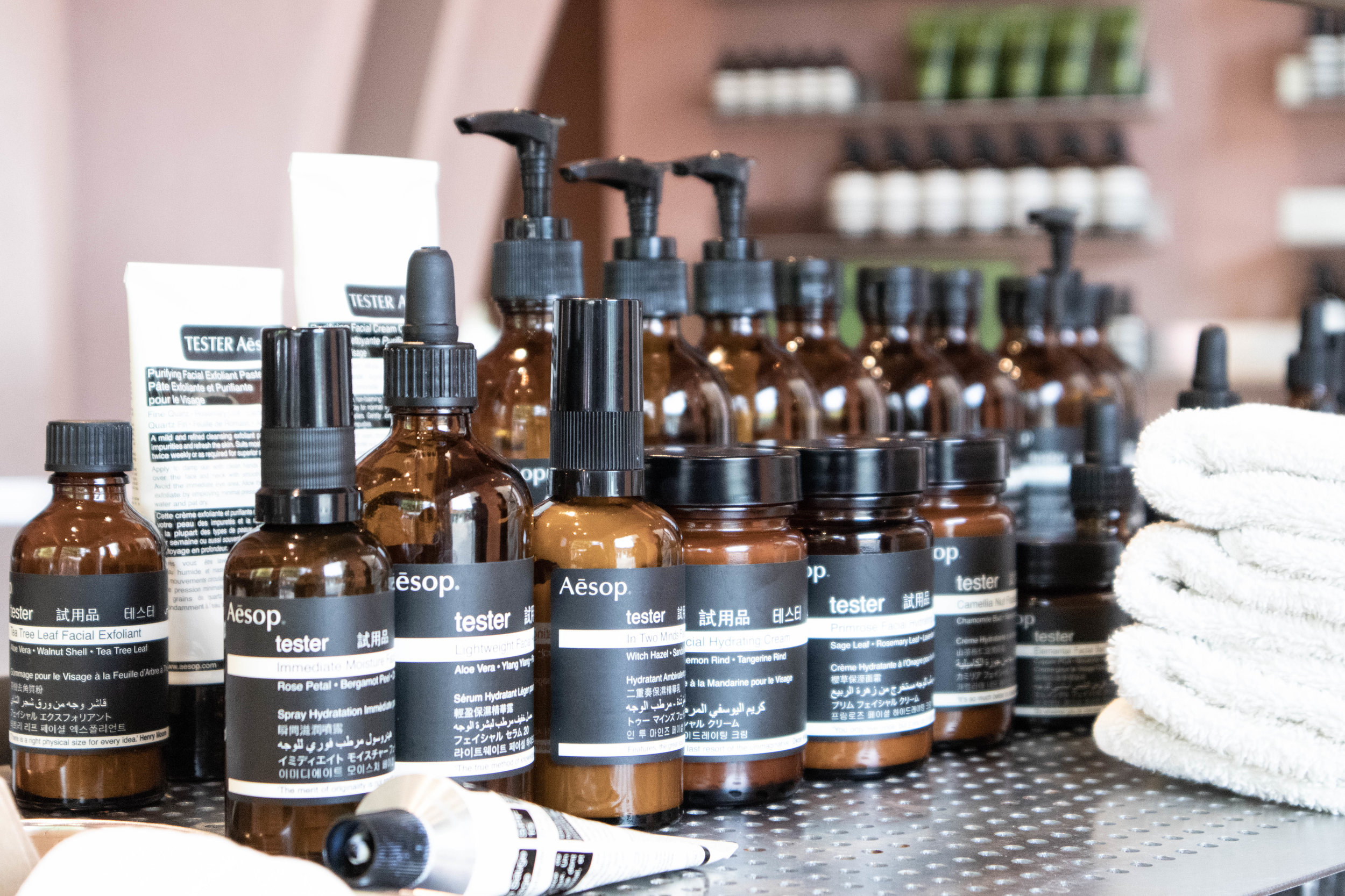
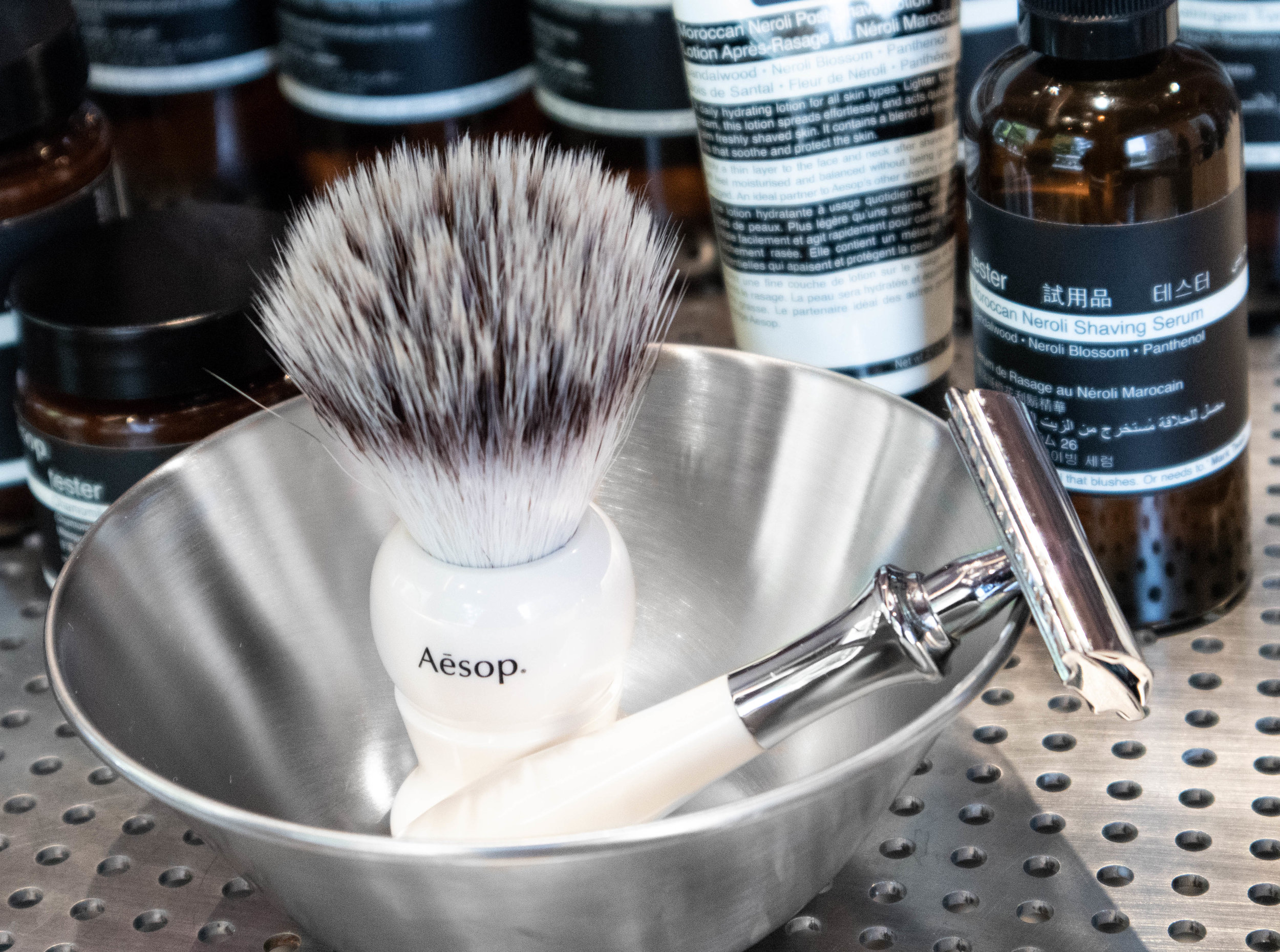
Aesop is a Melbourne based skin & body care company that has through all of it's locations always been pushing good design and retail display. their aesthetic language has been part of their marketing since quite some time now. It is one of those companies that have understood for a while that creating beautiful environments make people want to come inside even if they don't know what the shop is about.
This store in Chelsea was designed by their long time partners Oslo-based architects Snøhetta and was inspired in part by the opening scenes of classic James Bond films. Silvery shiny materials agains earthy down to earth wall tones create a focus point on the products themselves, playing with repetition and symmetry, Snøhetta really captures the essence of the brand in this location taking advantage of capacious dimensions to effect dramatic, clearly defined forms and material contrasts.
Earthy tones in the walls create a matt base where everything else contrasts and stands out. the water in the fountain creates a mirror that reflects the amazing multiple stem column arches up to envelop the entire store giving the user the feeling that he is stepping inside a cave.
These sweeping structures create zones of intimacy around a large circular demonstration sink, 4.2 metres in diameter, that seems to hover in space, inviting visitors to experience an Aesop product consultation. The sink is edged by a shallow reflective pool; during the night, light reflected off the water shimmers on the walls.
Repetition of Aesop's own products create rhythm and beautiful patterns...
Earth layers from Erik Jørgensen showroom in Copenhagen
Last May during 3 days of design in Copenhagen, we had the opportunity to visit the Home Collection showroom of Erik Jorgensen, who teamed up with interior stylist Pernille Vest to create this beautiful tone in tone atmosphere titled ‘Earth Layers’, a series of spaces that have been designed as ‘a landscape of complementing colours’, where one room takes you to another.
Now we are happy to incorporate our favourite pieces to our collection. Scroll down to have a look from their beautiful “home”
“The furniture appears as components in a landscape of complimenting colours, tone in tone. The aim has been through our choice of colours to create a soothing and inspiring atmosphere, which combined with the location of the various pieces of furniture in relation to their surroundings, provides an instant calm and serenity, “explains Niels Jørgensen, CEO of Erik Jørgensen Møbelfabrik.
The walls have been painted in soft, neutral colours with a chalky texture, inspired nature and the tones of clay. The space is instantly calming. Curtains have been removed from windows to let light bounce around, while different mirrors create reflections.
Spotted - New to de Insula family the Insula Wall.
The shelves organic design is a beautiful contrast to the vertical walls, and creates an interesting expression where the almost appear to be somewhat crocket.
“Through the colour tones of the furniture, we have tried to embrace and substantiate their mood with naive objects formed in clay and stone. It’s the details and nuances that make the difference, and the overall experience is calm, sensual and down to earth, “ explains stylist Pernille Vest.
If you are planning to visit Copenhagen and you are a design lover this is for sure a place you want pop by. visit them at Bredgade 76, 1260 Copenhagen.
A simple mirror that offers more
Flip mirror
Flip is inspired by the traditional dressing table where one can check ones appearance in the mirror and at the same time keep all the small items that are nice to have close at hand before leaving the house.
Javier Moreno
The designer behind this piece says: "Typically, a mirror has only one function, but I wanted to design a mirror that could offer more. You usually look in the mirror just before leaving the house, so why not let it be there where you keep the last things you use to get ready, or need to remember just before you go?"
Follow us in pinterest to get inspired.
Here 4 beautiful images of some of our favourites bloggers and stylists, Katerina Dima from @onlydecolove , Hannah from @han_house , Hege from @hegeinfrance and Susanna Vento from @susanna_vento
The Dots
These playful hooks have become a true Muuto icon through its characterful and functional expression. The Dots take a playful approach to the conventional coat hook with infinite possibilities and combination to create your own look.
Want to learn more about the design, Muuto recently visited the site that brings The Dots into the world and spoke to designer Lars Tornøe about his friendly family of coat hooks.
“The idea for The Dots came from something that wasn’t really design-related. I wanted to make a mobile with circled pieces of wood in different heights. While working on the sketches, I discovered that it wasn’t a mobile at all—it was a coat hook!”
“The Dots are composed of two pieces of wood that have been glued together. They’re put in a lathe and carefully shaped into the final form,” while noting that “the design is shaped so that there’s minimal waste of material.”
“The Dots strike the delicate balance of form and function to a high degree, making them a decorative object even when they’re not in use. It gives the design a friendly and playful character that really adds to the atmosphere of any room,” he says
To Tornøe, the most unique thing about The Dots is its possibilities: “The Dots are very versatile and can be used anywhere, whether it be the living room, a hallway, the kitchen or the bedroom. With the 18 different colors across four different sizes, you can combine The Dots exactly as you want. The possibilities are infinite,” Tornøe ends.
Check out our Pinterest Muuto Board and get inspired


