Aesop Duke of York Square - London

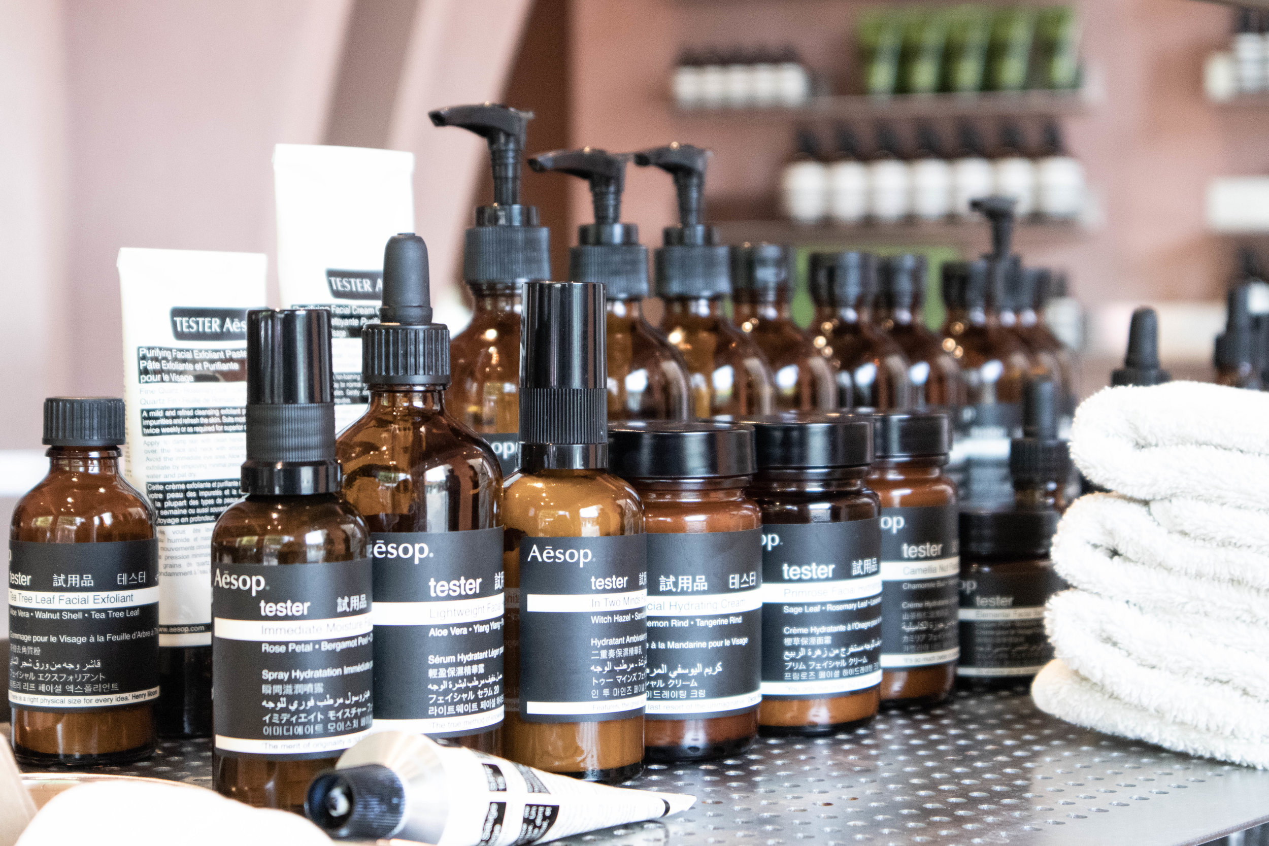
While in our visit to metropolitan London, we passed by this amazing space situated in Duke of York Square, right next to the incredible Saatchi Gallery, which is also an excelent place to visit.

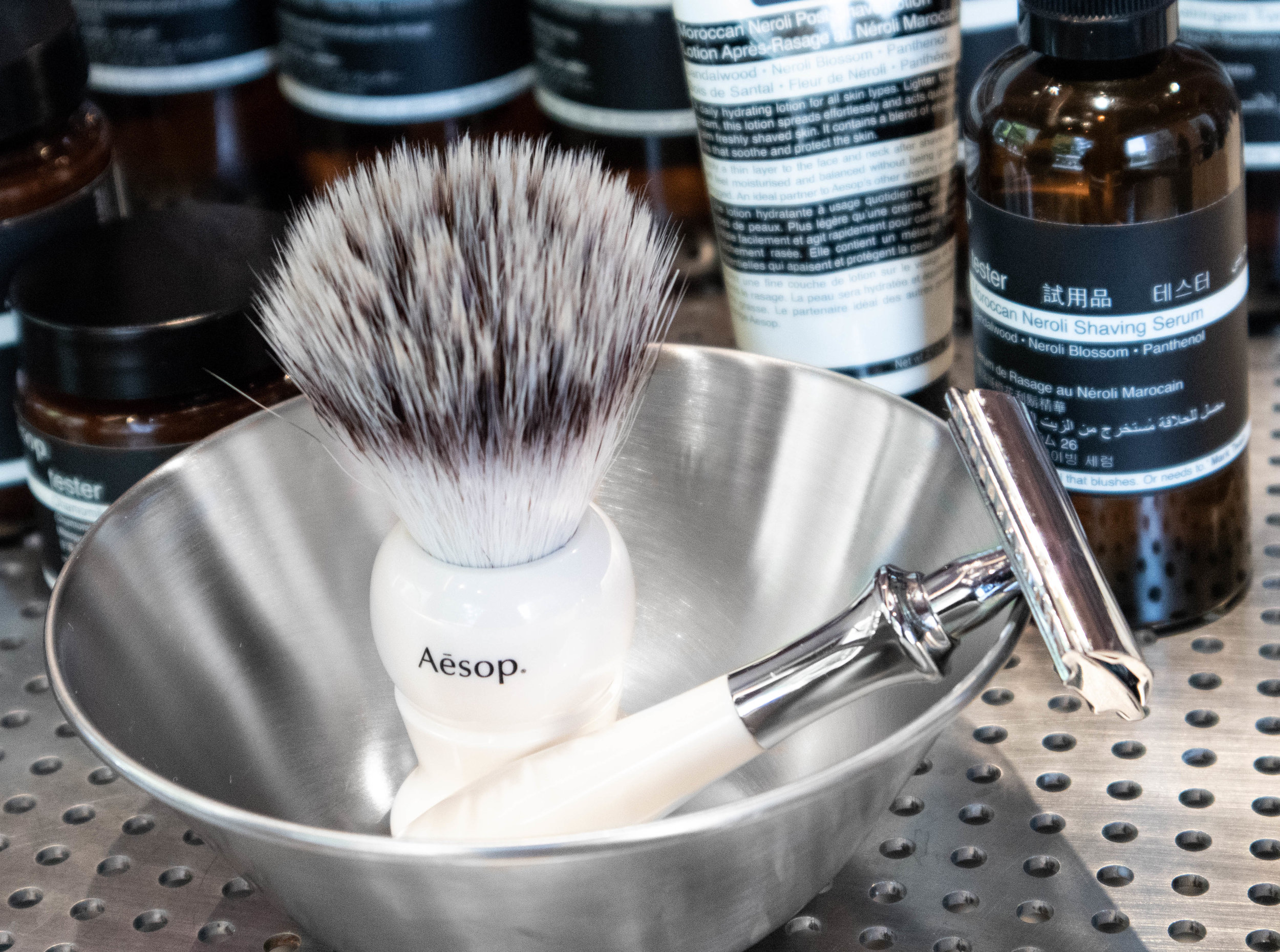
Aesop is a Melbourne based skin & body care company that has through all of it's locations always been pushing good design and retail display. their aesthetic language has been part of their marketing since quite some time now. It is one of those companies that have understood for a while that creating beautiful environments make people want to come inside even if they don't know what the shop is about.

This store in Chelsea was designed by their long time partners Oslo-based architects Snøhetta and was inspired in part by the opening scenes of classic James Bond films. Silvery shiny materials agains earthy down to earth wall tones create a focus point on the products themselves, playing with repetition and symmetry, Snøhetta really captures the essence of the brand in this location taking advantage of capacious dimensions to effect dramatic, clearly defined forms and material contrasts.

IMG_0853.jpg
IMG_0859.jpg

Earthy tones in the walls create a matt base where everything else contrasts and stands out. the water in the fountain creates a mirror that reflects the amazing multiple stem column arches up to envelop the entire store giving the user the feeling that he is stepping inside a cave.

 These sweeping structures create zones of intimacy around a large circular demonstration sink, 4.2 metres in diameter, that seems to hover in space, inviting visitors to experience an Aesop product consultation. The sink is edged by a shallow reflective pool; during the night, light reflected off the water shimmers on the walls.

IMG_0856.jpg
IMG_0862.jpg

Repetition of Aesop's own products create rhythm and beautiful patterns...

IMG_0868.jpg

Earth layers from Erik Jørgensen showroom in Copenhagen

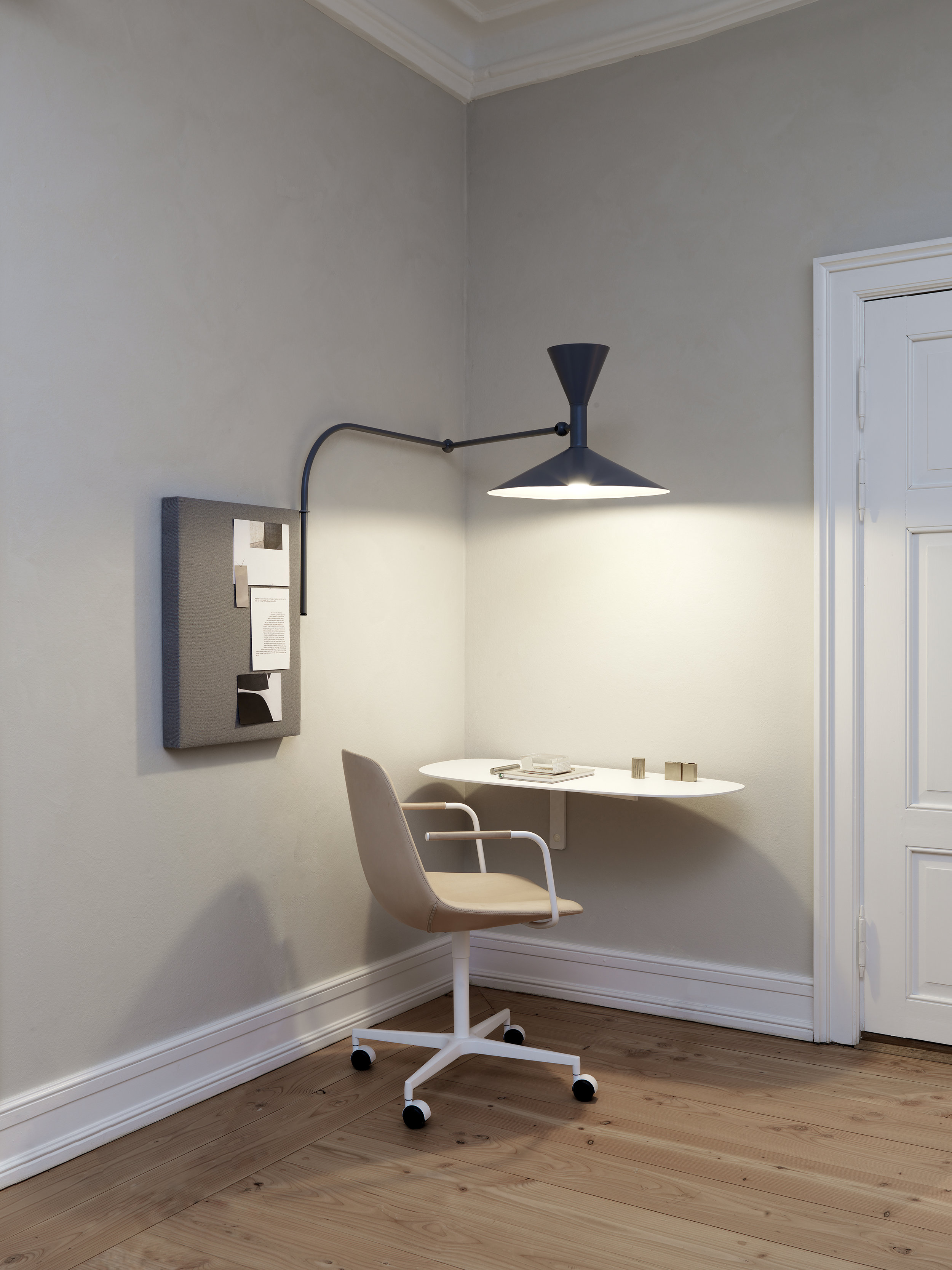
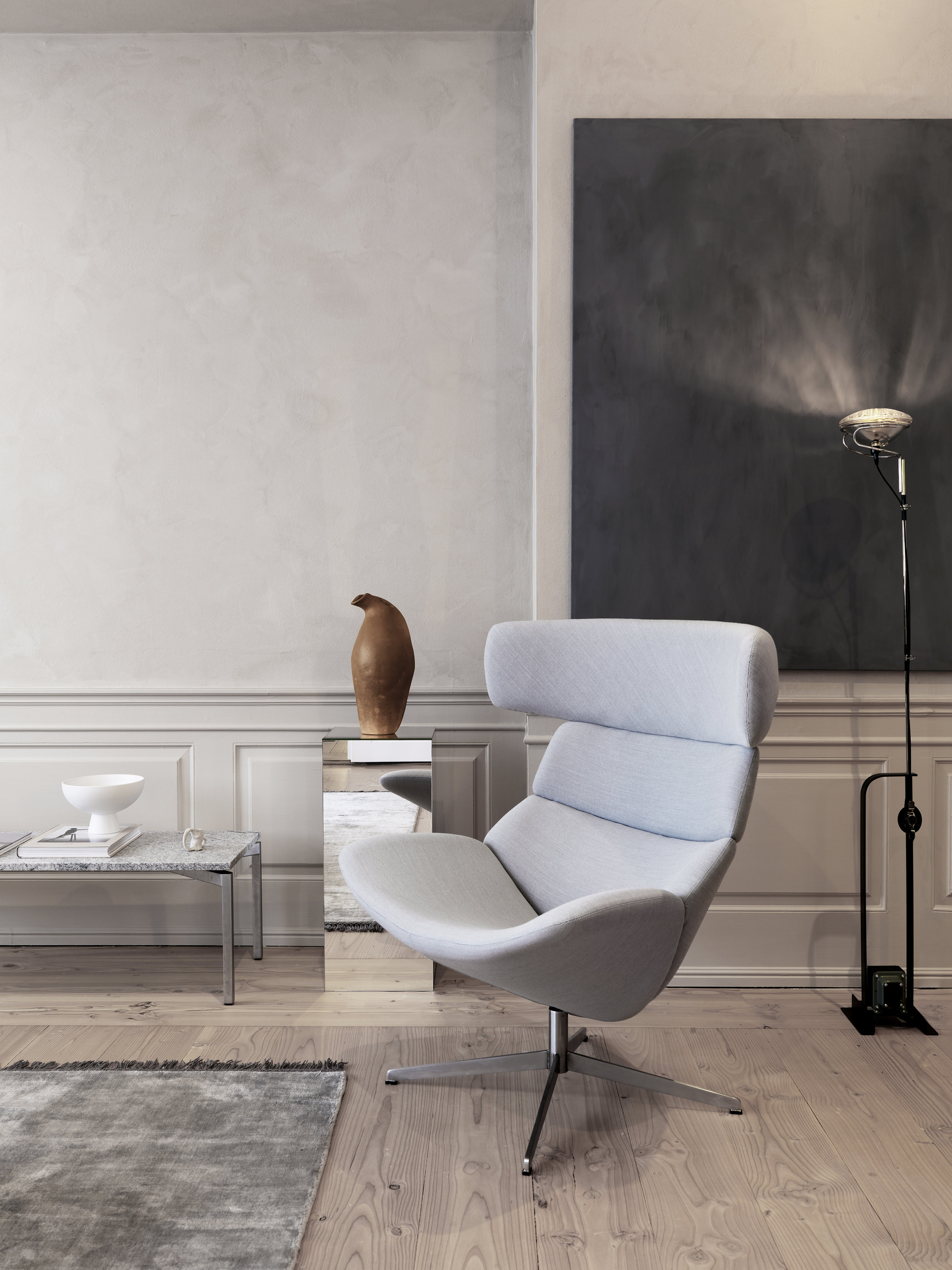
Last May during 3 days of design in Copenhagen, we had the opportunity to visit the Home Collection showroom of Erik Jorgensen, who teamed up with interior stylist Pernille Vest to create this beautiful tone in tone atmosphere titled ‘Earth Layers’, a series of spaces that have been designed as ‘a landscape of complementing colours’, where one room takes you to another.

Now we are happy to incorporate our favourite pieces to our collection. Scroll down to have a look from their beautiful “home”

Erik Jørgensen showrrom copenhagen, interiors, scandinavian design, living room, modern furniture 7.jpg

“The furniture appears as components in a landscape of complimenting colours, tone in tone. The aim has been through our choice of colours to create a soothing and inspiring atmosphere, which combined with the location of the various pieces of furniture in relation to their surroundings, provides an instant calm and serenity, “explains Niels Jørgensen, CEO of Erik Jørgensen Møbelfabrik.

Erik Jørgensen showrrom copenhagen, interiors, scandinavian design, living room, modern furniture 14.jpg

The walls have been painted in soft, neutral colours with a chalky texture, inspired nature and the tones of clay. The space is instantly calming. Curtains have been removed from windows to let light bounce around, while different mirrors create reflections.

Erik Jørgensen showrrom copenhagen, interiors, scandinavian design, living room, modern furniture 11.jpg

Spotted - New to de Insula family the Insula Wall.

The shelves organic design is a beautiful contrast to the vertical walls, and creates an interesting expression where the almost appear to be somewhat crocket.

Erik Jørgensen showrrom copenhagen, interiors, scandinavian design, living room, modern furniture 9.jpg
Erik Jørgensen showrrom copenhagen, interiors, scandinavian design, living room, modern furniture 10.jpg

“Through the colour tones of the furniture, we have tried to embrace and substantiate their mood with naive objects formed in clay and stone. It’s the details and nuances that make the difference, and the overall experience is calm, sensual and down to earth, “ explains stylist Pernille Vest.

Erik Jørgensen showrrom copenhagen, interiors, scandinavian design, living room, modern furniture 2.jpg
Erik Jørgensen showrrom copenhagen, interiors, scandinavian design, living room, modern furniture 1.jpg
Erik Jørgensen showrrom copenhagen, interiors, scandinavian design, living room, modern furniture 5.jpg

If you are planning to visit Copenhagen and you are a design lover this is for sure a place you want pop by. visit them at Bredgade 76, 1260 Copenhagen.

4 beautiful acoustic solutions for modern interiors

Sound absorbance is very rapidly becoming a high importance in interiors. From residential spaces to public areas, people have increasingly noticed how our sound affects our ability to feel comfort in a room. But far away from those egg-shaped foam panels from the music studios of the 90s, there are beautiful great sound-absorbing solutions these days that not only help out with the noise in your space but look truly like a piece of art.

Here are 4 sound solutions that will not only make your space less noisy but will look truly awesome in your interior.

Undecided or want to know more? contact us

Kvadrat Clouds by Erwan and Ronan Bourollec

kvadrat-clouds-bouroullec-2.jpg

In collaboration with Kvadrat, internationally acclaimed designers Ronan and Erwan Bouroullec created Clouds, an innovative, interlocking fabric tile concept for the home. Clouds can be used as an installation and be hung from a wall or ceiling.

54cea533ae490d3765fad18e1813c112.jpg

Clouds evolves as you add elements to it, producing a unique three-dimensional effect. Inspired by the inviting irregularity of the surface, you construct your own piece and make your vision reality. Self-expression lies at the heart of the appeal of Clouds.

The tiles are made of one element and are attached by special rubber bands. Creating your own piece is quick and easy, whether you want a simple design or a complex decorative screen or wall. You can easily arrange and re-arrange the tiles to reflect your individual style and bring new ideas into your home, time and time again.

You can read even more here

Kvadrat soft cells

Soft Cells bring acoustic comfort, aesthetic excellence and tactile surfaces into a space. In doing so, they provide a solution to the acoustic challenges of modern architecture and promote productivity. 

56530665e4cd31138fe53ce8b6634243.jpg

Soft Cells are acoustic panels that deliver up to Class A sound absorption. They can be mounted both on walls and ceilings. Available in a wide choice of Kvadrat textiles and fully customisable, they can be seamlessly integrated into any design scheme. Soft Cells frames are made with a minimum of 50% recycled aluminium. They include a patented tensioning mechanism, which ensures they are unaffected by temperature or humidity for many years.

florianhecker-01.jpeg

Kvadrat Soft Cells is a simple, modular system of acoustic panels that help improve sound quality in offices, meeting rooms or any other interior space. All have been tested for sound absorption according to EN ISO 354. All specs available at soft-cells.com

BAUX - Acoustic Panels & tiles

BAUX Acoustic Panels is an environment-friendly, recyclable material made from wood wool, cement and water. The natural components together provide many functional characteristics as reducing noise and adding depth to a space.

BAUX-Plank-Reception.jpg
BAUX-Acoustic-Panels-Corridor.jpg

BAUX Acoustic Panels. Available in 7 patterns; Quilted, Check, Stripes, Lines, Diagonal, Arch and Curve. All designed to be combined into infinity.

3d Acoustic Panels

BAUX is a joint ventures between entrepreneurs Johan Ronnestam and Fredrik Franzon and the founding partners of design studio Form us with love; Jonas Pettersson, John Löfgren and Petrus Palmér. Visit baux.se to know more

Zilenzio - A quieter work environment

Zilenzio develops and delivers high-quality sound absorption using well considered and designed solutions. Their products are the result of their long experience in sound design, analysis of offices, and tests carried out according to international standards.

They have created healthy acoustic surroundings in many workplaces, and their employees have high expertise in sound absorption and the acoustic properties of different materials.

Visit zilenzio.se for more info.

fazett-5.jpg
Dezign-5.jpg

Fazett

The Fazett wall-mounted system consists of a single element, a diamond that can be combined in many ways. By using fabrics of different colour it is possible to create patterns to cover any small or large surface. The diamonds create an attractive pattern and at the same time provide effective sound absorption.

Fazett.jpg

Timber 

Timber-väggabsorbent-2.jpg
2ee6b60fc5dd52417d379d9b6b09a81d.jpg

Timber can be used as classic wall panelling, decorative half-wall panelling, to imitate walls of offcuts, or in elegant herring-bone patterns as graphic wall pieces.

Dezign

The Dezign ceiling-mounted absorber can swing between vertical and horizontal mounting, and is available in several sizes.

dezign.jpg

So, no more excuse to inhabit those sound bouncing ear numbing spaces. Choose your favourite and get in touch with us to bring silence into your space.

Muted tones and natural materials

Your home, your sanctuary.

must-haves-5.jpg

It is way too noisy out there. Your home should be a place where you can shut everything out and find peace and calmness. Natural materials and muted tones make the perfect environment to lower your levels of stress. 

Our top products for the summer in muted tones:

Mogensen J39 Chair from Fredericia, Workshop Coffee Table from Muuto,  Ripple Long Glasses & Fein Long and small spoon from Ferm living, WM String Lounge Chair from Menu A/S, Ripple Throw from Muuto, Spine Day bed by Fredericia, Plant box from Ferm living, Pull floor lamp from Muuto.

See more at our muted and natural tones collection.


Menu space, a thrill to be back.

Last year, for 3 days of design, Menu Space opened it's doors. After many years, the brand finally opened a showroom in Copenhagen where anyone can get in close contact with the brand and its products. But it's much more than a showroom, its also a cafe and an co-working office.  "An open space where like-minded creative thinkers can work, meet and share their stories, ideas and processes."

Last year we had the opportunity to visit the Space just as it opened it's doors and this year we were back for 3 days of design to experience a more mature environment, with a broader collection. More products that we love.

If you are in Copenhagen don't miss the chance to visit. It's not in the city center but if you head up to Nordhavn neighbourhood, you can visit many other showrooms that will make it very much worth the trip. Here are some images of our latest visit.

IMG_1749.jpg

The Knitting Chair designed by Danish architect and designer Ib Kofod-Larsen in 1951, was reissued by Menu and presented during 3daysofdesign. 

IMG_1791.jpg

It's has been almost a year since our last visit and we love to see and feel the new warm and cozy atmosphere of the space and all the new products.

Harbour Chairs in warm and elegant variety of textiles . 

IMG_1822.jpg
IMG_1773.jpg

New from the Tribeca Series By Søren Rose New York, the Hubert Pendant Tribeca. A beautiful lighting statement.

Cyclades Vases, resting in the stunning marble plinth table.  

IMG_1815.jpg
IMG_1798.jpg


The Androgyne coffee table by Danielle Siggerud and this beautiful rug were some of the new products we spotted that we hope become available soon.